Dorico 4 is out! I've been testing it for the past few months, and I'm not even sure I am scratching the surface of what it can do. It is, in my opinion, the most important and exciting update to Dorico since its release in 2016.
This past summer, Dorico released an iPad app, which has many of the design updates and features seen in Dorico 4. You can read my first impressions about the iPad version of Dorico, and hear my conversation with Product Marketing Manager Daniel Spreadbury, here.
Fortunately, the Scoring Notes blog posted a review, which you can read here.
Here are some quick things that I am excited about in Dorico 4
Licensing
Dorico 4 uses Steinberg's brand new Steinberg Licensing, replacing the Steinberg e-Licenser. The e-Licensor was one of the two or three most frustrating licensing processes on my Mac. The new Steinberg Licensing is one of the least frustrating processes for licensing software on my Mac.
Once Dorico 4 launched, I was presented with the option to move my existing Dorico 3.5 license over and log into my Steinberg account. Once completed, Dorico can run on up to three machines without connecting to the web. This is a super easy and generous way to handle licensing.
Key Editor
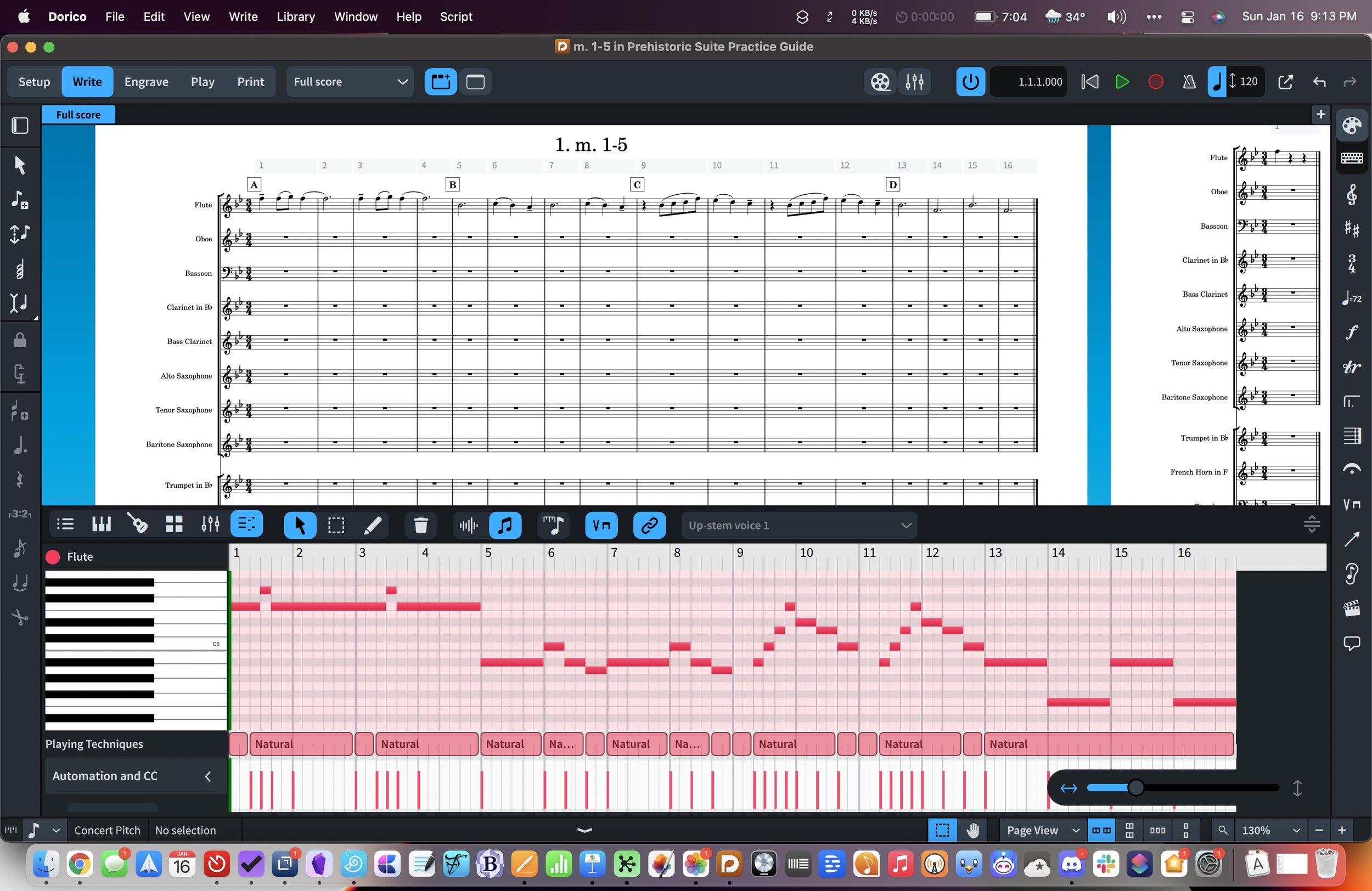
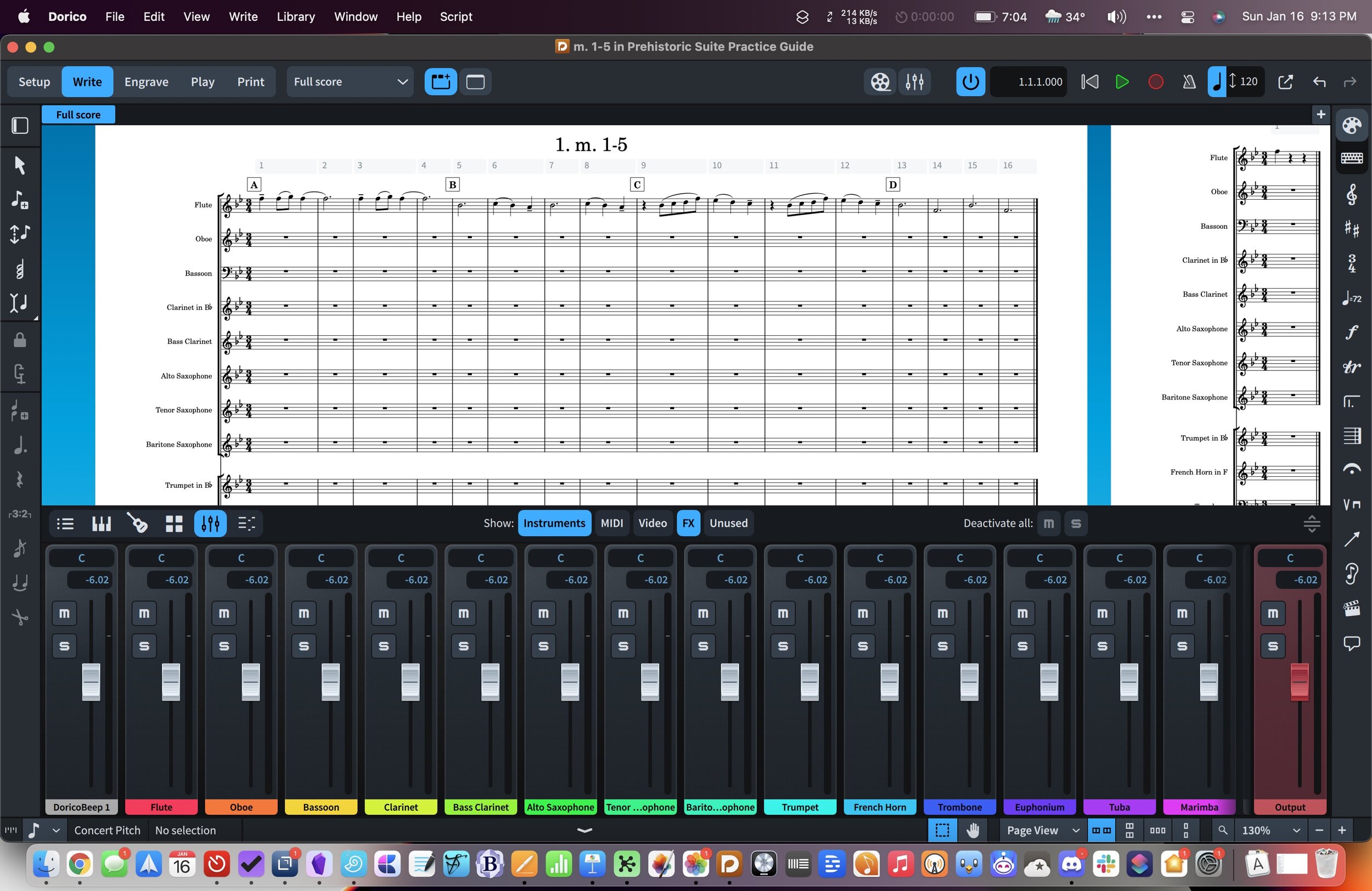
I covered this in my iPad First Impressions post, so I won't go into too much detail here. The bottom area, which previously only contained project properties, now includes new note input methods like a piano, fretboard, and drum pads. It also integrates a piano roll and mixer right into Write Mode.
I really enjoy writing with notation and a piano roll visible on the screen at once. Perhaps this is because I am comfortable with DAWs. But I think it also speaks to how easily I conceptualize and edit rhythmic duration on a piano roll. Ethan Hein summarizes this well:
This is so cool, the piano roll and the score are great complements and they balance each others' weaknesses, all I want is the ability to jump back and forth between them in a single view https://t.co/dcYTipvsNB
— Ethan Hein (@ethanhein) January 14, 2022
You can also view a mixer in the bottom area while in Write Mode. Cool.
Jump Bar
"Command pallet," "command search," "quick open"... whatever it's called, this feature is becoming very popular in pro-software. If you have used Sibelius, you might be familiar with their Command Search feature. The feature is also quite popular in productivity software. I love using Command+O in OmniFocus to open projects and perspectives quickly. In my note app Obsidian, Command+O smartly searches my notes, and Command+P acts upon them.
The idea is that you have a keyboard shortcut that brings up a search, you start typing, and then the software smartly displays some options on the screen for places it thinks you want to go or things you want to do.
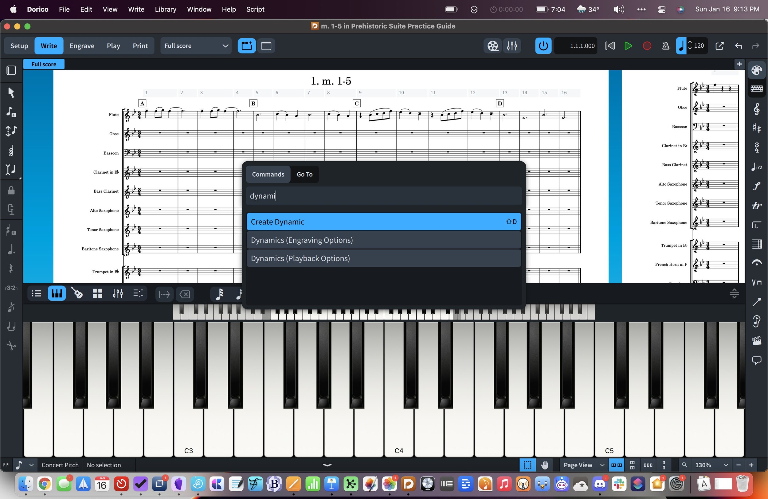
Dorico has added this feature with their new Jump Bar, and I couldn't be happier. Just press the letter J, and you can type "m30" to bounce to measure 30 or "dynamics" to bring up the dynamics popover.
Popovers are my favorite part of the Dorico workflow, but I sometimes forget which keyboard shortcuts belong to which menus. In my opinion, having one command that allows for natural-language searching is a workflow win. Even if it is technically more keystrokes to find things, there is way less mental overhead in just typing what you want plainly.
Improvements to Play Mode and the Interface
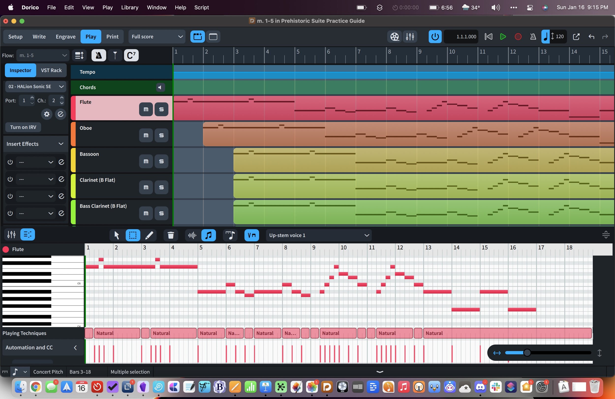
Play Mode moves a handful of track options to the left, making it more familiar to users who work inside DAWs. Working with inserts and effects feels less esoteric in this design. I like it.
Project Templates
You can now turn any project into a template. Templates appear in the File menu, under the New from Project Template selection.
Previously, I used a Siri Shortcut to manage project templates in Dorico. I wrote about that for Scoring Notes here. My shortcuts method handles some of the file management for you and is worth a look if you want to learn more about macOS and iOS automation.
Generally, I think it is a benefit to store templates inside of Dorico, and I will be taking some of my most frequently used templates in the Shortcuts app and moving them inside of Dorico.
Library
Dorico moves most options relating to customizing the app's behavior into a menu called Library. It drives me nuts when professional creative software stores its settings across numerous custom preference panes throughout the application. This adjustment makes customizing Dorico's various options more discoverable, regardless of the mode or context they relate to.
The new library features also include many new options for font styles, which I am sure will make David MacDonald very happy.
M1
Dorico 4 works with Apple Silicon. From Scoring Notes:
Dorico 4 is the first Dorico version, and the first of any of the major desktop applications, to support Apple silicon Macs, such as the M1 MacBook Pro, iMac, and Mac mini. If you have an Apple silicon Mac, Dorico will run as a native application by default. However, if you use VST plug-ins, Dorico can only load VST plug-ins that can run natively on Apple silicon as well, and these must be VST 3 (there is no support for VST 2 plug-ins on Apple silicon). It is possible to force Dorico 4 to run under Rosetta 2 on Apple Silicon, which will allow VST 2 and Intel-native plug-ins to be loaded, though at the expense of slower overall performance.
Overall, Dorico 4 is a huge step forward. I imagine a lot of the work on this update was done in preparation for the iPad release. Now that both versions exist, I expect that the shared development platform between desktop and mobile will mean that future updates are released in side-step and continue to be feature-rich.


