Ipad

StaffPad Comes to iPadOS (Reflections on App Store Pricing and Touch Screen Operating Systems)

Five years ago, StaffPad came to Windows Surface tablets. StaffPad is a professional music notation application that turns handwritten notes into beautiful music notation. It is built around the stylus being the primary input, and because the iPad did not have stylus support at launch, StaffPad remained Windows only.

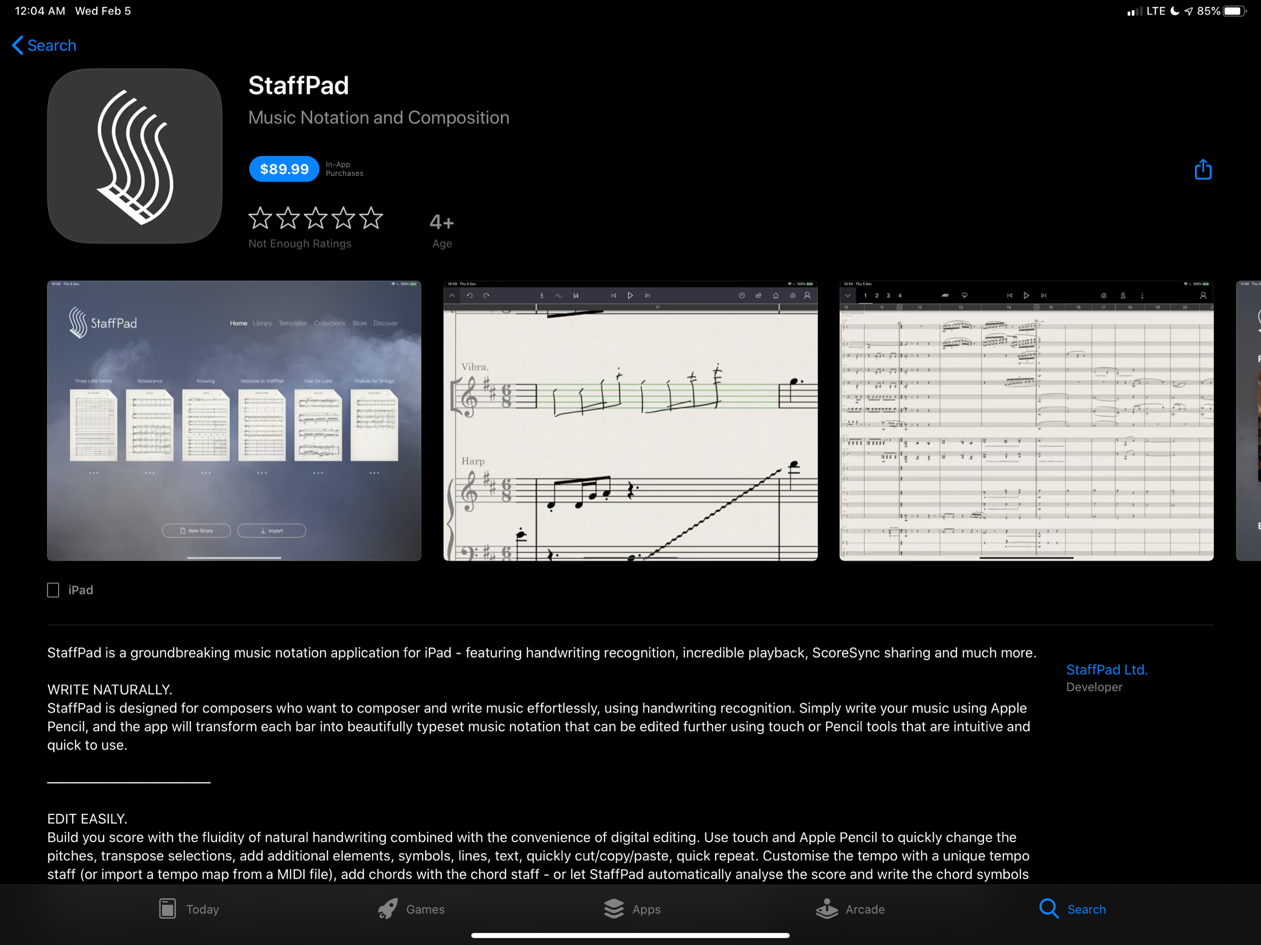
Multiple years into Apple supporting its own official stylus, the Apple Pencil, StaffPad is finally here on iPad!

StaffPad’s intro video sells itself, so I am not going to write much about the app here. Instead, I point you to…

StaffPad’s Introductory Blog Post

Download Link to the App Store

Scoring Notes Review - a must read if you are interested

Since the features of StaffPad are covered in the links above, I want to comment on two interesting aspects of this release.

First, the price. At $89.99, this is no impulse purchase. I find it refreshing to see a professionally priced app like this on the App Store. For years, the App Store has seen a race to the bottom type approach for grabbing sales. Users are so used to <5 dollar apps that the idea of paying for software has diminished from reality.

IMG_2544.png

Increasingly, developers are finding that subscription based pricing is the only way to maintain software and put food on the table. There was a big discussion about this in the Apple community last week when beloved calendar application Fantastical released their version 3 and went to subscription pricing. As is customary when an app goes to subscription pricing, users of the application and bystanders alike were enraged at the idea of a calendar costing four dollars a month.

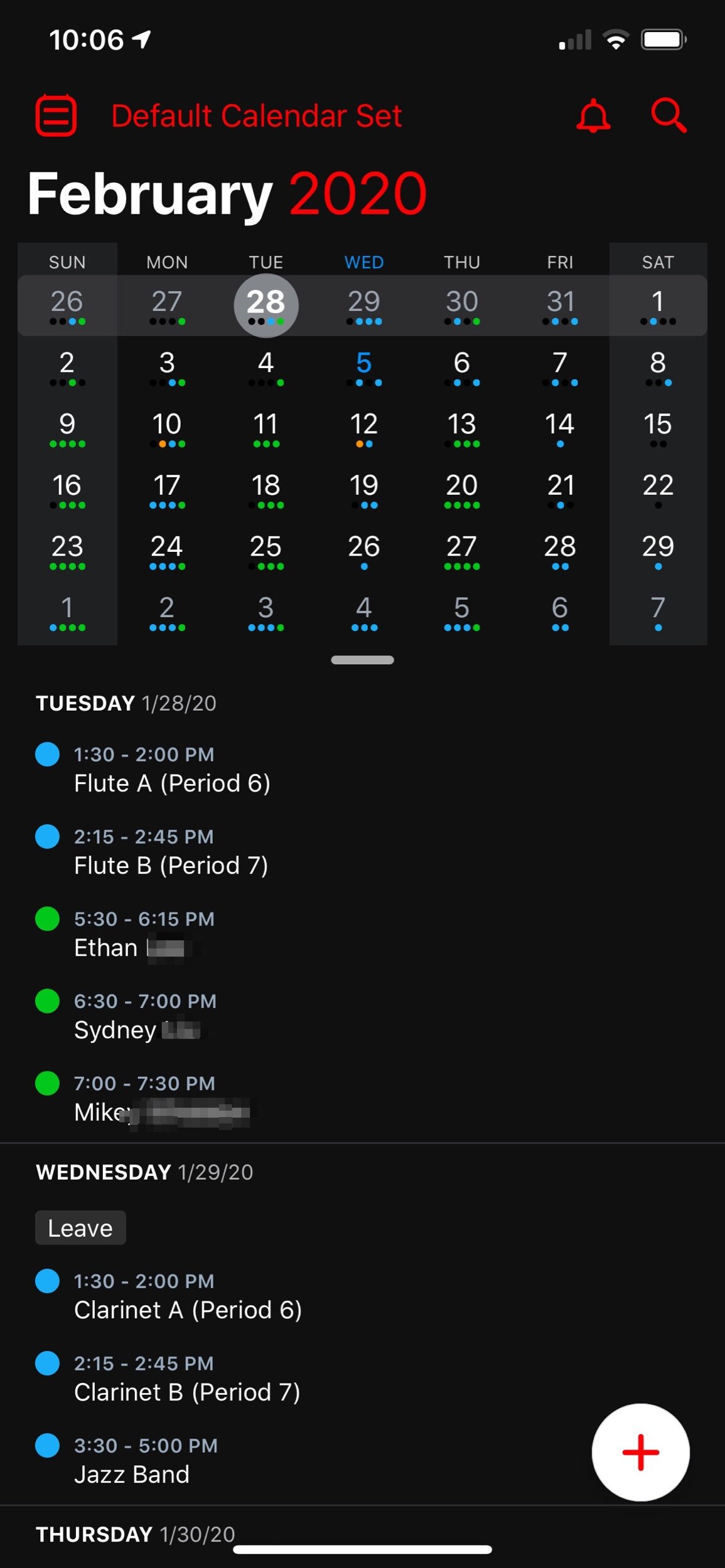
I couldn’t resist sneaking my love of Fantastical into this post. The interface is beautiful.

I couldn’t resist sneaking my love of Fantastical into this post. The interface is beautiful.

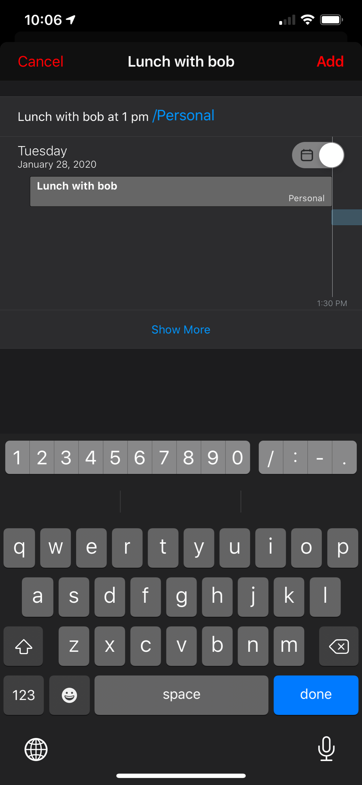
And the natural language input is one of many essential features that helps me get my work done more efficiently.

And the natural language input is one of many essential features that helps me get my work done more efficiently.

As a user of Fantastical, I was happy to keep supporting development. It is one of my most used applications on a daily basis and its features are essential to me having a full time teaching job, while also scheduling gigs, 25 private students, speaking engagements, and all of my other personal events.

Fantastical is what I would call a prosumer application. It offers more power to someone looking for an advanced and well designed calendar, and it has a wide appeal (everyone needs a calendar!). Four dollars a month is steep, but manageable. Now that the price is reoccurring, I do think it will appeal to a smaller audience, as each user will have to reevaluate on a monthly or yearly basis whether or not this application is continuing to be worth the cost.

StaffPad is very different. It is a professional creation tool. Much like Photoshop is essential to designers and photographers, score editors are essential to the lives of most musicians, composers, and music educators. By charging 89 dollars, StaffPad follows a long history of apps in its field, which are often priced between 200 and 600 dollars.

I have to wonder… if the iPad had more software like this, and from an earlier point in time, would users have adjusted their expectations and would more expensive professional apps be more viable? And if so, would the viability of such professional apps lead to more (and better) professional apps on iOS?

And furthermore, would Apple adjust to these trends? Apple still offers no free trial for apps (something that will definitely deter a lot of my music teaching colleagues away from giving StaffPad a chance). Not to mention that professional creative software has a tradition of volume licensing and educator discounts. Educators who would normally be able to afford a program like this for themselves or their class are going to be stuck if they are looking for the same options with StaffPad.

App developers get around to this in number of ways, an example of which is to offer a free app where you have to buy it as an in-app purchase after a week. Of course there is also the subscription model. I am glad StaffPad went with a more traditional model than a subscription because it fits within the tradition of how its class of software is priced. And my hope is that this just might convince more developers to bring their own apps to iPadOS.

Which brings me to my second point…

StaffPad doesn’t, and probably wont, have a macOS app. It is built entirely around stylus input. This is why it could only exist on Windows Surface tablets at first. I am thrilled it is on iPad, but this presents an interesting question for users of Apple products.

A Windows Surface user notices no distinction between whether or not StaffPad operates on a touch-based OS or a traditional point-and-click OS, because they are one and the same. Even as macOS and iPadOS move closer and closer together, this distinction has lead them to be products with very different potentials.

On the other end, all the other players in the score-editor field (Sibelius, Finale, Dorico) remain “desktop” applications that run on traditional point-and-click operating systems. With the power of the current iPad Pro, there is no reason these applications couldn’t exist on iOS, other than that developing for iOS is very different. None of these developers have shown any signs of bringing their programs to iPadOS any time soon, and I would suspect StaffPad has no plans for a Mac version.

I admire how Apple has held their ground about the iPad being the iPad and the Mac being the Mac. It has made both platforms stronger. But as the iPad becomes a more viable machine for getting work done, Apple has got to get a plan for how to solve this essential “input” question.

Integrating Luna Display Into the Classroom

My wife gave me a Luna Display for my birthday and I have been really impressed with it so far. Luna is a USB-C dongle that plugs into a Mac. Using the companion app on iPad, you can access the entirety of macOS, wirelessly. 

public.jpeg

I cannot wait to use this device this coming school year. I teach in about five different classrooms which makes transporting my Mac cumbersome. It is heavy, always running out of battery, and is missing some of my iOS music apps like forScore and Tonal Energy. The light form factor of my iPad Pro is perfect for toting around the building in one hand.

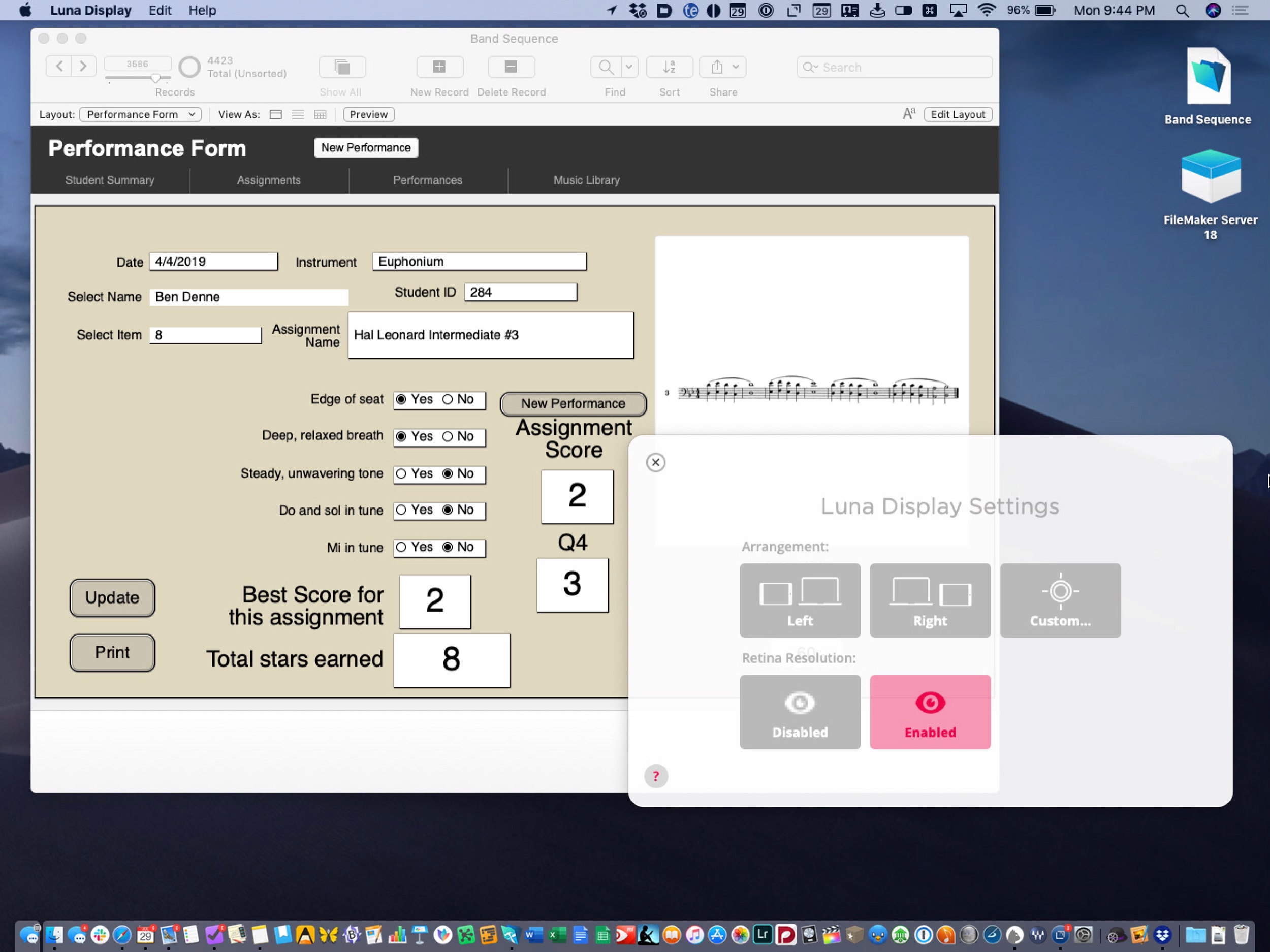
There are a few problems with this. I am still faster on macOS for one. And more importantly, there is software on the Mac that I cannot take full advantage of on the iPad. I depend heavily on FileMaker for a tracking student data, assessments, and assignments. I have discussed that workflow on two episodes of The Class Nerd podcast. This episode on tracking student data and this episode, which is a bit miscellaneous. For whatever reason, keyboard input on certain parts of the user interface is slow on FileMaker Go, the iOS version of the app. Even though I can do 90 percent of the things I need to with my database on iOS, the typing speed slows me down.

Luna Display puts macOS right on the screen of my iPad.

Luna Display puts macOS right on the screen of my iPad.

It is for reasons like this that I am thrilled to use Luna Display in school next year. The experience of using the app is so smooth that at times I forget I am not using my Mac. Are there issues? Tons. But I stop to wonder every now and then why it is again that macOS can’t work with touch.

I also use a score editing app called Dorico on my Mac. Not as often as FileMaker, but enough that it is sorely missed on iOS. I have not tried to operate this application on the Luna Display but in full screen mode I suspect it isn’t so bad. Once I give it a shot I will report back.

🔀 Top 10 iPad features we’d like to see in iOS 13 | Macworld

From Macworld...


Top 10 iPad features we’d like to see in iOS 13 | Macworld

The new iPad Pro hardware is great and Apple needs to invest in upgrades for iOS to take advantage of it. Here are a few ideas for new features.

No way 9 or 10 are happening any time soon. I am really hopeful for 6, 7, and 8. A resounding “yes, please!” to 3, 4, and 5. With regards to 2, I must be the only person who does not require external file support to get work done on an iPad. I would much rather Apple improve iCloud Drive and third party cloud drive support in the Files app. For the most part, I think these are likely to happen in order from 2-10.

I am looking forward to the future of iOS, whatever it is.

Raw first impressions of the new iPad Pro

I am all set up with my new 12.9 inch iPad Pro. Here are my gut thoughts on the process of purchasing the device and the first few hours of use.

I ordered the 11 inch device on day one and then immediately regretted it once I heard reports of the 12.9's lightness. This mixed in with the fact that the 11 inch still runs apps in a different size class than the 12.9. For example, when you run Mail and Notes side by side, it is possible to see the list of notes/messages and the contents of the note/message on screen at once in the 12.9 model.

I went in to the Apple Store today with the idea in mind that I would test both out, most likely buy a 12.9, and then return the 11.

Things I tested in the store:

-Holding each device in hand with and without Keyboard Folio attached.

-Running two productivity apps side by side in 50/50 split view on both devices to see how much content was visible.

-Typing an email on each keyboard.

-Looking at sheet music on one half of the screen while taking handwritten notes on the other. (In landscape and in portrait)

-Fitting each device in and out of my back pack.

-Taking handwritten notes in Apple Notes while holding the device in the other hand.

Making the decision

It was a hard decision. I really miss watching movies and reading books on the couch with my current 12.9. It's too big. It is also too heavy for me to hold in one hand at length. Still, I purchased it. Because I don't want to miss out on any software features now, or down the road. The fact that you can put 15 apps on the dock of the 12.9 and that you can run apps with more features in split view was enough to sell me on it. Apple could add those features to the 11 inch later through software. But Apple could also add new features to just the 12.9. Another tie breaker was the keyboard. I just can't type on the 11 inch keyboard as comfortably. I don’t think I will regret this. An honest look at my iPad use over the past year reveals hours and hours a day reading sheet music from far away while viewing a seating chart on the other half of the screen. Can I just have two iPads? The thought crossed my mind and then I realized how needlessly complex that could be. My wallet rejoiced.

First thoughts

The inductive charging pencil that snaps to the device is brilliant. It is going to make the pencil feel so much more delightful to use.

Pencil only attaches to the top while in landscape. Bummer.

It will take some time to retrain myself to swipe up to go to home screen and double tap the pencil to change tools. These are superior methods, but habit is habit.

Using the pencil with Apple Notes is a dream. Combine the higher refresh rate (my first time experiencing this since I own the first gen iPad Pro) with the feel of the new pencil, along with the responsiveness of "tap to wake," and you get as close to paper as I can imagine. Tapping the pencil tip to the sleeping iPad screen instantly gets you handwriting in the Notes app. This feature has existed before, but it is so smooth now, that... you really just have to try it to believe it. It's so good that I am already thinking about how to work Apple Notes back into my note workflow (I can’t ever seem to avoid using less than three or four note apps at once). I was so compelled by this idea that I sketched out some workflow ideas in Apple Notes with the new pencil. I have to conceive of note apps with a healthy dose of metaphor.

FullSizeRender.jpg


12.9 is lighter but still too heavy to hold in one hand with ease. It actually feels grippier to me when the case is on. Less like I am going to drop it.

New Keyboard Folio is way easier to unfold but harder to detach from the iPad.

Apps that aren’t optimized for the screen are currently letterboxed. I don’t mind it as much as I thought I would.

This device is going to feel so much better to use all around, but as many members of the tech press have stated, it is still powered by a limited OS. iOS hasn't seen features to differentiate the iPad since iOS 11. Rumor has it that iOS 13 is going to bring a lot more iPad productivity. Until the other shoe drops, I wait in eager anticipation for what this iPad could become.

Features I would need from iOS to allow me to use my iPad for 99 percent of my work (that are within Apple's control)

-Trackpad and mouse support

-Open two instances of the same app side by side

-Faster animation when I press Command+Tab

-Desktop-ier Safari

-Improvements to the Files app (I need more control in iCloud Drive over which documents are stored in the cloud vs. local to the device. Third party providers like Google Drive do not show up in the search results when I search in Files app or in Spotlight.)

-Default apps. Not just for stuff like Mail and Maps. I need to be able to specify which app a document opens in when I tap it in the Files app.

-Ability to manage my iTunes Library.

-Logic Pro (they have to be working on this, right?)

-Bonus point: Ability to have more than one audio in or out running at the same time.

-Bonus point: some sort of rethink to the home screen. I would love to be able to launch a file or a folder from there. A widget with recent notes wouldn't suck either.

-Bonus point: three apps 33/33/33 percent at the same time.

-Extreme bonus point: keyboard intent to allow TextExpander to work.

-Extreme bonus point: extension for apps to put a window in the middle of the screen that allows for viewing or editing content. Example: a quick note function, or the ability to add a task to OmniFocus.

I think about half of the things I did not label as Bonus could happen in the next year. I would be disappointed if they don't, but fortunately, I bought the new iPad for what it is, not what it will be. And what it is is an extremely powerful iPad that is 100 percent more delightful to use in every respect. I can't wait to test this thing out in the classroom tomorrow.

🔗 Sonos gets AirPlay 2 Support and Affinity Designer Comes to iPad

It’s an exciting day for users of Apple products today. Two announcements that caught my attention are highlighted below...

Affinity Designer Debuts on iPad as a Full-Featured Graphic Design Tool – MacStories:

Nearly one year ago, Serif released Affinity Photo for the iPad as a full-featured photo editing powerhouse. Unlike what companies such as Adobe do, where a Mac app like Photoshop is broken down into less powerful versions on iOS, Affinity Photo was brought to the iPad with no compromises whatsoever. Today, that same philosophy is bringing us Serif's second major iPad app: Affinity Designer.

Where Affinity Photo focuses on photo editing, Affinity Designer is a vector-based illustration tool. And with full support for the Apple Pencil, iOS 11's drag and drop, and system technologies like Metal, the app looks like the ultimate portable design studio.

For a limited time, Affinity Designer is available at a launch price of $13.99, 30% off the regular price of $19.99.

I have long been looking for something like Adobe Illustrator on the iPad. I have been very happy with OmniGraffle for designing seating charts, posters, flyers, and other graphics on iOS, especially because it syncs flawlessly to its Mac counterpart. For $13.99 I am going to be very tempted to give Affinity Designer a spin. Download it here.

IMG_1671.JPEG

Next up, Sonos!

Sonos Adds AirPlay 2 Support to Certain Speaker Models – MacStories

Sonos announced today that it has added AirPlay 2 support to compatible speaker systems. The update allows users to stream audio to the company’s Sonos One, Beam, Playbase, and the second generation Play:5 speakers from iOS apps that support AirPlay 2 of and from iTunes on a Mac.

I recently purchased a HomePod and have been looking forward to pairing its audio with my existing Sonos Playbar in the living room and Sonos Play:1 in the bedroom. Jason Snell wrote a great post for Macworld that gets into the all the details about how all of these different smart speakers play together.

Sonos update adds AirPlay 2 support | Macworld:

Perhaps most impressively, all AirPlay 2 speakers can play music in perfect synchronization. If you’ve got a HomePod or two and a compatible Sonos device, you can now select all those devices and play music through them, entirely in sync. Even better, if you’ve got incompatible Sonos devices and place them in the same group as an AirPlay 2-compatible Sonos device via the Sonos app, those speakers will also play synchronously. I was able to get music to play in sync throughout my house this morning, via a paired set of HomePods, a Play:5, and the (incompatible) Play:1 in my bathroom.

My two Sonos speakers are incompatible. So I can’t get too excited unless I buy a new Sonos One or Play:5. I do need one of these for the basement but it is a steep price to pay. Furthermore, it is a bummer that the old speakers cannot be controlled individually through the Apple home app, only as a group with a compatible Sonos.

I can bypass this problem in the living room, where my TV (with Apple TV attached) is running its audio through a Sonos Playbar. AirPlay allows a phone to send audio to an Apple TV on the same network, so if I want to control the Playbar individually, I just send audio to the living room Apple TV its attached to. The bedroom will be a different story, through I cannot imagine that many scenarios where I will need separate music or volume control in the bedroom and basement.


FullSizeRender.jpg

Music education apps on iOS that I would love to see come to the Mac

From Macworld...

iOS apps that need to be on the Mac | Macworld:

Bloomberg’s Mark Gurman, who has a great track record of reporting Apple scoops, wrote a few months ago that Apple was working on a new approach to app development that would let developers “design a single application that works with a touchscreen or mouse and trackpad depending on whether it’s running on the iPhone and iPad operating system or on Mac hardware.”

Accepting that Apple could change direction at any time and that this project—code-named Marzipan—might not even be announced this year, it’s an intriguing possibility. Obviously iOS has a much more thriving app store than the one on the Mac, so if Apple could make it easier for iOS developers to deploy their apps on the Mac, it might help the platform thrive. Merging the approach to developing apps on Apple’s two platforms also may make sense in light of the report that Apple may be replacing Intel processors with Apple-designed ARM processors in future Macs.

A lot of rumors and speculation, to be sure. But let’s go back to the root premise of this entire story: The Mac could be improved if it was much easier for iOS developers to bring their apps over. Which got me thinking, what iOS apps do I use today that I wish were on my Mac?

I have been giving this a lot of thought since reading Bloomberg's report. I think this is a big deal. In music education, a lot of useful apps are iOS only. I would die to have the utility of some of them on my Mac. Here are a few examples.

Tonal Energy Tuner: This may be my most used rehearsal tool in the band room. I constantly have a drone and or a metronome running in the background while my students play. The problem is that my Mac is my device that is usually plugged into the mixer at the front of the band room. I would be able to much more efficiently manage TE alongside my Keynote slides and iTunes library if it were piping audio through the same speakers and had support for tactile keyboard shortcuts.

forScore: forScore is one of the only apps I use exclusively on iPad. The form factor of the tablet is perfectly suited to it. That being said, there would be times where it would be easier to manage files in bulk if there was a version for Mac that I could open up and drag stuff into. This, of course, would assume that a forScore library would sync across devices. This is something it currently cannot do (which is good because it is one of the only things keeping me from buying a second, smaller iPad).

Tempo and Tempo Advance: There is a shortage of good metronomes on macOS. There are a lot of good ones on iOS. For the same reason that Tonal Energy would rock on a Mac, so would Tempo. And nothing like Tempo Advance exists on Mac.

I would imagine that Marzipan could work the other way around, making Mac apps easier to develop for iOS. If this were the case, I could do an entire second blog post on Mac apps I would love to see on iOS. Logic Pro, are you out there?

🔗 Why every orchestra is going to scrap sheet music and go digital

 Why every orchestra is going to scrap sheet music and go digital | David Taylor Music:

This summer, my orchestra took a risk. Yorkshire Young Sinfonia became the first youth orchestra in the world to become 100% digital, using iPads and an app called Newzik instead of sheet music.

Cool story. Interesting that they are using Newzik and not something like forScore. Newzik is a really cool alternative but I personally do not have a huge need for reading XML files on my iPad. Most of the scores I work with are scanned copies of original paper. There are a lot of cool things you can do with XML though, like resizing the music and having the entire layout of the score adjust itself to the size you prefer. Neat stuff.

What did Apple check off on my WWDC wishlist?

A few weeks ago, I detailed my wishlist for WWDC. Below, I have reposted it with what Apple actually announced. My assessment over whether or not a feature was announced is based on whether or not the feature was announced verbally during the keynote, not on a slide or later discovered within the OS.

MACOS

-News app to mirror the one on iOS NOPE

-improvements to pro apps (Final Cut Pro X and Logic Pro X) and additions to the Photos app NOPE

-splitting iTunes up into separate apps like what is on iOS: separate app for Music, TV, Podcasts, and iTunes Store NOPE

IOS

-default apps (won't happen) NOPE

-serious overhaul of iPad productivity (better file system, better home screen, drag and drop, better multitasking, more control over audio ins and outs) YESX100

TVOS

-PiP NOPE

-Ability to watch TV content from two apps at once NOPE

-ability to command with Siri without the Remote app (for example, I want to say to my phone, “hey Siri watch Game of Thrones,” and have it turn on the TV, launch the HBO app and start the most recent episode) NOPE

-ability to sync all Apple TVs in the house so that they show the same video at once (for parties...also, this won't happen) NOPE

WATCHOS

-smart contexts: ability to change Watch face, complications, and notifications based on sensitivity to time and location CHECK, Siri watchface

-better audio controls (easier to access Now Playing screen, complications to play and pause audio, ability to scroll the crown for volume and use hardware buttons for control whenever audio has recently been playing) CHECK, sort of with swipe to audio controls within Workout app

GENERAL

-Siri improvements (more reliable, faster, more open to third party apps, better integration with tvOS, local dictation and basic commands CHECK

-AirPods with always listening Siri NOPE

-improvements to iCloud Drive (shared folders, files, and URLs) CHECK definitely to shared files, but not sure about others

Here are some of my favorite features that reddit users replied with:

-Multiple iOS user logins NOPE

-Hey Siri on Mac NOPE

-custom watch faces NOPE

-open CarPlay up to more developers (pasrticular third party maps apps and messenging apps) NOPE

-iOS dark mode NOPE

-Workflow integration NOPE

-Open up NFC to third party apps CHECK

-Apple Pay your friends and family over iMessage CHECK

-Apple Music continuity NOPE