iPhone

Spending Time with iPadOS 13

I have been running the beta of iPadOS 13 for almost a month now. iPadOS 13 ships this fall and is the first version of iOS that Apple is branding iPadOS because of its focus on features unique to the iPad. At first you might think this to mean that Apple is adding ‘desktop’ features to the iPad, but the more I think about it, the more I realize that the iPad is in many respects growing into a platform with its own unique set of strengths. Here are my favorite features so far.

New Home Sceen!

The first thing I really love is the new home screen. You can fit way more apps on it now, and they stay oriented the same way in both landscape and portrait because it is a 6x5 grid in either orientation. This wastes way less space on the screen and allows you to cram a lot more apps into a smaller space for extra productivity!

public.jpeg

Also useful is that you can pin your widgets to the left of your apps. I can now see my OmniFocus tasks, upcoming calendar events, recently accessed Files, and notes, every time I return to the home screen. For OmniFocus, I have it showing my Priority perspective, which shows all due items, soon to be due items, and flagged items that are tagged ‘Today.’ This is one more tool to help make sure I don’t let stuff slip through the cracks. The same could be said of the Calendar widget. Having the Files app display recently opened files on the home screen sure does feel a lot like being able to treat the home screen the same way I do my Desktop on the Mac.

desktop safari

The thing that is surprising me the most is how much the new Safari update transforms the way I use my iPad. Safari now runs like the desktop version. This means that websites operate as you would expect them to on the Mac. No more taking out your MacBook for those few websites that just never quite worked right on iOS. For me this is going to change the way I use a lot of my school district’s mandated learning management software, which would often not work correctly, or as reliably, on my iPad.

public.jpeg

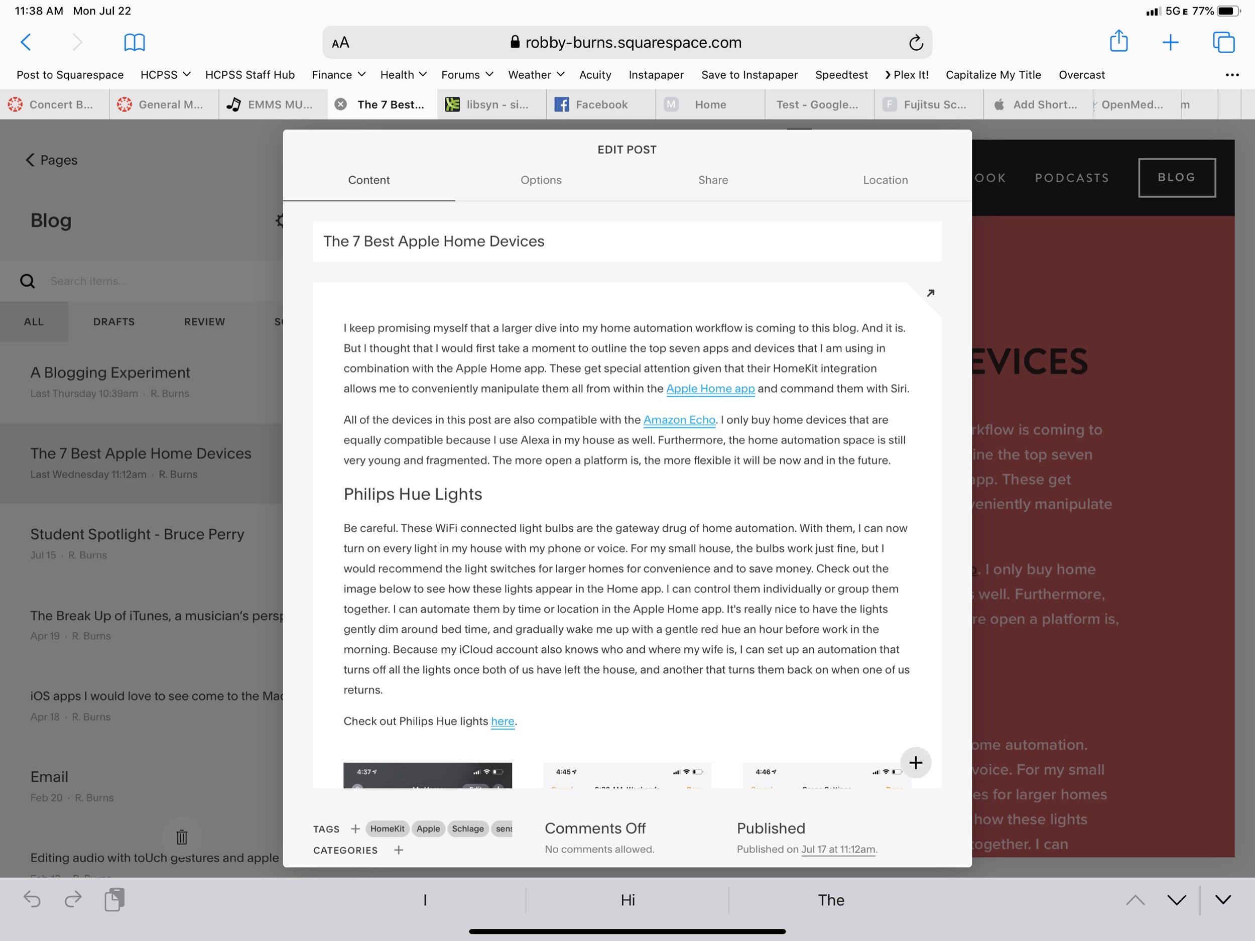
But what is really great is that I can now access the full versions of Google Docs and Squarespace from my iPad. Google’s apps on the App Store are still a little nicer, but they have never had the full feature set of the web apps, and now this is nearly a non-issue. Apple and Google need to find out some way to better let users choose if a document opens in Safari or Google Docs/Sheets/Slides, but I expect that to be eventually ironed out.

Even more exciting is that I can finally use the full toolset of Squarespace to update my website on the iPad (just one of the few things that would keep me taking my Mac out of my bag). So far, Apple has already done a nice job with these features, and they are not even ready for public release yet. There are some issues and unexpected behaviors, but not nearly as much as I expected. Desktop Safari has turned out to be the biggest productivity boost of all the new features. And did I mention there is now a download manager!?

multitasking and pencilkit

public.jpeg

There are also some improvements to multitasking. Notice above that I am using two apps open side by side with another one floating in what Apple calls Slide Over view. iOS 13 now adds the ability to manage multiple different apps in Slide Over at once. The implementation is great. It works like multitasking on an iPhone X or higher. You can swipe the little handle on the bottom of the app left and right to page through recent apps, and you can swipe it up and to the right to see all recently opened Slide Over apps. This makes it much easier for me to manage the few apps I am using often in this mode: apps like Tonal Energy Tuner, Messages, and Twitter.

public.jpeg

I now also appreciate that you can have more than one instance of the same app open at the same time. Notice above that I am viewing two notes side by side. When I mentioned that iPadOS is growing into its own specific identity, the pencil tools on the right side of the screen are what I was thinking about. They have been brilliantly updated. And Apple is releasing them for use by third party developers in an API called PencilKit. Here’s to hoping that it is widely implemented so that using the Apple Pencil feels more consistent across apps.

See below also. Swiping from the lower left of the screen with the Apple Pencil allows your to quickly mark up whatever you are looking at. And if you are in Safari, you can now clip an entire website, not just what fits into the screenshot. You can highlight, annotate right from this screen and then send it somewhere like Apple Notes where you can search the article by text.

public.jpeg

For me it is becoming clear that PencilKit is a feature that is going to widely shape and define the iPad as a particular tool for certain jobs that a Mac or an iPhone is not as useful for. Apple is bridging the gap a little by introducing a feature for the Mac called Sidecar, where you will be able to send windows of Mac apps to the iPad to be able to take advantage of the same pencil precision editing tools.

Conclusion

Overall, iPad OS is shaping up to be an awesome release. I didn’t even mention half the features here. And even some of the ones I am most excited about will not reach their fullest potential until third party apps take advantage of them (like PencilKit) or until more people are on iOS 13 (like iCloud shared folders). If you are an iPad user you have a lot to look forward to this fall. If you want to try the beta, you can go here. It is pretty risky though, and I am admittedly very unwise for doing it.

iOS apps I would love to see come to the Mac, a musician’s perspective

There has been a lot of buzz lately around ‘Marzipan,’ a set of developer tools that Apple is making to help third party developers more easily port their iOS apps to macOS. It is heavily rumored that Apple will detail this initiative at their developer conference, WWDC, this June (during the keynote on June 3rd).

Last year at WWDC, Apple unveiled four Mac apps that use this new set of tools to bring iPad-like versions of iOS apps to the Mac. The apps launched were Home, Stocks, Voice Memos, and News. The apps have been met with much criticism for their lack of Mac-likeness. For example, when you double click a news article in the News app, you can't see an article in a separate window, a behavior you would expect from the Mail app or Notes app on Mac. Likewise, the Home app, when setting up a time based automation displays they iOS style date picker, with scrollable numbers, rather than the calendar like interface that you would see when selecting a date in traditional Mac apps.

I agree that these four Mac apps are garbage, but I would much rather have the utility of them than not. Even if all these Mac apps do are act like iPad apps that accept input from a cursor instead of a finger, I would still kill to have any of the following on macOS:

-Tonal Energy Tuner. There are no tuning drone based apps, even on the web, that do 1/100th of what this iOS app does. My Mac is my primary device for sharing audio and visuals with my students during class. This would get used every single day.

-forScore. I have a weird way of managing my digital sheet music using the file system of my Mac, but then importing duplicate copies into my iPad’s forScore library. It would be really nice to have one place where this is all managed across all devices. Of course, this would require forScore to sync a library across devices, which the team has told me is too difficult a task to prioritize currently.

-Twitter. Twitter killed their Mac app recently and as someone who recently started using their app on iOS (Tweetbot is still far better but Twitter no longer provides the proper APIs for them to stay up to date on modern features), I would really prefer to not use the web browser on the Mac.

-Apollo. To my knowledge, there has never been a good Reddit client on any non-mobile device. Apollo is great.

-Facebook Messenger. I hate Facebook but it is a necessary communication tool. I would love to use it for that without going to their stupid website ever again.

-Overcast. My favorite podcast player. Would love to have it on Mac.

-Health. An app that excels in showing me data on graphs and charts sure would be useful on the big screen of a Mac.

-Due. My favorite reminder app is already on Mac but it looks gross.

-Instapaper. I use ReadKit on the Mac as an Instapaper client on Mac now, but would not mind something more minimal. Instapaper is the perfect candidate for a Marzipan app for its simplicity.

-Instagram. Who wouldn’t want this on Mac?

-Tempo. There is only one good metronome app on the Mac (Dr. Betotte). Opening up UIKit to Mac developers would bring a whole lot of competition in this space. Frozen Ape’s Tempo would be my first choice to get ported over.

-AnyList. Their Mac app is already just a gross port of their iOS app. Using Apple’s tools would surely make it prettier and more responsive.

-Ferrite Recording Studio. My podcast audio editor of choice is only on iPad. It sure would be cool to use these tools on a bigger screen with keyboard and mouse.

🔀 Mastering Organization in Rehearsal with iPad

In September, School Band and Orchestra Magazine published an article of mine about using the iPad to be organized while rehearsing a large ensemble. I am reposting it here for readers of my blog to enjoy...

Mastering Organization in the Rehearsal with iPad:

Chances are likely that you have heard of a few iPad apps for use in the classroom. Like me, you may have heard about so many of them that you can’t even remember them all. Or you have made it so far as to download them and now hundreds of little icons have been left un-touched in a folder called “Music,” sitting on your home screen.

There are a lot of fantastic music teaching apps for educators and students. Tuning apps, notation apps, note reading apps, staff recognition, music games, creation tools, historical videos, you name it. The iPad is often positioned in music education as a miscellaneous platform. One that we use for whatever purpose it serves best in the moment, whether that be in our own hands or those of our students. Few of us have an iPad for each of our students though. And several years into owning one, you might still wonder what niche it is really intended to fill.

For me, the iPad become a transformative tool in the classroom when I started to think about it like a digital piece of paper. And it became in-dispensable when I found ways to become de-pendent on it while rehearsing large ensembles.

The apps in this article have turned the iPad in-to a necessity for me. Many of them are not simply portable versions of desktop apps I use elsewhere. They are apps that thrive, particularly on the form factor of the iPad.

Files

Rather than bringing a pile of parent letters, pie sale pamphlets, and field trip documents to the podium, I have taken to queuing these documents on my iPad. Thankfully, Apple has re-leased a Files app with iOS 11. This app func-tions very similarly to the Finder on the Mac. You can view documents, launch them in other applications, and even drag files from one fold-er into another. The Files app works out of the box using Apple’s iCloud Drive, but third party cloud providers get to join the fun too! Installing apps like Dropbox and Google Drive now makes them appear alongside the left sidebar in the Files app. No need to go fishing in the Dropbox app to see your documents stored there. In Files, they are displayed, natively, alongside your other iCloud files. You interact with your documents the same way no matter which cloud service you are browsing.

You can drag your favorite folders to the side-bar for easy reach, regardless of what third party cloud drive provider they are part of. Us-ing the iPad’s split view feature, you can open another app, like Mail, on the other side of the screen and drag files from the Files app, over into the Mail app, to add them as attachments.

If you are looking for a little more control, I rec-ommend an app called Documents 5 by Read-dle. If you have purchased their app PDF Ex-pert (which is amazing), it allows you to use all of the PDF Expert annotation tools right from within the Documents app. You can also open multiple different files at once in a tabbed inter-face, much like a web browser. This is useful for mornings where I need to review multiple different documents with the class at once.

Notability

I give my students a weekly rehearsal grade for preparation and participation. I use a rubric to generate this score but I base it off of informally collected data in the classroom. I needed a way to quickly jot down information on top of stu-dents names and then an easy way to view it from my computer later while inputting grades. I decided to design a seating chart using Om-niGroup’s OmniGraffle app (but you could just as easily draw one and scan it into your com-puter as a PDF). I open these PDFs in an app called Notability. Of all the many great note apps on iPad that let you scribble on a PDF, I find Notability to be the least fussy. The mo-ment the PDF shows up on screen you can begin scribbling on it with an Apple Pencil. It really feels as responsive as paper. I write quick notes on student performance on these charts throughout rehearsal. Jimmy is sitting with great posture, Susan is late, John didn’t bring his instrument...When I sit down at my computer, I launch the Mac version and view all of the charts because the edits have been syncing over iCloud. Then I enter my grades.

Going into the Dropbox app each morning, du-plicating the file, and opening it in Notability was getting to be quite a chore. So I decided to automate it...

Workflow (Now Shortcuts)

Workflow is an app for iOS that allows you to string together multiple actions and trigger them with one tap of a button. This all takes place in plain English, using drag and drop blocks to make up your recipe. This app is a real testament to the growing power of iOS as a productivity platform. If this app sounds in-tense, don’t worry. When you download it, the app walks you through the process.

One of my favorite “Workflows” is a two step workflow called “Band Seating Chart.” Step one of this workflow looks into my Dropbox account for a file called “Symphonic Winds.PDF.” Next, it opens that file as a new note in Notability. All in one tap. Workflows can be published as tap-pable app icons on the homescreen for easy use. So to create a new seating chart in Nota-bility every day as described above, all I do is tap once. Pretty cool.

If designing workflows seems tedious, never fear. You can download these pre-made from a user submitted gallery.

Note: Workflow was purchased by Apple and was integrated into iOS as the Shortcuts app with the release of iOS 12 this past fall. Look forward to more posts about this awesome app in the future.

forScore

forScore is my app of choice for all score read-ing and annotating now. I keep all of my music in it. Since the app added the ability to index long Real Book style PDFs last year, I even store my method books and longer form teach-ing materials within it. Indexing these files means that I can search for individual song ti-tles in the forScore search, even if they are within the body of a larger single file. forScore takes me right to the exact page I want to be on.

Of course my more obvious stuff goes in for-Score as well — things like band scores, meth-od books, sheet music for the next gig, you name it.

I am a messy note taker. While I miss the tac-tile feeling of post it notes and pencil on a pa-per score, doing it with forScore allows me to be as messy as I want and just erase it later in the tap of a button. forScore allows me to an-notate with my Apple Pencil right on the screen. With my seating chart open on the other half of the iPad screen in Notability, I can actually an-notate my seating chart and my score simulta-neously. And for the workaholics out there, have you ever tried score study in bed? You don’t need to keep a messenger bag of paper in your bedroom anymore!

forScore is full of fun bells and whistles. My cur-rent favorite is to embed press-able buttons in my scores that initiate tuning drones and met-ronome clicks. And forScore works with all the new iPad features of iOS 11. So, for example, I can open the Files app on one half of the iPad screen, forScore on the other, and drag and drop scores from Files right into my forScore library. These are just a few of the many pow-erful features in forScore.

Drafts

One of the most stressful things in rehearsal is tending to all of the student needs. Not to men-tion my already spinning head, struggling to keep all of my teaching responsibilities togeth-er. Drafts is a note taking app that focuses on simplicity at the front end, and unlimited power on the backend. Launching into this app brings the user to a blank white space and a key-board, where you can instantly begin typing. Once you have accumulated a bunch of unpro-cessed “drafts,” you can swipe to the right to reveal numerous custom “actions.” These ac-tions can process the text in your notes by rout-ing them to other third party services. Your draft could become the body of an email or text, a Twitter status, or a calendar event. It could be exported as a task to a todo app or become the basis of a Google search. User ac-tions can be created much like workflows in the Workflow app, even including multiple different steps. I use one of my favorite Drafts actions to take meeting notes and then, in one tap, save them to Evernote, email them to the members of my music team, and parse out the actions relevant to me and save them to my todo app of choice, OmniFocus. As with Workflow, you can download user created actions from an online gallery. When the whirlwind of rehearsal starts, and students begin telling me about bro-ken valves, missing music, and the like, I simply start brain dumping all of my thoughts into Drafts. Then later, I sit down at my desk and process all of these thoughts by sending them to the apps they need to go to.

Music education apps on iOS that I would love to see come to the Mac

From Macworld...

iOS apps that need to be on the Mac | Macworld:

Bloomberg’s Mark Gurman, who has a great track record of reporting Apple scoops, wrote a few months ago that Apple was working on a new approach to app development that would let developers “design a single application that works with a touchscreen or mouse and trackpad depending on whether it’s running on the iPhone and iPad operating system or on Mac hardware.”

Accepting that Apple could change direction at any time and that this project—code-named Marzipan—might not even be announced this year, it’s an intriguing possibility. Obviously iOS has a much more thriving app store than the one on the Mac, so if Apple could make it easier for iOS developers to deploy their apps on the Mac, it might help the platform thrive. Merging the approach to developing apps on Apple’s two platforms also may make sense in light of the report that Apple may be replacing Intel processors with Apple-designed ARM processors in future Macs.

A lot of rumors and speculation, to be sure. But let’s go back to the root premise of this entire story: The Mac could be improved if it was much easier for iOS developers to bring their apps over. Which got me thinking, what iOS apps do I use today that I wish were on my Mac?

I have been giving this a lot of thought since reading Bloomberg's report. I think this is a big deal. In music education, a lot of useful apps are iOS only. I would die to have the utility of some of them on my Mac. Here are a few examples.

Tonal Energy Tuner: This may be my most used rehearsal tool in the band room. I constantly have a drone and or a metronome running in the background while my students play. The problem is that my Mac is my device that is usually plugged into the mixer at the front of the band room. I would be able to much more efficiently manage TE alongside my Keynote slides and iTunes library if it were piping audio through the same speakers and had support for tactile keyboard shortcuts.

forScore: forScore is one of the only apps I use exclusively on iPad. The form factor of the tablet is perfectly suited to it. That being said, there would be times where it would be easier to manage files in bulk if there was a version for Mac that I could open up and drag stuff into. This, of course, would assume that a forScore library would sync across devices. This is something it currently cannot do (which is good because it is one of the only things keeping me from buying a second, smaller iPad).

Tempo and Tempo Advance: There is a shortage of good metronomes on macOS. There are a lot of good ones on iOS. For the same reason that Tonal Energy would rock on a Mac, so would Tempo. And nothing like Tempo Advance exists on Mac.

I would imagine that Marzipan could work the other way around, making Mac apps easier to develop for iOS. If this were the case, I could do an entire second blog post on Mac apps I would love to see on iOS. Logic Pro, are you out there?

🗒 Road Trip!!! Off to the Tennessee Music Educators Association Conference!

I am pumped to be spending the next four days in Nashville to present at the Tennessee Music Educators Association Conference. I am presenting three sessions tomorrow, Friday, April 13th. One of these sessions is brand new and focused entirely on teaching intonation to student musicians with the support of the Tonal Energy tuning app. Scroll down for links to all of my session notes.

Road Trip!!!

My wife and I are making a road trip out of this event. In addition to eating and drinking our way through the city over the next few days, I am excited to be seeing old friends and new. Tomorrow night we will be seeing the Nashville Symphony Orchestra performing a program of Elgar, Mozart, and Bach. I will get to watch a friend of mine from grad school, Joshua Hickman (Principal Timpanist), performing with the ensemble.

I will also get to meet friend, Craig McClellan, in person for the first time. Craig has an awesome education/technology blog called The Class Nerd and has been a recent regular on my podcast. (Listen here and here).

Craig and I may or may not have a very special project we are cooking up for teachers later this year...

Session Notes

Here are the session notes for my three sessions. Check them out!!!

Going Paperless with iPad (April 13, 9 am)

Working with Digital Scores (April 13, 10 am)

Teaching Intonation with Tonal Energy (April 13, 3 pm)

App of the Week: Sleep Cycle

From the moment I walk into school, chaos surrounds me. Tasks begin, busses arrive, students transition the halls, and classroom lessons never stop. It is important to take frequent steps back to monitor my physical and mental health as it relates to my stress and energy levels throughout the week.

In an ongoing effort to stay healthy, I have continued to explore health apps on the App Store that will help me collect data on my body. I one day plan to blog about this in detail. But for now, here is an app that I have used on and off for a while, but have recently been experimenting with again.

Sleep Cycle is an alarm clock app that is based on the following premise: that you will wake up the most refreshed if it is during your least deep sleep. Sleep Cycle allows you to set a time you need to be up by, and a wake up window. Using the microphone of the phone, Sleep Cycle uses advanced technology to listen to your movements during your sleep and wake you up within that window of time when you are in the least deep sleep. Sleep Cycle then records your movement (much like a Fitbit but without wearing anything) and presents it to you on a graph.

Sleep Cycle has many features. Amongst my favorites are: 

- Soothing alarm sounds

- Inegration with Philips Hue light bulbs. I can link it to the lightbulb in my bedside lamp so that it slowly turns on with a red tone as my alarm goes off. This way, my wife is not disturbed but I am gently woken up. 

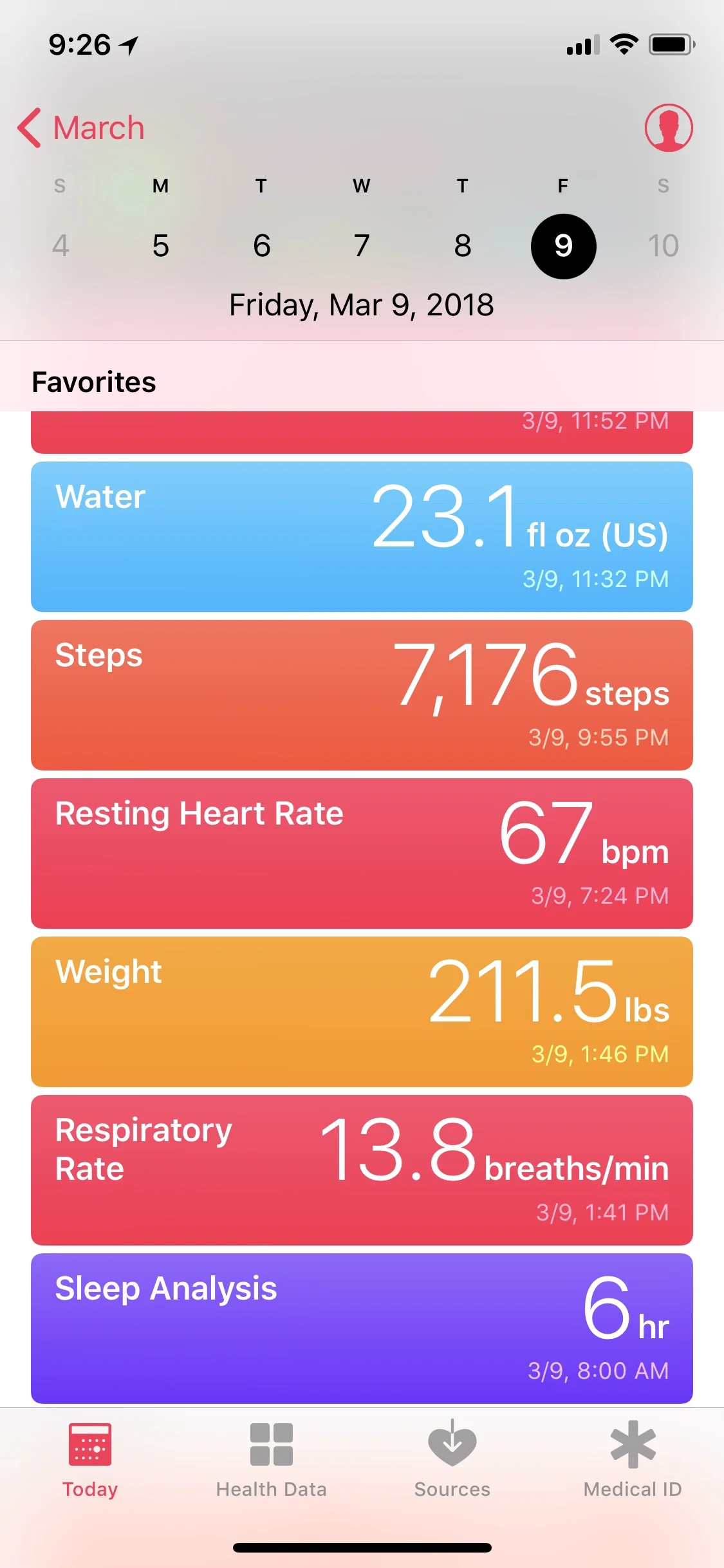
- Integration with Apple’s Health app. Sleep Cycle records my hours in bed and hours asleep to the Health app so that I can see how all the pieces of the puzzle fit together. How do activity and water intake influence my sleep? How does my sleep influence my weight? Etc... 


07021D32-1E39-40F7-85B4-E229FB75703B.JPG
D757C6C1-6847-4EF9-A1E3-139DC88A413F.JPG
76570EC2-D3BC-4D0D-988C-64A0F88B2216.JPG

What did Apple check off on my WWDC wishlist?

A few weeks ago, I detailed my wishlist for WWDC. Below, I have reposted it with what Apple actually announced. My assessment over whether or not a feature was announced is based on whether or not the feature was announced verbally during the keynote, not on a slide or later discovered within the OS.

MACOS

-News app to mirror the one on iOS NOPE

-improvements to pro apps (Final Cut Pro X and Logic Pro X) and additions to the Photos app NOPE

-splitting iTunes up into separate apps like what is on iOS: separate app for Music, TV, Podcasts, and iTunes Store NOPE

IOS

-default apps (won't happen) NOPE

-serious overhaul of iPad productivity (better file system, better home screen, drag and drop, better multitasking, more control over audio ins and outs) YESX100

TVOS

-PiP NOPE

-Ability to watch TV content from two apps at once NOPE

-ability to command with Siri without the Remote app (for example, I want to say to my phone, “hey Siri watch Game of Thrones,” and have it turn on the TV, launch the HBO app and start the most recent episode) NOPE

-ability to sync all Apple TVs in the house so that they show the same video at once (for parties...also, this won't happen) NOPE

WATCHOS

-smart contexts: ability to change Watch face, complications, and notifications based on sensitivity to time and location CHECK, Siri watchface

-better audio controls (easier to access Now Playing screen, complications to play and pause audio, ability to scroll the crown for volume and use hardware buttons for control whenever audio has recently been playing) CHECK, sort of with swipe to audio controls within Workout app

GENERAL

-Siri improvements (more reliable, faster, more open to third party apps, better integration with tvOS, local dictation and basic commands CHECK

-AirPods with always listening Siri NOPE

-improvements to iCloud Drive (shared folders, files, and URLs) CHECK definitely to shared files, but not sure about others

Here are some of my favorite features that reddit users replied with:

-Multiple iOS user logins NOPE

-Hey Siri on Mac NOPE

-custom watch faces NOPE

-open CarPlay up to more developers (pasrticular third party maps apps and messenging apps) NOPE

-iOS dark mode NOPE

-Workflow integration NOPE

-Open up NFC to third party apps CHECK

-Apple Pay your friends and family over iMessage CHECK

-Apple Music continuity NOPE

Great iOS 11 concept video

Check out this expertly executed concept video of features that Federico Viticci hopes will come to the iPad in iOS 11. 

I use my iPad for getting work done more and more everyday. There are still a lot of hurdles in the software for getting work done. I think Federico has done a great job illustrating how some of these problems could be solved in an elegant way that doesn't confuse the intuitive nature of iOS. 

I will loose my mind if Apple announces a file management feature anything like the Finder demoed in this video. Apple's developer conference kicks off with a keynote at 1 pm on June 5 where they are expected to announce next years iOS, macOS, watchOS, and tvOS feature updates. Announcements of some hardware products, including a Siri powered speaker to rival the Amazon Echo, are also rumored to appear. 

New iPhone Announcement, September 7, 2016 - Reflections

Apple announced the Apple Watch Series 2, the iPhone 7, and a new set of wireless AirPods this past Wednesday. I wanted to take a hot second to jot down some quick reflections on some of the announcements. These are in somewhat chronological order.

Just one brief note: I went into watching this event without any real interest in purchasing anything announced.

Mario

Not sure what it is, but the announcement of a Mario game coming to iOS made me feel like a seven year old. It looks to have the characteristic tightness and polish I expect from Nintendo games. I will definitely buy and play this game. Also very cool that it is going to be a fixed price and not have in app purchases.

iWork

Oh boy. Anytime iWork gets mentioned, I sit up in my seat a little. It was announced that iWork is getting real time collaborative features (yeah yeah, just like Google Docs in 2007). The cool thing is that collaborators can be working on Pages, Numbers, and Keynote documents from on the web or in the native applications on Mac or iOS. As these apps are my primary tools of choice for making docs, spreadsheets, and presentations, I am pumped that Apple is working on this.

Sadly, these features depend on the reliability of iCloud sync to be awesome. If these newer features work as well as existing iWork document sync, I am going to need see them in action first hand before getting too excited.

Pokemon Go for Apple Watch

Again, I found myself surprised that one of the most exciting announcements for me was about a game. Pokemon Go is the perfect fit for Apple Watch. It will resolve every reason that I do not currently play the game often (even though I find it entertaining and aspire to play it more).

The app reconciles the fact that playing Pokemon Go is basically a workout and therefore tracks your calories and distance as you play and records this data to the Apple Health app. It tells you when Pokemon are near as you walk so that you don't have to be staring at your screen the entire time, ignoring the moment and running your battery dry.

I will play this game a ton.

Apple Watch Series 2

I was not planning to be excited about this device but it might be the most compelling thing to me about the entire presentation. Apple Watch Series 2 brings GPS, waterproofing, speed increase, and water related workouts to the watch and also has some new and cool designs.

The Nike+ version of the watch has a breathable sport band and comes with some extra software installed to help track runs and motivate the user to get outside.

I have the stainless steel version of the original Apple Watch but I have bounced around the idea of getting a cheaper aluminum model just for the work out features and speed increase. It was also announced that watchOS 3 will come out next Wednesday, September 13th. This update is advertised to improve speed so much that it will feel like a new watch. So far, reviews have indicated that the hype is real. I will wait to see how much faster my watch feels next week before deciding if I really want a the new model.

iPhone 7

Well, they really did it. They took away the headphone jack. Honestly, I think this is where the technology needs to go, but as an audio professional, I think I am going to introduce a lot of friction into my life for the next year if I early adopt this technology. I still want the ability to plug my phone into any sound system I come across, and while using a Lightning to 1/8th inch adaptor is not a huge hassle for me, I would really rather just not deal with it. Eventually I do believe the entire industry will move this way, but I really wish that in pushing things forward, Apple had gone with a standard solution like a USB C cable, not one that is proprietary like Lightning.

Audio jack aside, the new camera features on the phone look compelling and I am definitely interested in them. Maybe next time around...

AirPods

Along with the audio jack removal, Apple announced a new set of wireless "AirPods" that are designed just like the ones that come in the box, but without wires. The AirPods come in a chargeable case that charges the pods itself. As soon as you take them out of the case, they immediately pair to whatever Apple device you want to use them with (Mac, Apple Watch, iPhone) in one tap. They seamlessly pass audio from one of these devices to the other in one tap without fiddling with Bluetooth settings. They allow you to talk to Siri and get a couple hours of playback from a few seconds of charge.

If you have seen the product photography of these, the potential for loosing them is immediately obvious. That being said, I am very compelled by these devices because they are the only one in the presentation that actually solve new technological problems for me in a user friendly way. If these don't sound like garbage and fit my ears, I will definitely buy them. If you are compelled by these but fear of loosing them, Apple's headphone company, Beats, is also releasing three new wireless headphone models that use them same pairing technology as the Apple AirPods. Each of the Beats models have a wire to attach the two ear pieces together.

Conclusion

I think for me, it is looking like:

iPhone: I'll wait.

Apple Watch: See how fast watchOS 3 feels first.

AirPods: See how they sound and fit first. If the fit is bad, consider Beats.

My favorite apps of 2015

I feel the need to defend these apps in a way that I didn't for my favorite albums of 2015 list I posted yesterday. In part, this is because music's role in my life has a certain type of inevitability that makes it difficult for me to immediately understand its value myself. Secondly, the music I experienced this past year is worth so many more words than I could possibly type. Finally, apps, especially paid ones, tend to require a defense; a "why do I need to buy this?" Their value is also often technical and practical, and can be condensed down into a few sentences.

Productivity

Documents by Readdle

I can't remember what getting work done on an iPad or iPhone felt like before discovering this app. Think of this as the missing Finder on iOS.

Due

My new favorite for setting timers and reminders. I like how persistently it bugs me until I actually complete the task.

Workflow

Unbelievable automator for creating multi step workflows on iOS.

Scannable

For getting all physical paper into the cloud as beautifully formatted, text searchable, PDFs. Syncs effortlessly to Evernote, lightning fast, and zero step scanning.

Apple Notes

Stellar update this year to the notes app that comes bundled with Apple devices. I love the rich text formatting, web clipping, and list support.

OmniGraffle

A great app by the makers of two of my favorites: OmniFocus and OmniOutliner. OmniGraffle has come to replace Adobe Illustrator for me. It is my go-to for designing graphics. Specifically, I use it to design seating charts for my classes.

IFTTT

Amazing service for linking different internet connected services and devices. You can create if-then statements to automate them. Example: If I am tagged in a Facebook post, save that photo to my Dropbox. Another example: When I arrive at home, then turn on the lights in my house.

Paprika

Cooking game changer! My wife and I clip recipes from the web into this app and it formats them beautifully so we can isolate ingredients, directions, and set timers. It has a built in grocery list and meal planning feature that can send data to Apple Reminders and Calendar apps, respectively.

Overcast

I have been listening to a lot of podcasts this year. Overcast offers the best experience of all the podcast apps I have tried.

Music

forScore

Not a new app to me but I have really taken to organizing my scores on the iPad with this app over the last year. It has truly revolutionized my musical workflow throughout my band directing, private teaching, gigging, and church music directing jobs.

Tempo

Still my favorite metronome app on iOS.

Tunable

My favorite tuning app. Features gamified tuning, polyphonic tuning drones, just intonation, and simultaneous metronome and tuner playback.

Health

Using these apps (and more) in combination with the Apple Health app and Apple Watch, I have lost about 30 pounds since late August. Ok, really, I worked out and changed my diet some, but the apps helped.

Waterminder

Helps me set goals for water consumption and see my progress each day. Logging water is easy with the Apple Watch app and all data syncs to the Apple Health app.

Lark

This app is fun for tracking work outs and food, but I use it primarily to track the hours I sleep each night. It accomplishes this through the motion of my iPhone.

myfitnesspal

I have been using this app to track calorie and nutrition data for almost a year now. Really easy and addictive to use once you get into a routine.

Spire

This app, in combination with the wearable tracker by the same name, has allowed me to track trends in my breathing for the last few months. The app categorizes my breathing patterns into "focus," "tense," "calm," and "activity." When it senses a streak of tension, it sends my watch a message to breathe slower. It also allows me to set goals for minutes of focus per day, offers guided meditation, and syncs respiratory rate data to Apple Health.

Home

All of these require home automated hardware to be useful. By recommending them, I am recommending the devices themselves as well.

Harmony

Automated TV remote. No more fuss over HDMI inputs and multiple remotes. This app controls all of the things plugged into my TV and allows me to trigger different things on and off with simple one tap button presses.

Philips Hue

Lights that connect to wifi. These can be controlled from a phone app, automated with services like IFTTT, and commanded with Siri.

Sonos

High quality speakers that connect to one another over a home wifi network.

Games

Crossy Road

Shooty Skies

PAC-MAN 265