I am back on the iPad Pros podcast, this time to talk about Logic Pro for iPad.
I really had fun talking to Tim about this topic. I hope you will check it out.
I am back on the iPad Pros podcast, this time to talk about Logic Pro for iPad.
I really had fun talking to Tim about this topic. I hope you will check it out.
Robby does hot takes on macOS Ventura, iOS and iPadOS 16.1, and new iPads.
Subscribe to the Blog... RSS | Email Newsletter
Subscribe to the Podcast in... Apple Podcasts | Overcast | Castro | Spotify | RSS
Thanks to my sponsors this month, Scale Exercise Play-Along Tracks.
Cubasis is, in my opinion, the app to use if you are looking to produce music in a professional DAW using your iPad.
Good news! Version 3 is currently deeply discounted and they just released an Android version!
What's New in Cubasis 3.2 | Steinberg-->
Musical ideas come when you least expect them and are often gone in a flash. With Cubasis, you always have your mobile DAW with you, because Cubasis is available for all your mobile devices. iPad? Check. iPhone? Of course! Android smartphone and tablet? Sure thing! And now we bring one of the fastest, most intuitive and complete mobile DAWs to the world of Chromebooks, too. Welcome Google (again)! Welcome Chrome OS! Cubasis is ready to capture your ideas whenever and wherever you are.

Listen to my podcast interview with Daniel Spreadbury (Product Marketing Manager) about Dorico for the iPad.
Subscribe to the Podcast in... Apple Podcasts | Overcast | Castro | Spotify | RSS
Dorico for iPad is out today! You can read their announcement here. It's a desktop-class adaptation, which includes most of the features I need for my everyday work as a music teacher. I am beyond excited that a major professional scoring app has come to the iPad for two reasons:
I depend on iOS for getting much of my work done. There are still apps and workflows that require me to take out my Mac, and I am delighted whenever the release of a professional iPad app lessons these occurrences.
Our niche professional corner of the world is receiving legitimate, pro-featured, software for iPadOS, a market that is still light on “pro” software, even from Apple themselves (like, for real... where is Logic Pro on iPad?). While many "pro" iPad apps are companion experiences to bigger desktop versions, Dorico brings a whole lot of the power from its desktop app to its mobile version, proving that the iPad can be every bit as "pro" as its name suggests.
Dorico for iPad's free tier is similar to their free desktop offering Dorico SE, and an in-app subscription adds features comparable to their Dorico Elements version. The iPad app has new features, many of which are optimizations for touch, including several new input methods (piano, fretboard, drum pads, and a new Key Editor). Dorico for iPad doesn't do everything. Serious composers and power users might need the desktop for some things. For me, a middle school band director, it will fill most of my iOS composing needs.
There are some quirks due to Dorico not supporting features that make iPad apps feel like iPad apps: full Apple Pencil support, responsive touch gestures, file system integration, Magic Keyboard/trackpad support, and multitasking are examples of this. While there is room for improvement, it's bold for the Dorico team to pack a desktop-class experience into the first version. I am thankful for their hard work and wish the Dorico team future success on this project.
Watch Dorico for iPad in action.
When my long-time favorite iPad app (forScore) came to the Mac earlier this year, I wrote about it.
While forScore was one of the few remaining iPad apps I wanted on Mac, there are, similarly, plenty of Mac apps I would still love to see on iPad.
One could argue that with the latest iPad hardware (featuring M1 chips), there is no excuse for professional apps not to run on the platform. I agree! The iPad has more than enough processing power, all of the necessary input devices (if you have a keyboard and mouse), and even some things that the Mac doesn't have (like touch support and the Apple Pencil).
The issue of why the iPad lacks pro apps is too broad to cover here, but it has much to do with how Apple has positioned iPadOS and the App Store model over the past 10 years. It is becoming easier than ever to make a cross-platform app, but this doesn't change the fact that there are still some fundamentally dissimilar aspects of developing for iOS and macOS. The arguably bigger problem is that the App Store (even with fewer sandboxing limitations in recent years) is hostile towards the exact kind of developers who cater to niche professionals like composers and music teachers.
For example, companies who make digital audio workstations and notation editors have traditionally charged prices in the multiple hundreds of dollars, costs which the mobile market has decided is not acceptable. Such developers also offer things like crossgrade/upgrade/educational pricing, group licenses, and more. These are not feasible in the current-day App Store, and I think Apple is oblivious to keep calling the iPad Pro the iPad Pro while not providing more flexible App Store rules. This is not to mention that Apple hasn’t even brought their professional apps (Logic Pro, Final Cut Pro, and Xcode), to the iPad.

I am dependent on my iPad and prefer to work on it whenever possible. Its light form factor and simple operating system make me feel more nimble moving in and out of apps. Dorico has always been one of the reasons I have to take my Mac out of my bag when I am sitting on the couch wrapping up some school work late at night. Even though there are good score apps on iPad, the convenience of leaning back on the couch to get work done has been counterbalanced by needing to import and export XML files back and forth, just to get these apps to talk to Dorico on desktop.
It is within that context that I am pleased to say Dorico is available for iPad today. It's the first of the major professional desktop scoring apps to be released on a mobile platform, and after just a few weeks of use, I can tell that it will become my primary notation editor on iOS.
Because I am a music teacher, my opinions about scoring software are viewed through the lens of someone who does not depend on the entire feature set of Dorico, particularly engraving and playback. This means I usually need to get in and out of the program fast and that I am often performing tasks like writing scale exercises, reconstructing missing bass clarinet parts from my library, or adding percussion instruments to the score of a piece on our next concert. That said, I admire tools that empower me to work efficiently, and for notation, Dorico is that tool.
If you are looking for a professional composing perspective, and a more comprehensive feature overview, I recommend the Scoring Notes review of Dorico for iPad.
Dorico for iPad is an ambitious and stellar 1.0 that should make every developer of pro software take note and get to work.
The Dorico team has brought many of the core functions that make Dorico so powerful on Mac and Windows to the iPad version. All of the features I depend on are all there. It has keyboard input, powerful pop-overs, MIDI controller input, and all of the custom Notation and Layout Options that are available on desktop. It even has the same custom keyboard shortcut editor.
Dorico is available for free with a set of features very similar to their desktop offering Dorico SE. If you subscribe to the app through In-App Purchase, features are added which bring in line with the experience of using Dorico Elements.


Dorico for iPad has all of the modes you would expect: Setup, Write, Engrave, and Play. There is no Print mode and I don't miss it. All of the export options I use regularly are conveniently accessed through a share button in the upper right corner of the application. Play mode supports third-party iOS plugins. This is certainly more limiting than desktop, because iOS doesn’t support traditional VSTs, but this is also not a feature I take advantage of anyway.
Dorico for iPad is so much Dorico that it is hard to write about it without reviewing the existing desktop versions, which is not something I have set out to do here. That said, it is worth noting some of the things that are added for touch, and some of the quirks that result from a desktop app being so faithfully reproduced on a touch-based tablet.
One of the things that makes Dorico on iPad feel so faithful to the desktop version is that computer keyboard input is nearly identical with a Magic Keyboard attached. Once I got acclimated to the small differences in the user interface, I comfortably began recalling all the same shortcuts and workflows I am used to.
Because this version is designed to be used without the keyboard attached, there are some added on-screen buttons for touch control. Extra toolbar buttons for things like delete, repeat, undo, redo, and moving the arrow keys, are all included.
A floating toolbar, which can be moved around on the screen, allows common note adjustments to be made by finger. This toolbar includes things like moving a selected note up/down, shifting a selection of notes right or left by a 16th note, etc...

Holding on the score with one finger and then dragging displays a rectangle on-screen that can select multiple elements of the score at once. And there are also some new methods of touch input:


There will always be room for growth. What I want most from future iterations of Dorico on iPad can be best explained in the context of the forScore article I linked at the top of this post. forScore is a beloved app amongst musicians that is iPad-first but has recently been ported to the Mac through Apple's Catalyst technology. My TL;DR in my forScore Mac review was basically to say that it's amazing to have such an indispensable music app on Mac, even though it has some quirks relating to the fact that some iPad paradigms don't translate to the Mac.
My Dorico first impressions are more or less the inverse of that statement. Dorico for iPad is desktop-class. What I'd like to see from it down the road is to become more iPad-native through taking advantage of common features on the platform. Dorico is written using Qt, a development platform that makes it easy to write one code base for Windows and Mac. This same development platform is what made it easier to bring Dorico to the iPad now, but for this same reason, I can understand that the team had their hands full prioritizing the features for the first version.
Now that the iPad Pro has excellent trackpad, keyboard, and mouse support, I don't feel that different using it than I do my Mac in many instances. While Dorico's "desktop-ness" is its greatest strength, its fluency makes the missing iPad-isms more apparent. Here are a few:
Dorico doesn't have Apple Pencil support (with the exception of it imitating a touch in some circumstances).
Dorico does not work with the native File picker, which is to say that you can't open a Dorico project from your Dropbox or iCloud Drive within the Files app, edit it, and then save it back to the original location. You must instead import it from within the Dorico app, which then makes a copy inside of the app. You can export it back to the original location you pulled it from, but don't forget to delete the old copy! See an image below of OmniOutliner, a popular outlining app for iPad. When launched, it shows the same interface as the Files app. A document can be selected, edited, and saved back to the same location. I would love to see Dorico add this feature down the road.


The obvious elephant in the room is StaffPad. StaffPad is not always included in conversations about major pro notation software (Sibelius, Finale, Dorico), but relative to the power of most iPad software in the App Store, it deserves to be a part of the conversation. I covered StaffPad here.
StaffPad feels very iPad-native and supports a premium design experience and numerous pro-features, like, for example, a store of top-of-the-line audio plugins within the app.
While the comparison to Dorico is fair, I also feel like StaffPad is aiming for a different experience. Sure, they will compete to some extent, but StaffPad is aiming at new innovative methods of input, and high-end audio output that is all intuitively integrated into the same package. For example, StaffPad features Apple Pencil gestures for note input, exclusively, and a forthcoming feature will listen to you play an instrument in the microphone and transcribe you in real-time. StaffPad's third-party software instruments sound great and require little fuss to set up. It’s all a very iPad-first experience. But it's an iPad-only experience (unless you are also using it on Windows).
The strength of Dorico on iPad is that you are getting much of the power of the desktop version, on iOS. This means that there are some quirks, but that you are ultimately less inhibited by what you can produce. Dorico’s Engrave mode allows you to get more customizable, better looking, scores and note input in the Write mode is just as easy to do with a computer keyboard or MIDI controller as it is on a desktop.
I do appreciate the novelty of writing scores with the Apple Pencil. It feels nice. In fairness to Dorico, I wanted to see if I am more efficient using this method. I took about 10 excerpts from my music teaching resource library (music I would use a notation editor for in real life) and timed myself recreating these excerpts into both StaffPad and Dorico.
Much like using the self-checkout lane of a grocery store, I “felt” faster in StaffPad, but I was about twice as fast at note entry using Dorico in every instance. I was also 100 percent sure that the note I input would be the note that appeared on the screen.
I appreciate that there is competition in this space, and I think that stylus input has a place in the future of mobile score software. But I have shifted most of my score work on iOS to Dorico, and will probably continue to do so in the future. It sure is great having another professional Mac app on iPad. Here’s to hoping that my other tools like Logic, Final Cut, and Descript are next in line.
Thanks Dorico team for an ambitious and excellent release. I am looking forward to years of updates.
For anyone looking for a serious photo editing power tool, Affinity Photo can’t be beat. Click here to take advantage of the deal.
I presume this is happening because Photoshop for iPad finally launched this week. Photoshop comes as part of one of Adobe’s Creative Cloud subscription plans. My wife and I subscribe to Creative Cloud because she uses Illustrator for design work (Illustrator was recently announced to be coming to the iPad next year).
That being said, I think there is very little reason to use Photoshop over a one time purchase like Affinity unless you are …
a. really familiar with the features and interface of Photoshop
b. depend on sharing PSD files with others in a professional or collaborative environment
Affinity Photo is a great catch. Pick it up if you are looking for a mobile based photo editing tool!
Readdle Launches PDF Expert 7, Free Update for iPhone & iPad
Today we are incredibly excited to launch PDF Expert 7 — our vision of what the ultimate PDF experience for every iPhone and iPad should be.
This week’s update to PDF Expert secures it as my favorite PDF app on iOS. The one and only problem I have been having with it for the past year or two was its lack of integration with the iOS document browser, which shows you the same interface as the Files app when selecting which PDF you want to work with. I wrote about this last week with reference to the OmniGroup’s apps getting support for the native file browser this fall.
Accessing the the document browser is a tap away at all times. A ‘recent documents’ option is also one tap away. This is helpful because PDF Expert does a great job of integrating different options for managing your PDFs. It has Dropbox and Google Drive support. It also allows you to store PDFs locally within the app. This is useful for me when I am creating new PDFs or temporarily making copies of them for the purpose of editing the order of pages, the text of my documents, etc...
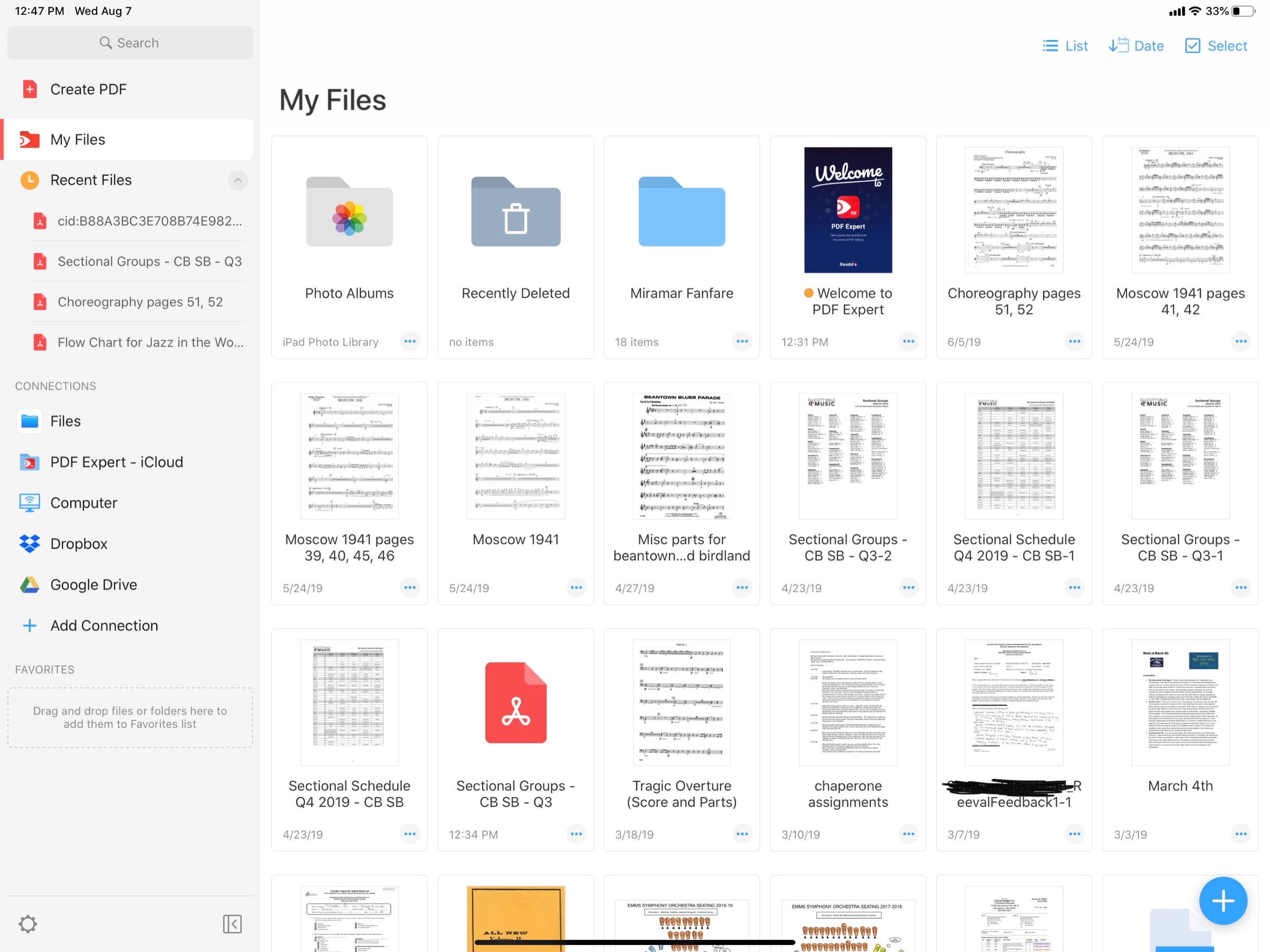
The PDF Expert 7 interface. ‘My Files’ are locally stored documents which do not sync to iCloud. They can be viewed in the Files app through the PDF Expert file provider.
I like my ‘one true’ copies of my documents to live in iCloud. I will often take a scan of a stack of concert band parts, drag it into PDF Expert, extract the individual pages into separate parts (Flute 1, Flute 2, etc.), and then save these parts back to iCloud. I don’t want any of the extra files generated during this process cluttering up my documents folder, so its nice to have a quarantined area of PDF Expert where they can live.
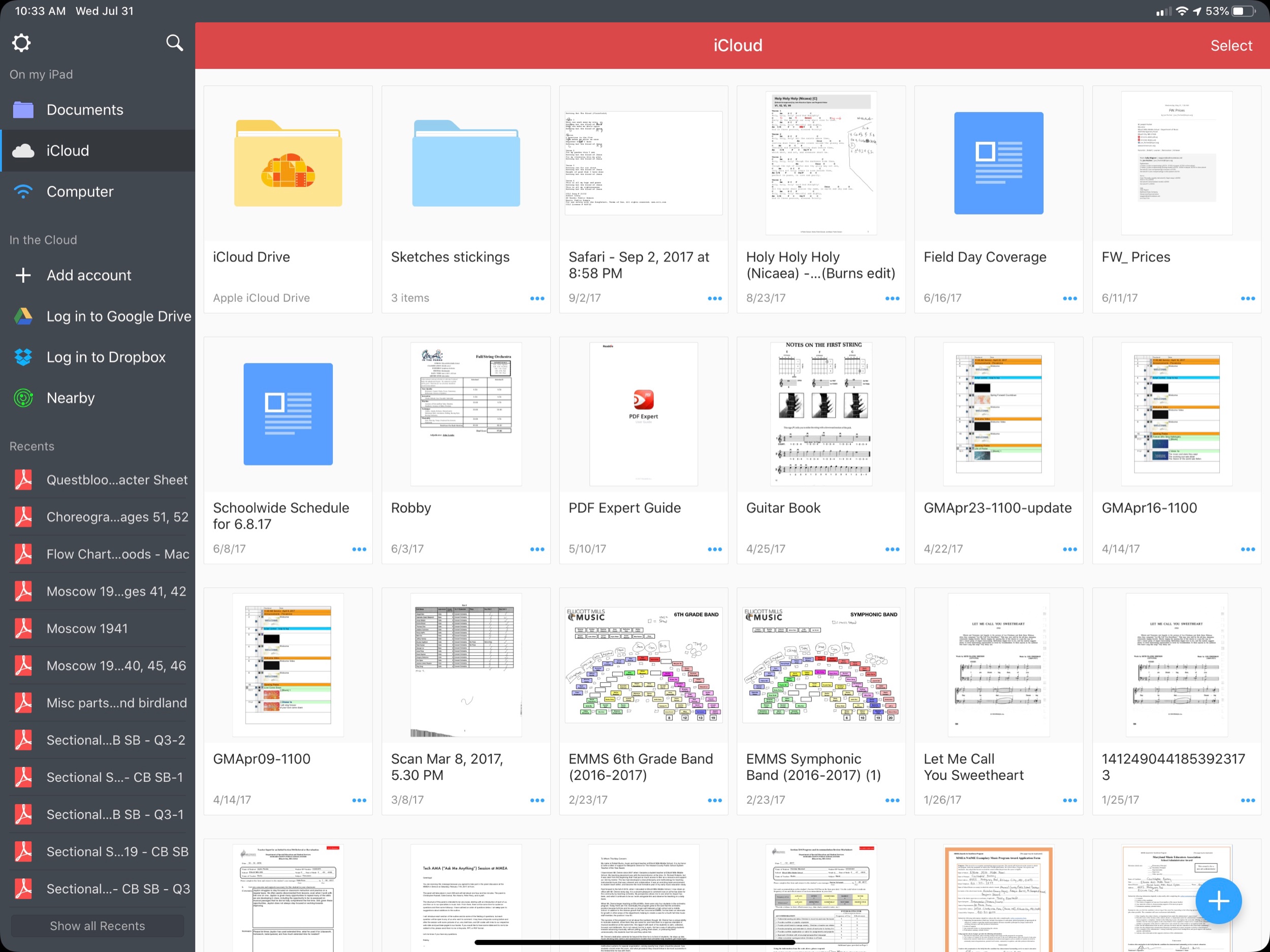
The old PDF Expert interface.
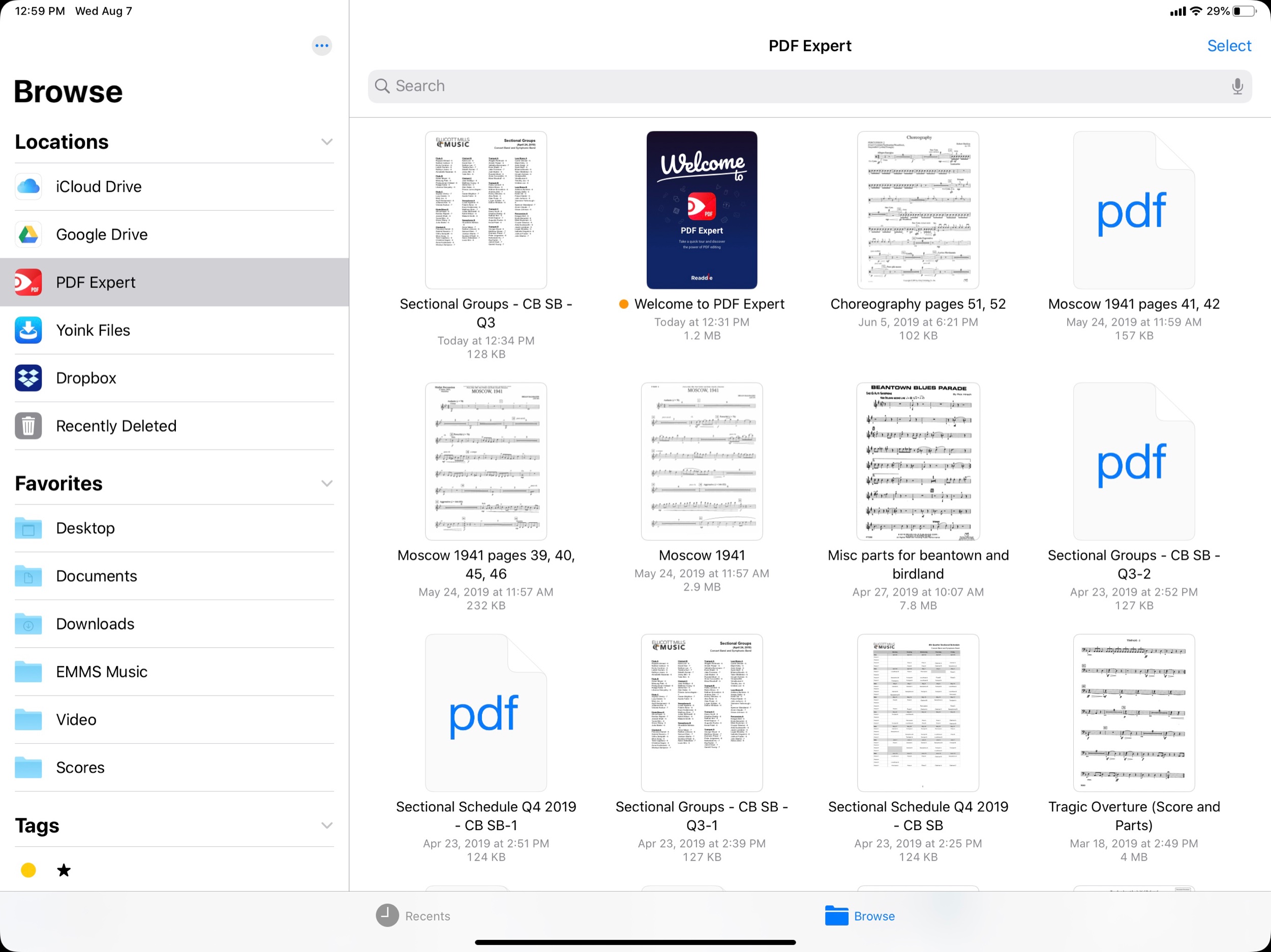
The PDF Expert file provider, accessed through the Files app.
These local files can also be accessed from the native Files app as PDF Expert is a file provider.
Furthermore, PDF Expert gets its own iCloud folder where you can store documents by default. This is becoming less necessary because of how easy it is to access the Files interface, regardless of where your PDFs are stored.
As mentioned above, the ‘recents’ option makes it more streamlined to find what you want, no matter which of these methods you have used to store documents.
I am focusing a lot on the file workflow here because PDF Expert 6 already had the best feature set of any PDF app I have used on iOS. A clean interface, great editing tools, the ability to edit the text and images of a PDF (for real!) and more. These features are now all free. PDF Expert 7 introduces some pro features that come at the cost of 50 dollars a year. Some of these features include converting to PDF from Word or Excel files, and the option to customize the look and feel of the editing tools at the top of the screen. I am glad PDF Expert chose these features to put in the paid tier. It is just enough that it will be worth it for some users, but all of the good stuff is still in the free version.
I will probably try the one week free trial but will most likely stick with the free version.
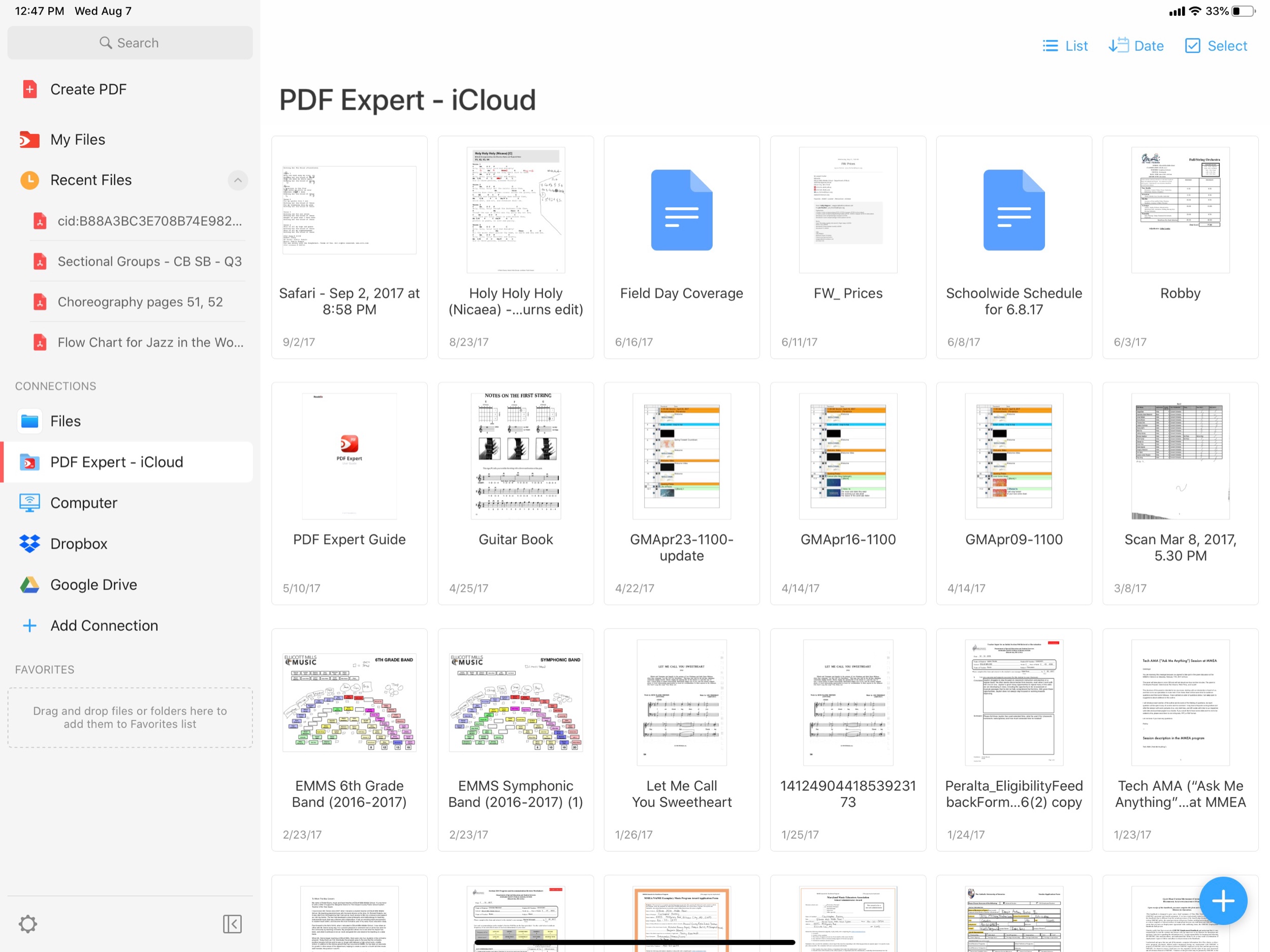
These PDFs are stored inside of iCloud Drive, inside a folder called PDF Expert. Though this is becoming less necessary now that the Files app is integrated more directly into the app.
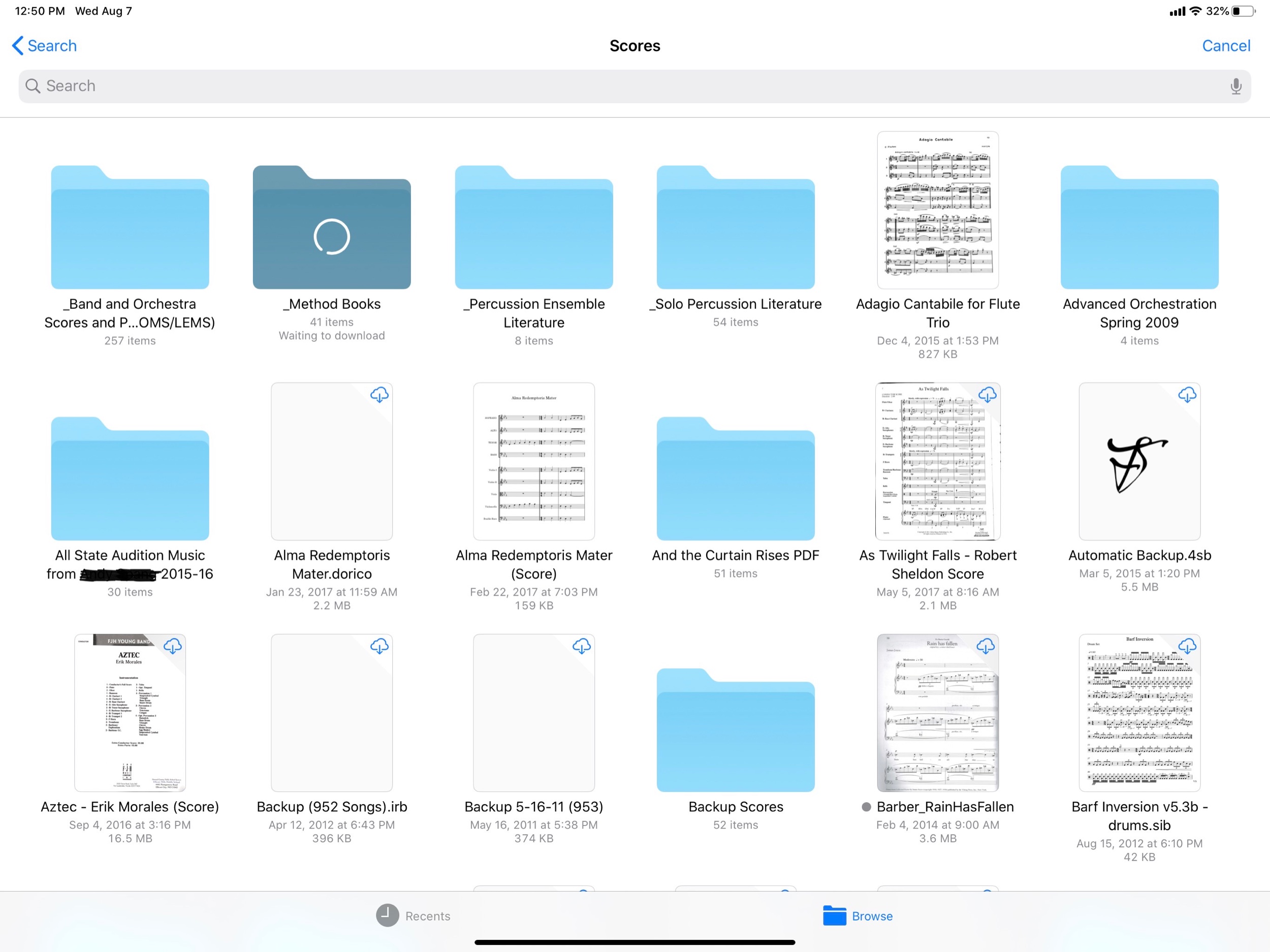
The new PDF Expert interface puts the iOS document browser. In this screenshot, I can directly access PDFs that are stored in my musical Scores folder, which is in my iCloud Drive.
I have been running the beta of iPadOS 13 for almost a month now. iPadOS 13 ships this fall and is the first version of iOS that Apple is branding iPadOS because of its focus on features unique to the iPad. At first you might think this to mean that Apple is adding ‘desktop’ features to the iPad, but the more I think about it, the more I realize that the iPad is in many respects growing into a platform with its own unique set of strengths. Here are my favorite features so far.
The first thing I really love is the new home screen. You can fit way more apps on it now, and they stay oriented the same way in both landscape and portrait because it is a 6x5 grid in either orientation. This wastes way less space on the screen and allows you to cram a lot more apps into a smaller space for extra productivity!

Also useful is that you can pin your widgets to the left of your apps. I can now see my OmniFocus tasks, upcoming calendar events, recently accessed Files, and notes, every time I return to the home screen. For OmniFocus, I have it showing my Priority perspective, which shows all due items, soon to be due items, and flagged items that are tagged ‘Today.’ This is one more tool to help make sure I don’t let stuff slip through the cracks. The same could be said of the Calendar widget. Having the Files app display recently opened files on the home screen sure does feel a lot like being able to treat the home screen the same way I do my Desktop on the Mac.
The thing that is surprising me the most is how much the new Safari update transforms the way I use my iPad. Safari now runs like the desktop version. This means that websites operate as you would expect them to on the Mac. No more taking out your MacBook for those few websites that just never quite worked right on iOS. For me this is going to change the way I use a lot of my school district’s mandated learning management software, which would often not work correctly, or as reliably, on my iPad.
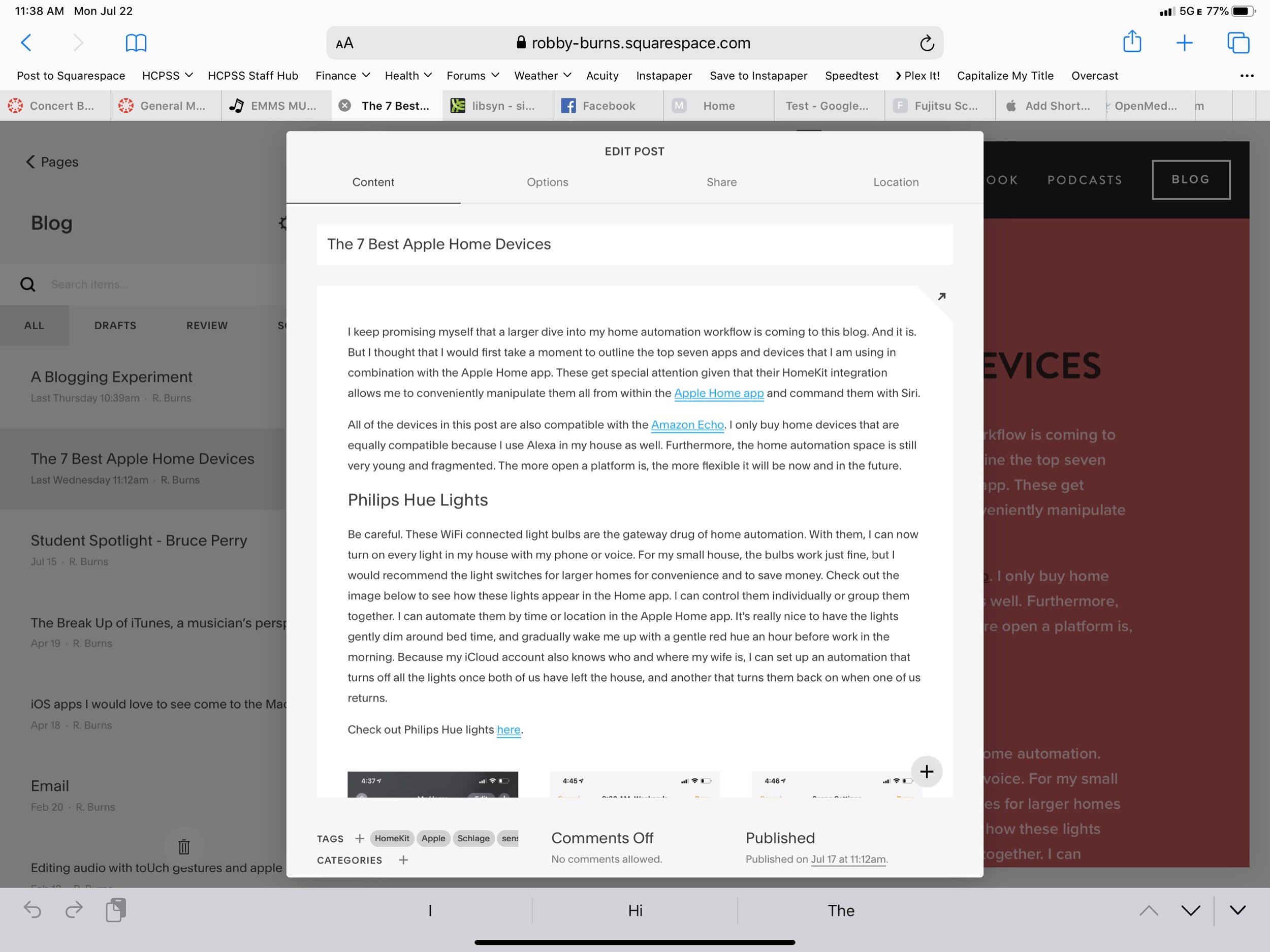
But what is really great is that I can now access the full versions of Google Docs and Squarespace from my iPad. Google’s apps on the App Store are still a little nicer, but they have never had the full feature set of the web apps, and now this is nearly a non-issue. Apple and Google need to find out some way to better let users choose if a document opens in Safari or Google Docs/Sheets/Slides, but I expect that to be eventually ironed out.
Even more exciting is that I can finally use the full toolset of Squarespace to update my website on the iPad (just one of the few things that would keep me taking my Mac out of my bag). So far, Apple has already done a nice job with these features, and they are not even ready for public release yet. There are some issues and unexpected behaviors, but not nearly as much as I expected. Desktop Safari has turned out to be the biggest productivity boost of all the new features. And did I mention there is now a download manager!?

There are also some improvements to multitasking. Notice above that I am using two apps open side by side with another one floating in what Apple calls Slide Over view. iOS 13 now adds the ability to manage multiple different apps in Slide Over at once. The implementation is great. It works like multitasking on an iPhone X or higher. You can swipe the little handle on the bottom of the app left and right to page through recent apps, and you can swipe it up and to the right to see all recently opened Slide Over apps. This makes it much easier for me to manage the few apps I am using often in this mode: apps like Tonal Energy Tuner, Messages, and Twitter.

I now also appreciate that you can have more than one instance of the same app open at the same time. Notice above that I am viewing two notes side by side. When I mentioned that iPadOS is growing into its own specific identity, the pencil tools on the right side of the screen are what I was thinking about. They have been brilliantly updated. And Apple is releasing them for use by third party developers in an API called PencilKit. Here’s to hoping that it is widely implemented so that using the Apple Pencil feels more consistent across apps.
See below also. Swiping from the lower left of the screen with the Apple Pencil allows your to quickly mark up whatever you are looking at. And if you are in Safari, you can now clip an entire website, not just what fits into the screenshot. You can highlight, annotate right from this screen and then send it somewhere like Apple Notes where you can search the article by text.

For me it is becoming clear that PencilKit is a feature that is going to widely shape and define the iPad as a particular tool for certain jobs that a Mac or an iPhone is not as useful for. Apple is bridging the gap a little by introducing a feature for the Mac called Sidecar, where you will be able to send windows of Mac apps to the iPad to be able to take advantage of the same pencil precision editing tools.
Overall, iPad OS is shaping up to be an awesome release. I didn’t even mention half the features here. And even some of the ones I am most excited about will not reach their fullest potential until third party apps take advantage of them (like PencilKit) or until more people are on iOS 13 (like iCloud shared folders). If you are an iPad user you have a lot to look forward to this fall. If you want to try the beta, you can go here. It is pretty risky though, and I am admittedly very unwise for doing it.
I Tweeted a thread yesterday about the superiority of editing audio on a touch screen by manipulating regions directly with my fingers and an Apple Pencil.
I’m just going to say it. Editing audio on an iPad with the precision of an Apple Pencil is superior to everything. If you are an audio professional, I am ready for you to fight me.
— Robby Burns (@robbyburns) February 10, 2019
It became clear that it wasn’t suitable to explain just how comfortable and precise the experience is in written text. So I have done my very best to communicate it through video. Enjoy…
Ferrite is still a very immature DAW by modern day professional standards. And the iPad is still a very immature platform for creative professional software by modern computing standards. What the iPad really needs is something like Logic Pro X. Apple has got to set the standard for professional apps by releasing their own.
Logic or not, Ferrite can get the job done. And gesture/stylus support aren’t the only things that make editing on an iPad more fluid. The form factor of a tablet makes it perfect for “couch-editing.” Plus, iPad is a lot easier to pick up and move from room to room while I am listening to hours of my own podcasts play back.
Microsoft Office and the Files App Finally Play Nice Together:
Today Microsoft updated its Office suite for iOS, with Word, Excel, and PowerPoint all reaching version 2.12. Office updates rarely receive detailed release notes, and today was no exception, but user Teddy Svoronos discovered that the updates brought 'Open In' capabilities to the share sheet, which previously only enabled making a copy of an Office document. The 'Copy to' option has now been removed, replaced by the more convenient 'Open in.'
After seeing Teddy's tweet, I did a little playing around in the Files app and discovered that, while Excel and PowerPoint documents accessed in Files will load Quick Look previews and require tapping 'Open in' from the share sheet, the experience is even better with .docx files. Those Word-associated documents open directly in the Word app with just a single tap from the Files interface – no need to open the share sheet first.
It is really nice to see proper use of the Files app user interface being adopted into apps by third party developers. The more time passes, hopefully we will see this adoption so wide that opening documents using the native file browser will feel no different on an iPad than it does on a Mac. It always feels jarring on Mac when the “Open” option doesn’t show the Finder. On iPad, custom “open” UIs have been standard since its beginning. Hopefully the Files app introduced this past fall with iOS 11 will continue to change that.
What I really thought was interesting about this article was something I have been wondering about the Files app since the summer.
Update: One of the developers working on Office has confirmed my suspicions: the reason Word files open for me with a single tap while Excel and PowerPoint files do not is that I haven't opened those files enough for iOS to know that I would prefer to bypass the share sheet.
I had noticed that tapping on files in the Files app could open them within third party apps but I never understood how iOS knew which apps to use. (For example, standard text files were opening in Byword on my iPhone and 1Writed on my iPad for a time.) It seems that the user can to some extent control these apps by using the “Open In…” option from the Files app and choosing the desired app frequently. Still though, I would love the option to set default apps on iOS. I can tell my Mac which app I want to open PDFs. Why not on my iPad Pro?
Well it has taken me long enough… This past week, Apple held an education event. Below are some brief thoughts on the subject. Chris Russell is coming on my podcast later this week to talk about all of the details. Keep in mind, I do not work in a school with 1:1 iPads or any kind of deployment strategy. But I am very seriously invested in Apple’s role in education and their vision for how their products fit into the classroom.
This device looks great. Adding the Apple Pencil to this model will be an asset for schools. But will schools really pay 89 dollars for a pencil after just having purchased numerous 250 dollar iPads?
The thing that gets me most excited about this device is its consumer potential. I am tempted to buy one for myself as a (more) mobile counterpart to my larger 12.9 inch iPad Pro.
Apple Pencil support. FINALLY. This was my favorite announcement of the day. I anticipate editing Pages documents, scribbling on bus attendance lists made in Numbers, and annotating Keynote slides at the front of the classroom on a daily basis. I hate to be cynical (which the rest of this post will be), but Microsoft Office for iPad has had the ability to write on documents with an Apple Pencil since the Apple Pencil launched, two years ago.
Seems like the Mac app is no longer going to receive development. All book publishing features have been moved to Pages for iOS and Mac. It doesn’t appear that the new feature does everything that iBooks Author can do. Hopefully this is like when Apple rewrote Final Cut Pro X, took away some features, but then eventually added them back. Or when iWork was rewritten to be the same for iOS and macOS, stripping AppleScript features from the Mac, but eventually bringing them back. I would hate to see iBook authors unable to use workflows they have in the past using iBooks Author for the Mac.
Apple’s learning management system comes to the Mac. Great! But what took so long? And can Apple keep up with the vastly more mature and flexible Google Classroom? (See conclusion below)
An app for teachers to give assignments to students, check their progress, and collect it back. School Work can route students to other apps to do their assignments using the ClassKit API which is very cool. But why is this separate from the Classroom app? And where does iTunes U fit into all of this?
Apple is making a lot of solid efforts here but a lot of it it feels like too little too late, especially the student and learning management software. I really do hope they can keep up with Google Classroom who has been eating everyone’s lunch for years. Apple will have to be aggressive about adding new features to all of these new apps and making sure that their app ecosystem is flexible enough to compete with Chromebooks which use browser based software. Yes, there are way more apps on the App Store than there are Chrome based apps, but in education (and especially in music education) a lot of the big players are writing for Chrome OS. To me, the draw of Chromebooks in education is not their price, but the flexibility of web based software.
Apple’s software engineers seem spread very thin and unable to balance the release of various applications, consistently over time. This is true of many of Apple’s consumer apps. Mail and Reminders, two tentpole productivity apps have fallen way behind the competition. Calendar has not seen any more than a few major feature updates since I started using the Mac back in 2006. Apple’s apps are part of the “nice” factor of being in the ecosystem. Sometimes an app like Notes will get some major new features, but then we won’t hear from it for a few years. Google’s apps, by contrast, lack the same design sense, but are constantly being updated with new features. And they are not locked into annual OS updates like iOS is. In my opinion, this is Apple’s biggest problem right now.
Ironically, software is still my draw to Apple products. Even though their hardware is the most indisputably good thing they are doing right now (I am nearly without complaint of my iPhone X and the iPad 10.5 is perfect), it is the software that locks me in. In other words, I am much more committed to macOS and iOS than I am Mac and iPhone. This leaves me with some long term concern about my interest in continuing to use Apple products. And great concern about any educational institution who jumps on the iPad bandwagon just because apps are bright and colorful and demo well on stage. Apple has to show continual support for their education software if their dream for the classroom is to come true.
Find Robby elsewhere on the web