bear

🎙Apps for Research and Remembering, with David MacDonald

Composer and teacher, David MacDonald, returns for a discussion about the apps we use for notes, research, writing, and clipping data to find later.

Other topics:

  • What kinds of work goes in which kinds of apps
  • Digital research tools
  • Kindle Paperwhite
  • Streaming / virtual teaching tools
  • Music theory YouTubers
  • Zooming in to your Mac screen
  • Quickly taking a screenshot with the Apple Pencil
  • Our favorite music and apps of the week

Show Notes:

App of the Week: Robby - Stream Deck Mobile App David MacDonald - Reincubate Camo & FiLMiC Pro

Album of the Week: Robby - Owane | Yolo EP Vol. 1 David MacDonald - Scary Pockets YouTube channel

Where to Find Us: Robby - Twitter | Blog | Book
David MacDonald - Twitter | Website

Please don't forget to rate the show and share it with others!

Subscribe to Music Ed Tech Talk:

Subscribe to the Blog

Subscribe to the Podcast in...

Apple Podcasts | Overcast | Castro | Spotify | RSS

🔀 Guest post: 10 Productivity Apps to Help You Organize Your Lesson Plans | Midnight Music

This month I wrote a guest post for Midnight Music, an awesome blog and website designed to equip music teachers with technology knowledge and resources.

The post includes about 10 of the productivity apps I use to create, organize, and collaborate on lesson plans in the music classroom. The list covers some of the web tools and native iOS/Mac apps that are most indispensable to my work as a teacher.

Click the link below to head on over to Midnight Music and read the whole thing.

10 Productivity Apps to Help You Organize Your Lesson Plans | Midnight Music:

Everyone likes to organize themselves differently. Teachers prefer different tools, organization methods, and preference over how much of their workflow is digital. Whatever your approach, there are a handful of great apps that can help you create your plans, search them, group them, and collaborate on them. The following apps are some of my favorite tools for managing lesson ideas, plans and resources.

Many of them have similar features as one another, but all of them have unique strengths. My philosophy is that there is always a better and more specific tool for the job.

Skepticism about Evernote’s new announcement

Screen Shot 2018-08-15 at 9.34.29 AM.png

As you probably know, I have been a huge advocate for Evernote in my book, clinics, and numerous podcasts. If you know that, you might also know that I have been looking for a replacement for it for years now. 

Evernote’s future has been unclear to me for a number of years now. While they have managed to keep their apps up to date with the latest iOS features, no major new features have been added to the platform in recent memory. Yet the company has raised prices, removed features from the free tier, and had some other small missteps. 

Yesterday, Evernote unveiled this post on their site. Its a followup to this post from earlier in the year. I thought the post from earlier in the year was a load of meaningless corporate and marketing speak, but today’s really takes the cake. And don’t even get me started on the post within today’s post that goes on and on for paragraphs about redesigning the app’s Elephant mascot, amongst other things. Dropbox tried this exact kind of thing earlier in the year where they make a huge rebrand announcement that is all graphic design and marketing fluff without any meat about how it will impact the user experience. And it hasn’t changed anything about how Dropbox is actually used other than making the user interface more difficult to understand in some places.

Like, really, Dropbox. In this limited space, could you seriously not think of any more information I might want to see while playing back an audio file other than this dude dancing next to a disco ball? This particular page is even worse on the sma…

Like, really, Dropbox. In this limited space, could you seriously not think of any more information I might want to see while playing back an audio file other than this dude dancing next to a disco ball? This particular page is even worse on the small screen of an iPhone.

To me, yesterday’s blog posts are further proof that Evernote does not have a clear vision for how to make their products better for users. The community has been very clear about what they want from the company. A better redesigned Mac app, markdown support, and code blocks, to name a few. But rather than disclose a roadmap of user facing product improvements, Evernote seems only committed to blowing steam through the use of fancy graphic design, photography, and web design. If only they put all of that time and money into actual features that would make users lives better. 

So I think this is the final straw. I am going to let my Evernote subscription lapse this fall when it comes to a close. The real challenge about this situation for me, and other Evernote users, is that it is the most fully featured note app on the market. Of all the things one might want from a note app, Evernote covers more of them than any of the competition. But unfortunately for Evernote, stock software like Apple Notes is good enough to do most of the things people need. And for those who want more, there is an emerging bunch of independent developers making note apps who show way more hustle, adding major features to their apps, annually (Bear, for example).

Apple Notes does such a nice job with simple text scraps, web clippings, and check lists, that the only primary use of Evernote I need to replace once my subscription lapses is the “everything bucket” use case. “Everything bucket” is the phrase I use to describe the dumping of PDFs, images, emails, and websites into a digital “drawer” so to speak, where I can later search these documents by the text within them. 

This summer I have been giving DEVONthink a try. It is a Mac and iOS app that is a one time paid purchase on each device. It is a document management app that has all of the “everything bucket" features of Evernote and more. I hope to write more on it soon. For now, I am pretty happy that I have an easy way to clip receipts, websites for later review, and emails, and have them made automatically text searchable. The DEVONthink app on Mac is hideous, and setting up iCloud sync took me a minute, but the utility of the app is worth it so far. I prefer something like this rather than to continue to support companies who string their customers along while they spend time and money on making their elephant mascot look more 2018. 

I may be wrong. Evernote could come out with a killer set of new features in the next 12 months, convincing me and the rest of the world to return to it. I’ll believe it when I see it. 


App of the Week: Drafts 5

PNG image 12.png

My ability to handle the cognitive load of teaching middle school band is largely supported by a wonderful app called Drafts, made by Agile Tortoise. I will detail a little bit about how I use this app below, but I want to first say that the developer of Drafts, Greg Pierce, very generously chatted with me about it on my podcast recently. Greg also has a background in guitar, ethnomusicology, and folk studies. He has an interesting journey towards app development, which we also talked about on the show. Listen to the episode here.

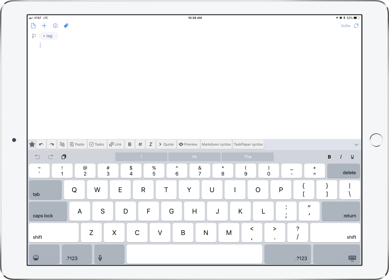
So what is Drafts? Drafts is the starting point for all text on my iPhone and iPad. It sits on the dock, right under my thumb, and I press it every time I have any kind of thought that I don’t want to slip away. Drafts opens to a blank white screen and a keyboard so you can instantly start typing. Adding a new Draft is as simple as tapping the plus button. You don't need to worry about what kinds of thoughts these are, or what kinds of apps you should be capturing them in. They can be todos, messages, emails, future blog posts, anything. Picture me at the front of the classroom before band rehearsal. 70 students pouring into the room. Instruments blaring loud. Countless questions being thrown at me at once. Chaos all around. From the podium, I leave Drafts open alongside my sheet music and type anything that comes to mind. If a student tells me they don’t have a 2nd trombone part to Air and Dance, I write a note in Drafts. If a flute is broken, I start an email to the repair shop requesting for them to come pick it up. If I want to take general notes on our rehearsal progress, I start typing that in another draft. Even if I remember I need eggs at the grocery store later, I type that too!

A beautiful, distraction free, user interface, as soon as you launch Drafts.

A beautiful, distraction free, user interface, as soon as you launch Drafts.

Drafts pairs perfectly with the sheet music app forScore in split view mode.

Drafts pairs perfectly with the sheet music app forScore in split view mode.

All of this stuff is categorized in the inbox where I can easily access it by swiping to the right. Here I can view any current or past archived draft, flag important ones, or send them to the trash. Once I am ready to process it all, I swipe left to reveal actions. Actions can do many things. At the most simple level, they send text to other apps like messages, email, a todo app, or Twitter. But actions can be heavily customized. They can perform multiple steps on text, and even run JavaScript on them. In the example below, you can see that I have a variety of drafts. Meeting notes, a few tasks, a start to a grocery list, a text to my wife, and the beginning of an email. To process these I would use the following actions, respectively: Send the meeting notes to the Apple Notes app, the tasks go to OmniFocus (where I manage all of my todos), the groceries go into my Reminders app grocery list, the text to my wife goes to Messages, and the email goes to Mail. Many of these actions happen in the background, meaning that I don't leave Drafts, and can therefore process them really quickly. You don't need to be a fancy pants to get awesome actions into Drafts, by the way. Some of my most frequently used actions are built into the app. There is also an Action Directory where you can steal the wonderful actions that others have already made. 

Swiping right reveals all unprocessed drafts.

Swiping right reveals all unprocessed drafts.

Swiping left reveals all of the various actions you can perform on drafts.

Swiping left reveals all of the various actions you can perform on drafts.

Drafts 5, the newest version, was released recently. The app is free which means there is absolutely no excuse not to give it a try. Some of the power features like creating your own actions and using automation require a subscription price of $1.99 a month or $19.99 a year.

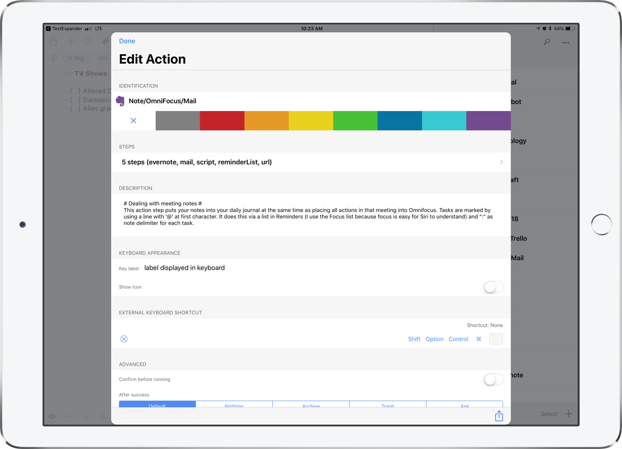
This is the Edit Action screen. Actions are highly customizable. This particular action a) saves meeting notes to Evernote, b) saves tasks begining with "@" to my OmniFocus task app, and c) emails the notes to others in attendance.

This is the Edit Action screen. Actions are highly customizable. This particular action a) saves meeting notes to Evernote, b) saves tasks begining with "@" to my OmniFocus task app, and c) emails the notes to others in attendance.

I have always treated Drafts as a starting point for text. Interestingly, the new version has added some features that encourage using it as a note app replacement. You can now tag notes, create lists with checkable boxes, and even create custom workspaces that you organize your text into (paid feature). I am not sure if using Drafts this way is for me, but here are some ways I have been experimenting with it…

Processing Text

I have a "default" workspace depicted by the blue star icon below. Navigating workspaces is as easy as tapping custom icons in the lower left. My default workspace is where all of my unprocessed notes go. These generate a badge that appears on the icon of the Drafts app so that I don't forget to act upon them later. This workspace resembles the extent to which I was using the previous version of Drafts.

My default workspace. This functions like I used to use Drafts before workspaces became available.

My default workspace. This functions like I used to use Drafts before workspaces became available.

Simple Lists

My next workspace is where I keep active lists of things like recommended movies to see, blog ideas, and even a list of things I do every time I migrate to a new Mac. I can automatically append this list by pressing the "Add to list" action (available here) and then choosing which list to add to. 

My lists workspace.

My lists workspace.

If a friend recommends a movie to me, I quickly write it in a draft without fiddling around with apps on my phone and getting distracted from conversation. Later, I append it to my movie list in one tap.

If a friend recommends a movie to me, I quickly write it in a draft without fiddling around with apps on my phone and getting distracted from conversation. Later, I append it to my movie list in one tap.

Blog Drafts

My next workspace is for blogging. I usually write my blog posts in a third party text editor called Ulysses which means that I usually get started in Drafts and then tap an action that sends the text there. But sometimes I do like to spend a little bit of time in Drafts writing before I take that step. For these types of drafts, I now have a tag called "blog" that allows them to show up separate from my other notes that need to be processed.

Blogging workspace.

Blogging workspace.

Lesson Planning and Note Taking

My last workspace is called Sectionals. My band program has weekly classes for each instrument. Once a week, I see the flutes from my band during one period, the clarinets the next, etc. I do some lesson planning for these sectionals in a note app called Bear. In those same notes I also write down things that happen in the sectionals. Things I assigned, things I assessed, things I said, students absent, instruments I repaired, etc. Fiddling through my notes app to add these notes was getting cumbersome and was distracting me from engaging with my students. So I created a series of sectional related actions that enable me to automate part of this process. The “R1, R2...” actions in the image below are examples of text expansion. Tapping buttons like these expand text that I commonly type. R1 stands for Rotation 1, which I would type if I were taking notes on the first week trumpet sectional for the quarter. The other actions automatically append my sectional notes. For example, tapping SW Trumpet would take my draft and append it to the bottom of that particular note in the Bear note app.

My sectionals workspace. Custom actions can be organized into different groups. This particular one has actions that expand common text that I type in my sectional notes like which weekly rotation we are on. It also contains buttons that take the te…

My sectionals workspace. Custom actions can be organized into different groups. This particular one has actions that expand common text that I type in my sectional notes like which weekly rotation we are on. It also contains buttons that take the text and append them to different notes, depending on which instrument group I am in front of.

My sectional note in the Bear note taking app, now appended by Drafts.

My sectional note in the Bear note taking app, now appended by Drafts.

As you can see, Drafts is a simple note app with infinite customizability. Check it out today at Get Drafts.