streaks

New Macs announced yesterday, new Mac operating system shipping tomorrow

Apple's "One More "Thing Event

Apple announced three new Macs yesterday that will use their new M1 chip. This will allow unprecedented increases in power, speed, and battery life. It will also allow iOS apps to run on them natively.

I have shared some real quick impressions below. If you want to hear more about this transition, Will Kuhn is on the upcoming episode of the podcast to talk about his impressions, amongst other topics in technology and music education. That episode should drop over the weekend.
Quick thoughts

  • Apple announced a new MacBook Air, MacBook Pro 13", and Mac mini. Of these three, the Air and Mac mini are particularly tempting to me. They maintain similar prices (way cheaper in the case of the mini), and dramatically improve performance, battery life, speed, and allow for using iOS apps. If you need a Mac, and you don't need the most powerful one on the market, I couldn't recommend either of these more. Of course, it is always safe to wait for reviews, but I anticipate that there won't be any significant deal breakers outside of potential software compatibility.
  • There are a lot of things Apple could do with the M1 chip down the road. Add FaceID, a cellular chip, a touchscreen, and maybe even a new design. Apple decided not to do these things yet and keep the designs pretty much like the last generation. I think this sends the message to the general public that this is not some new, experimental thing, but instead, the same old Mac you know and love. Just way better.
  • I was surprised not to see more iOS apps demonstrated. Apple showed a few iOS apps (like the game Among Us and HBO Max) running on one of the new Macs. Before the event, I have noted that it is weird that the TV app will show my recently watched HBO shows, but I can't play them on an intel Mac like I can on iOS or tvOS, which have the HBO app. This will be an obvious improvement. But where is Hulu? Netflix? Surely Apple chooses who they feature on stage strategically. Still, I would have expected them to do more bragging if they were anticipating a ton of extremely popular apps to launch on day one. Fingers crossed for a lot of new options in the Mac App Store early on.
  • No AirTags, over the ear headphones, or Apple TV. I was personally curious about these devices, particularly the rumored studio headphones, but maybe they will come later.

macOS 11 - Big Sur
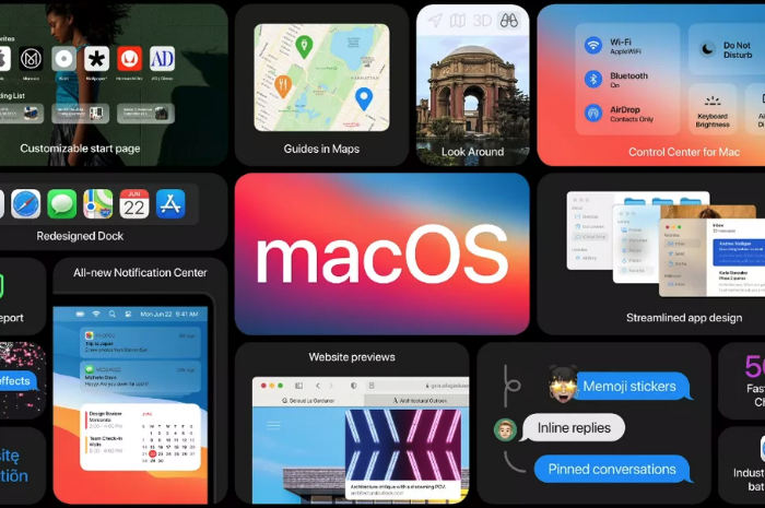
The new Mac operating system, Big Sur, is coming out tomorrow. This update is dramatic in numerous respects. You will immediately notice a fresh coat of paint. The user interface and app icons will feel a lot more like they do on iOS.

iPad Apps on the Mac

I am excited because iOS app developers I care about are finally starting to announce Catalyst apps in volume. Catalyst is Apple's technology that allows developers to easily turn their iPad apps into Mac apps. There have been relatively few good examples of this over the past year. GoodNotes 5, Streaks, Twitter, and Home, are a few of the ones I use regularly, but the list isn't long.

Instapaper has a Mac app as of today (yay), and forScore is launching one tomorrow. I expect to see a lot more in the coming weeks. It seems like changes to this new OS have finally provided developers the tools they need to make their iPad apps "good enough" to ship on the Mac.

Will I Install It On Day One?

While I usually wait to install releases like this, forScore will be enough of a productivity boost for my Mac workflow that I will be reckless and install it tomorrow, most likely. This will put my online teaching software setup at risk, but I think it is worth it. I am tired of having a beautifully curated music library on the iPad and not on my most powerful machine. Until forScore ships iCloud syncing, I plan to move my "true" sheet music library to the Mac version.

Music Software Compatability

If you depend on any creative professional music software, audio interfaces, or other apps you aren't sure will be compatible with Big Sur, don't be like me. Wait! I have a fallback Mac mini I can use if things get ugly.

If you are wondering what score editing software is compatible with, fortunately, Scoring Notes has already got the scoop. Read their article below.

Music notation software, macOS Big Sur, and Apple Silicon M1 Macs:

As far as Sibelius, Finale, Dorico, MuseScore, and Notion, are concerned: Broadly speaking, Big Sur does not appear to affect these applications much one way or the other. We don't expect users already working on macOS Catalina to be negatively or positively affected by Big Sur when working with these applications — and whenever a new OS is involved, status quo is very welcome news indeed.

New Software Updates from Apple: Exploring Widgets!

iOS 14, iPadOS 14, watchOS 7, and tvOS 14 came out a few weeks ago. I have a lot to say about these updates, but today I wanted to write about widgets for a moment.

Widgets are catching on as a significant feature amongst the masses. As someone who plays around with the way apps are organized on the home screen at least twice a week, I can tell that widgets are going to add a lot of excitement (and anxiety) into my life. I have been toying with them since July when this software entered the public beta, and I am far from resolved.

Here is where I have landed for now…

IMG_3278.png
IMG_3261.png
IMG_3257.png

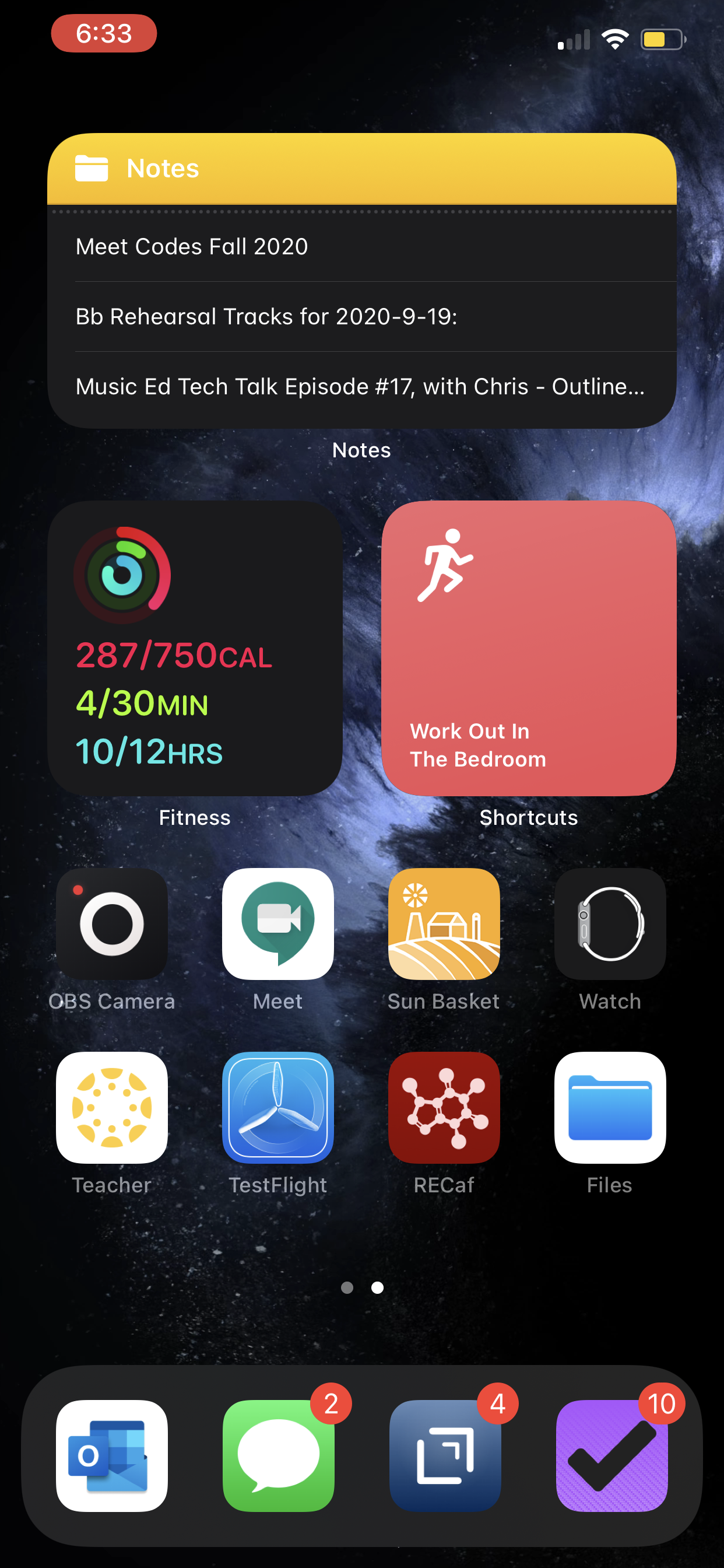
Page one (middle image) contains my most tapped app icons. This will be a hard habit to break, but I find lots of value in having upcoming calendar tasks and weather permanently on my most visited screen. Weather Line and Fantastical have the best small-sized widgets, in my opinion. Even this smallest widget size takes up four app icons, so they need to be beautiful and information-dense for it to be worth me sacrificing four apps.

I didn’t think I would want weather on this first screen, but now that it is always visible to me, I don’t see how I could live without it. The Weather Line widget is awesome because its user interface depicts the weather on a line, almost like a chart. It even manages to fit an hourly rain graph into its small space when it is raining out. Not even my second favorite weather widget, Carrot Weather, does that.

The Today View (left image) is where I keep Siri Shortcuts and the older, legacy style widgets from iOS 13. As much as I like the newer widgets’ look, the older style widgets are interactive. I keep OmniFocus, Timery (for time tracking), Streaks (for tracking daily habits), and Waterminder (for quickly logging water) all on this screen because I can tap right on the buttons to act on these apps without the widget needing to launch into the app.

I am continually playing with page 2 (right picture). I like it to be mostly another grid of tappable apps, but I am experimenting with various widgets here. I think what I have settled on is to have the Maps and Notes app widgets stacked on top of each other at the top, and then to use the Siri Suggestion widget, which shows me two rows of apps that swap in and out throughout the day based on my phone’s predictions of which apps I want to use in which contexts. The image above shows some other widgets I am experimenting with, but I think I prefer having more app icons there.

IMG_3071.png

On the iPad, I keep: calendar, weather, notes, Apollo (a Reddit app I use to keep up on the latest news about my interests), Siri Shortcuts, and the Files app for launching into recently modified files. 

On both my phone and iPad, I am waiting for an OmniFocus widget to track my tasks. Even though I like the one in the Today view where you can mark the tasks as done right from the widget, I think I might want to have my next few upcoming tasks permanently visible on page one.

9to5Mac.com and MacStories.net have been two great websites to follow if you want to stay up on which apps offer widgets.

Favorites of 2018 - Apps!

These posts will never happen if I don’t make it fuss free. So here is it! With little introduction or fanfare, the ‘stuff’ that made up my year. My favorite albums, live shows, apps, and ‘things’ of 2018.

Next up, apps!

Apps

Things and OmniFocus

Task management software makes up about 50 percent my time on computing devices so it’s natural that I include what I consider to be the best two apps in this field. After seven years of using OmniFocus, I am experimenting with Things again. I plan to write about this switch in more detail but for now I leave you with this: if you are looking for a powerful way to stay on top of your tasks and don’t mind paying for a premium design, check these apps out.

The Today view in Things displays all of my tasks for the day alongside my calendar.

The Today view in Things displays all of my tasks for the day alongside my calendar.

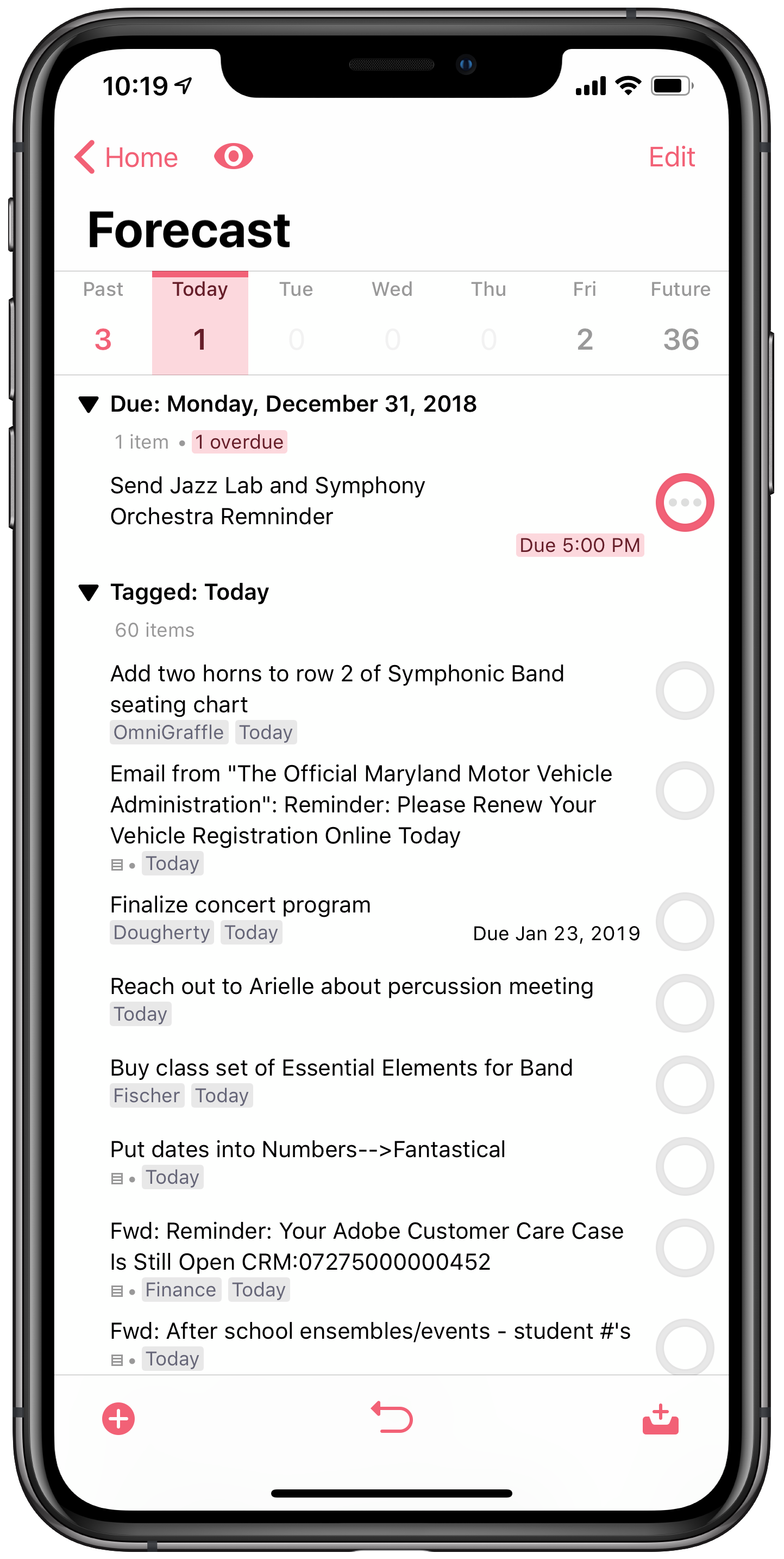
The Forecast view in OmniFocus is similar to the Today view in Things. Though I have it turned off in this screenshot, it actually displays your tasks inline with your calendar events so you can see where ‘due’ tasks fit into your day.

The Forecast view in OmniFocus is similar to the Today view in Things. Though I have it turned off in this screenshot, it actually displays your tasks inline with your calendar events so you can see where ‘due’ tasks fit into your day.

Health

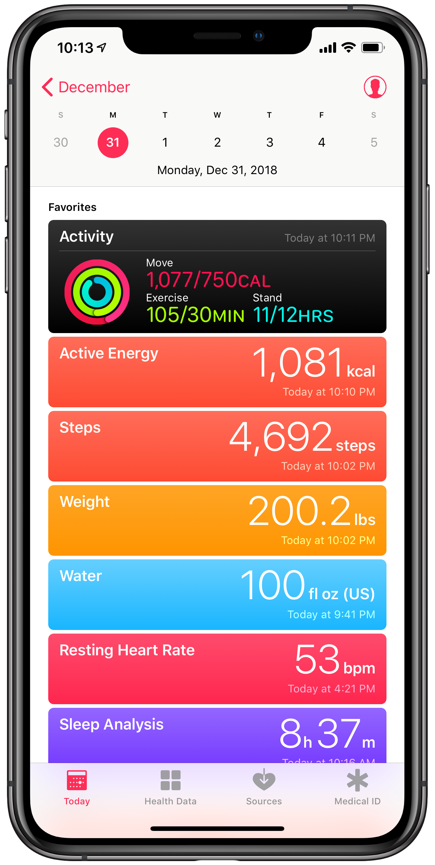
The Health app by Apple is my hub for collecting all sorts of data about myself from various devices, apps and clinics. It houses data from devices like my Apple Watch, Spire respiratory monitor, Fitbit WiFi scale, and Spark Smart Water Bottle. It tracks data in third party apps like: work outs, active calories burned, steps, heart rate, sleep, water intake, nutrition, meditation minutes, caffeine intake, and blood pressure. It can now even aggregate health data from participating clinics and practices so I don’t have to log into a million web portals. My Quest and LabCorp results are a tap away. The beauty of the app is that it allows me to organize these data points and see them alongside one another so I can draw meaningful conclusions about them. Like for example, I eat better on days when I get more sleep.

Home

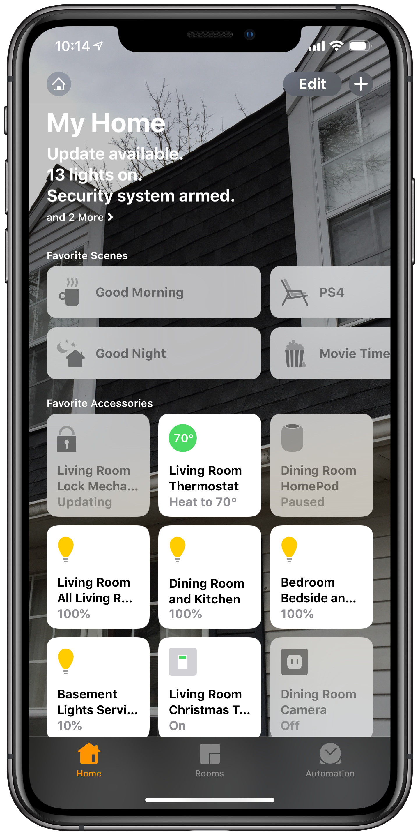
Apple’s Home app is the hub for controlling my smart home. I can control all of my smart things in the same user interface rather than by punching into lots of different apps. I can also use it to automate different actions. For example, my Good Morning scene automatically runs at 6:30 am every day which turns on my lights, changes the temperature, and lately, turns on the Christmas tree.

My Today view in Apple Health aggregates all of my health data regardless of which app is responsible for tracking it.

My Today view in Apple Health aggregates all of my health data regardless of which app is responsible for tracking it.

The My Home view in Apple Home shows my most used home automation devices and ‘scenes.’

The My Home view in Apple Home shows my most used home automation devices and ‘scenes.’

Tonal Energy Tuner

Absolute must for an instrumental music teacher. Using the new Screen Time feature on iOS reveals that I spend too much time on Reddit. But also that I spend more time than any other app in Tonal Energy. It’s literally running in the foreground all day long while I’m at school, helping students to match pitch, blend, and keep steady time.

Trello

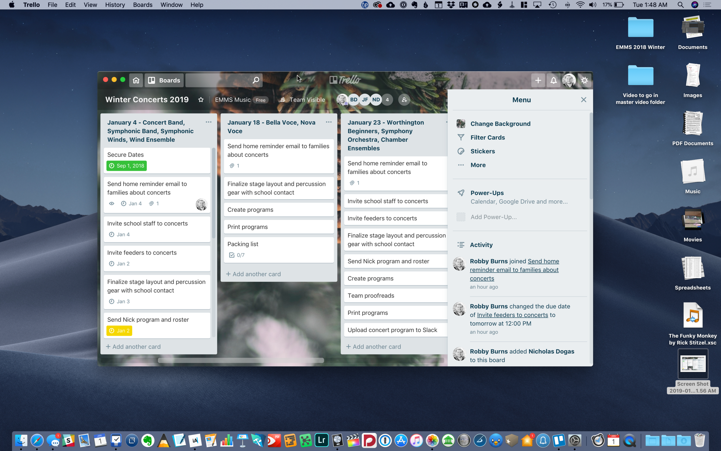
This may be my productivity discovery of the year. Trello is the team project app you have been waiting for. It’s vibrant, Kanbab board style interface will have your team, family, or Dungeons and Dragons group enjoying every minute of collaboration. Bonus points for how well this app integrates with Slack which is my preferred team communication tool.

Planning concerts in Trello allows my team to share todos, check lists, files, and more. We can give items due dates and even assign tasks to other members.

Planning concerts in Trello allows my team to share todos, check lists, files, and more. We can give items due dates and even assign tasks to other members.

GoodNotes

GoodNotes has become my go-to handwritten note application. It acts like a bookshelf of notebooks so to speak. I take a lot of the work I create in iWork, Ulysses, and OmniGraffle, export them as PDFs, organize them into notebooks in GoodNotes, then annotate them on the go using my iPad. My favorite thing to do with it is keep a notebook of seating charts that have my rehearsal annotations on top of the names of my students. I love how you do not need to trigger an annotation mode to start scribbling on a document with the Apple Pencil. It just feels like paper.

Streaks

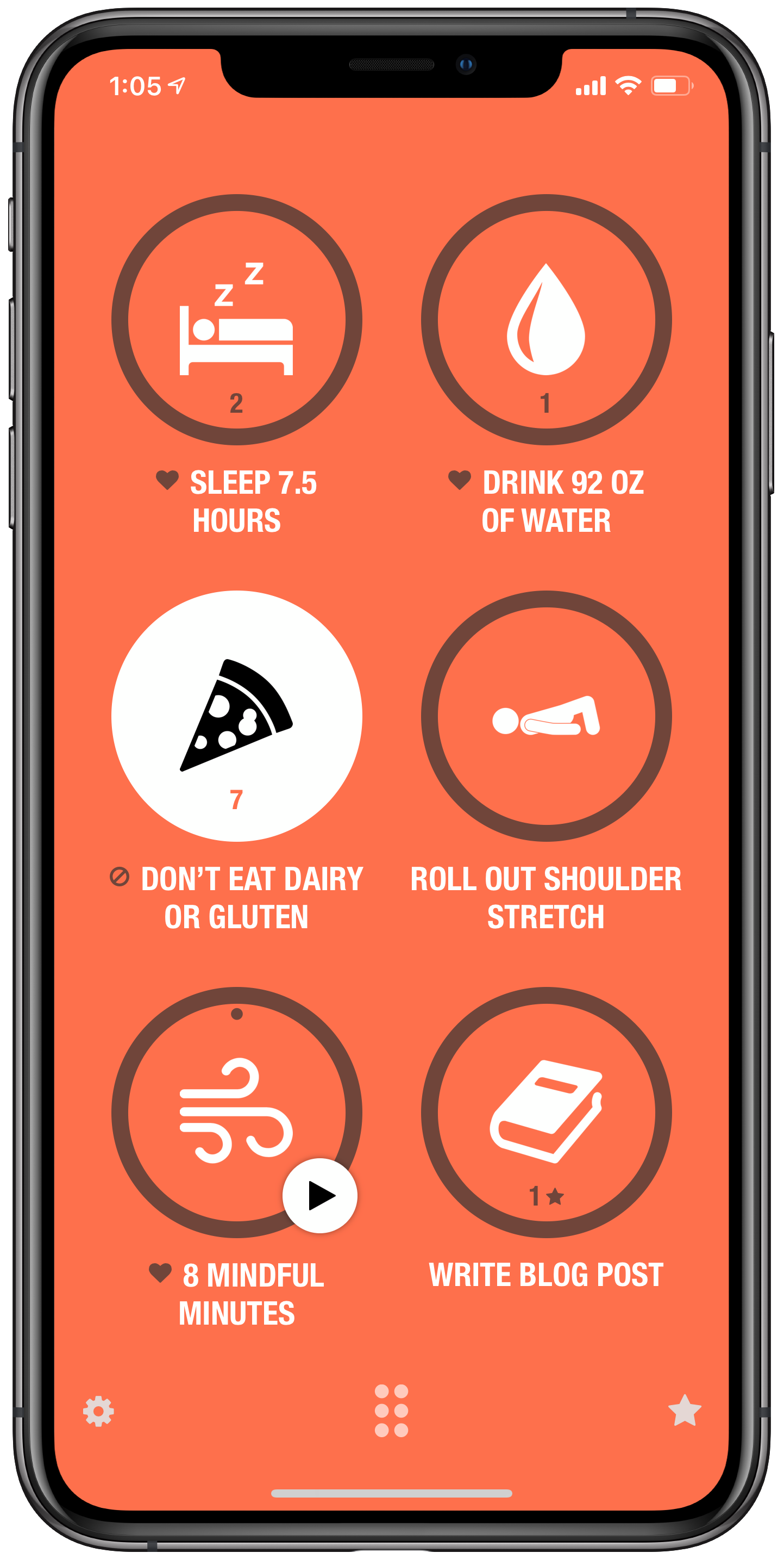
There are a lot of great habit building apps out there but Streaks has stuck with me because it encourages you to focus on just six habits at a time. When I am building too many habits at once, they start to feel like a todo list. The Streaks method of choosing six, along with its addictive user interface, keep me launching the app, which keeps me working towards my goals.

AutoSleep and AutoWake

Of the ten or so sleep trackers I have tried for the iPhone and Apple Watch, AutoSleep has stuck with me the most. There are numerous things I like about it, but most of all is how it figures out the most accurate number of hours I have been asleep whether I wear my watch to sleep or not. The companion app, AutoWake, wakes me up silently with haptic feedback on the watch. It does this when I am in my least deep sleep within a half hour before my alarm is set to go off. This eases me awake rather than jolting me awake. I plan to blog later this month about how I am automating some cool stuff in my house when I wake up using this app.

WaterMinder

WaterMinder is my favorite app for tracking water intake, mostly because of its well designed and space efficient widget.

Shortcuts

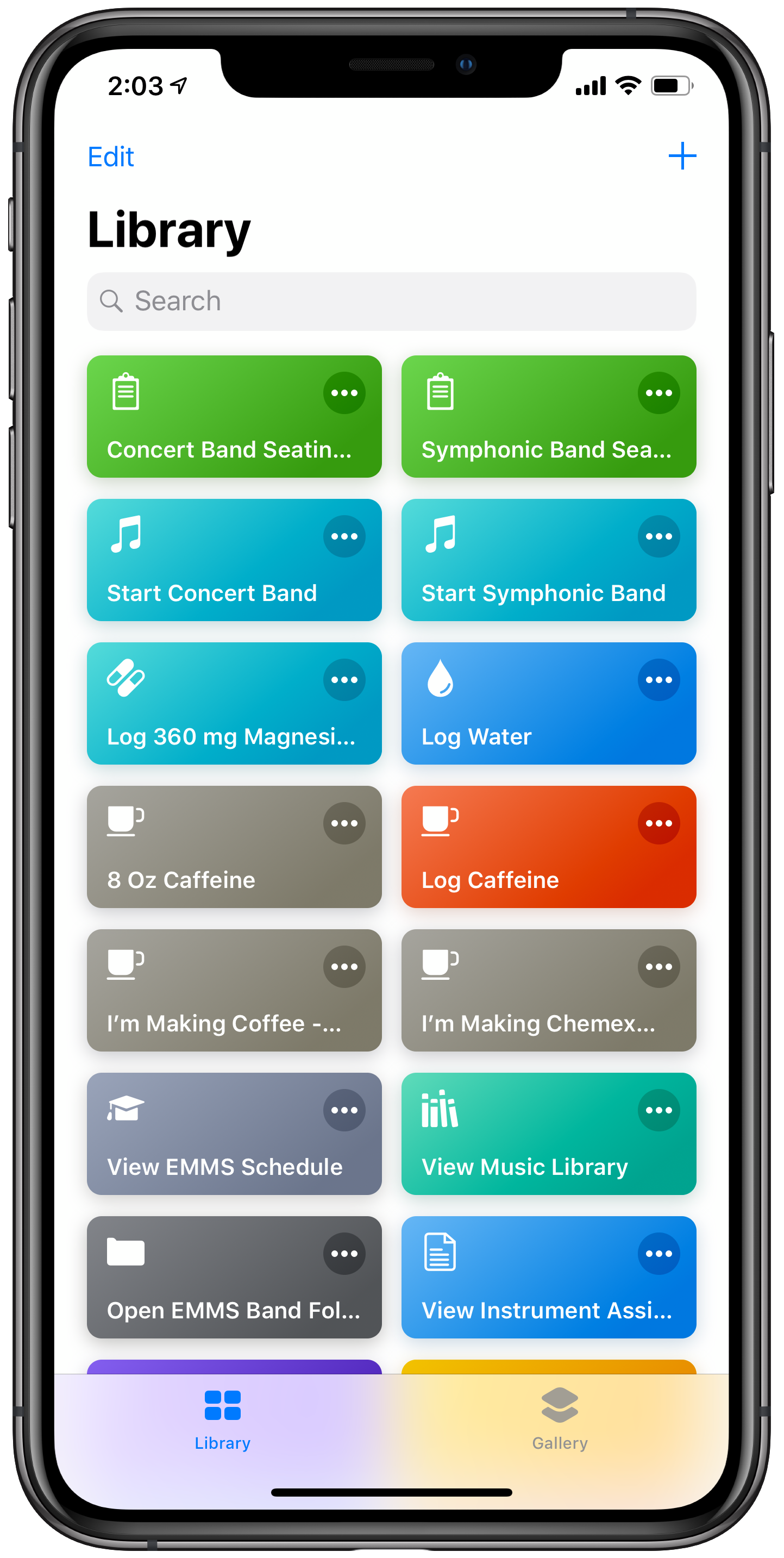
I did not get as much out of the Siri Shortcuts app this year as I wanted to. In fact, I had a lot of bad luck with it. But it is still an app that is working really well for me in a couple of small areas. In one tap, it generates a clean copy of my band's seating chart in GoodNotes for annotations and opens my lesson plan for the day in OmniOutliner. 

The Waterminder Widget.

The Waterminder Widget.

Some of my Shortcuts.

Some of my Shortcuts.

CARROT⁵ Weather

This is my favorite weather app due to its clean and appealing design. It gets my pick this year because of how they continue to innovate the Apple Watch app. My favorite feature of the watch is the customizable complications. Carrot makes the best weather complication for the Apple Watch, maybe the best complication, period. Carrot allows infinite customization for how it looks on the watch, depending on which watch face you like to view it, and even in which corner of the watch face you prefer to keep it installed.

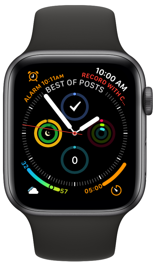
The Carrot Weather app complication can be seen in the lower left corner.

The Carrot Weather app complication can be seen in the lower left corner.

Streaks. Guess I can check off that one in the lower right corner now.

Streaks. Guess I can check off that one in the lower right corner now.