iwork

Google Drive Can Now Edit Office Files From the Web

Google Drive web opening docx, Office files in editing mode - 9to5Google:

Google’s editing applications can open and edit Microsoft files, with that capability recently coming to Android. When opening Office files from the Drive web client, Google will now directly open them in editing mode. 

I would guess this is one more small nail in the coffin for my school district never using anything other than Google Drive again. Most of my colleagues have moved their docs, tables, and presentations to Google’s suite of apps. For the few hold-outs who still email Word docs instead of Google Doc links, it looks like this will allow them to continue editing comfortably in Microsoft Office, while enjoying the benefits of organizing their work in Google Drive and sharing it with others.

I have been outspoken about enjoying native apps over web apps but online teaching has forced me to depend on my Mac and Google Chrome much more. The more I get used to doing my work in a web browser, the less I mind it.

I still do most of my work in Apple’s iWork suite because it is nicer, easier, prettier, faster, and better integrated with Apple platforms. Something tells me iWork isn’t getting the option to edit from the Google Drive interface any day soon. 

Brainstorming ways teachers might be more productive with Microsoft’s New Fluid Framework

Microsoft kicked off a developer conference earlier this week. The Verge writes about a very cool set of forthcoming productivity features.

Microsoft’s new Fluid Office document is Google Docs on steroids - The Verge

Microsoft is creating a new kind of Office document. Instead of Word, Excel, or PowerPoint, the company has created Lego blocks of Office content that live on the web. The tables, graphs, and lists that you typically find in Office documents are transforming into living, collaborative modules that exist outside of traditional documents.

Microsoft calls its Lego blocks Fluid components, and they can be edited in real time by anyone in any app. The idea is that you could create things like a table without having to switch to multiple apps to get it done, and the table will persist on the web like a Lego block, free for anyone to use and edit.

This is obviously very cool, but it’s the next part that gets me excited.

Fluid is designed to make those tables, charts, and lists always feel alive and editable, no matter where you create them and regardless of how you share and copy them into other apps. Instead of getting a static and dull chart you copied from Excel, you’ll get a chart that can be edited anywhere you paste it, and you’ll see everyone making edits as they happen. That might be in the middle of an email chain, in a chat app like Microsoft Teams, or even third-party apps eventually.

So certain parts of Office documents can be shared between multiple spaces, or with multiple users, across multiple apps. If I am understanding this correctly, I can instantly think of 25 ways this could make my job easier. Here are a few...

  1. Copy tasks from a Microsoft To Do project called Field Trip into an email to my music team and have everyone check off tasks in the email as they do them. Status of those completed tasks syncs back to my project in To Do.
  2. Say I am logging a spreadsheet of student concert attire orders and I need some data for a few choir kids. I can copy and paste just those cells, email them to the choir teacher, he can fill out the data right in the email, and I watch as it syncs back to my spreadsheet.
  3. Similar to that last one. My school district sends me an updated list of recommended private teachers. I email just the flute teachers to my flute students and it stays up to date when the data is edited by those who maintain the list.
  4. No more putting the same student names in multiple different documents. I can have one Word document that acts as a primary roster. All concert programs, student lists, sectional roster documents, etc. are just snippets of text from my primary roster document, that automatically update when I update the primary roster. No more misspelled names, inconsistency, or duplicated work.
  5. Various data from documents can be clipped into media rich notes in OneNote where I can access them alongside one another without thinking about document management. For example, a short list of Concert Attire tasks could coexist in the same note as a portion of a payment spreadsheet, and both could update in real time when I edit their respective documents in To Do and Excel.

For the reccord, I don't use any of Microsoft's apps as my default tools, but I can certainly see myself using them more often if I can leverage this kind of power out of them.

Some questions I have:

  • Will this be web only or will it eventually roll out to Microsoft apps on all platforms?
  • Will Microsoft stand alone apps like Excel continue to exist or will they be replaced with one app (like the iPhone which now has an "Office" app that combines features of the whole suite)
  • Will this actually catch on with people who are used to saving files to places on their hard drive? It seems ahead of its time.
  • Will it compete with Google Docs? Someone needs to. Google Docs gets a only a few things right, but they get them really right, and that's why I think it has been so pervasive. Personally, I would far prefer that my work and personal circles relied on great native apps like Office.
  • Will third party apps be able to embed the modular Microsoft elements inside of them, create modular elements to be able to insert in Microsoft docs, or both?
  • Would Apple ever consider participating in this framework with their iWorks apps? Would they recreate their own version?

🔗 Omni Apps are Adopting Apple’s Standard iOS Document Browser this Fall

Adopting Apple’s Standard iOS Document Browser - The Omni Group

In 2019, we think it’s time to retire our custom document browser in favor of using Apple’s built-in document browser—and with our iOS 13 updates this fall we’ll be doing just that. Instead of seeing our custom file browser, you’ll be presented with the standard iOS document browser—just like in Apple’s own iWork apps. Using Apple’s browser, you’ll be able to store and sync your documents using Apple’s built-in iCloud Drive, or third-party commercial options like Box—or even in cloud- or self-hosted collaborative git repositories using Working Copy.

As a user of OmniFocus, OmniGraffle, and OmniOutliner, I am grateful that the OmniGroup is making this change. The Files app on iPad works very similarly to the Finder on Mac these days. So when I open or save a document on an iPad, I want to see that same interface. It's exactly the same as if I were on a Mac. I would never go to the File-->Open menu and expect to see anything other than the traditional Save/Open dialogue box that I see for every other app. This is standard on Mac. (Mostly. Some apps like Microsoft Office still refuse to use it.) So it is only fitting that in iOS, document based apps display the system provided interface for interacting with files.

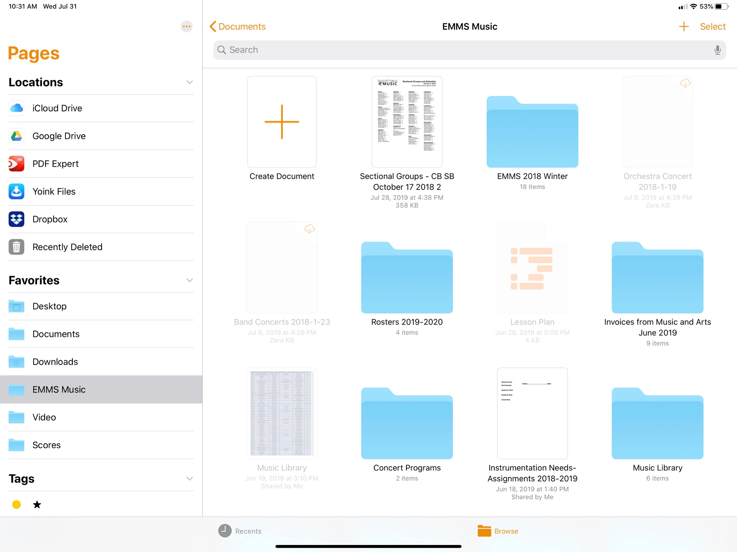
In apps like Pages, for example, opening a new document displays an interface that looks and behaves like the Files app.

In apps like Pages, for example, opening a new document displays an interface that looks and behaves like the Files app.

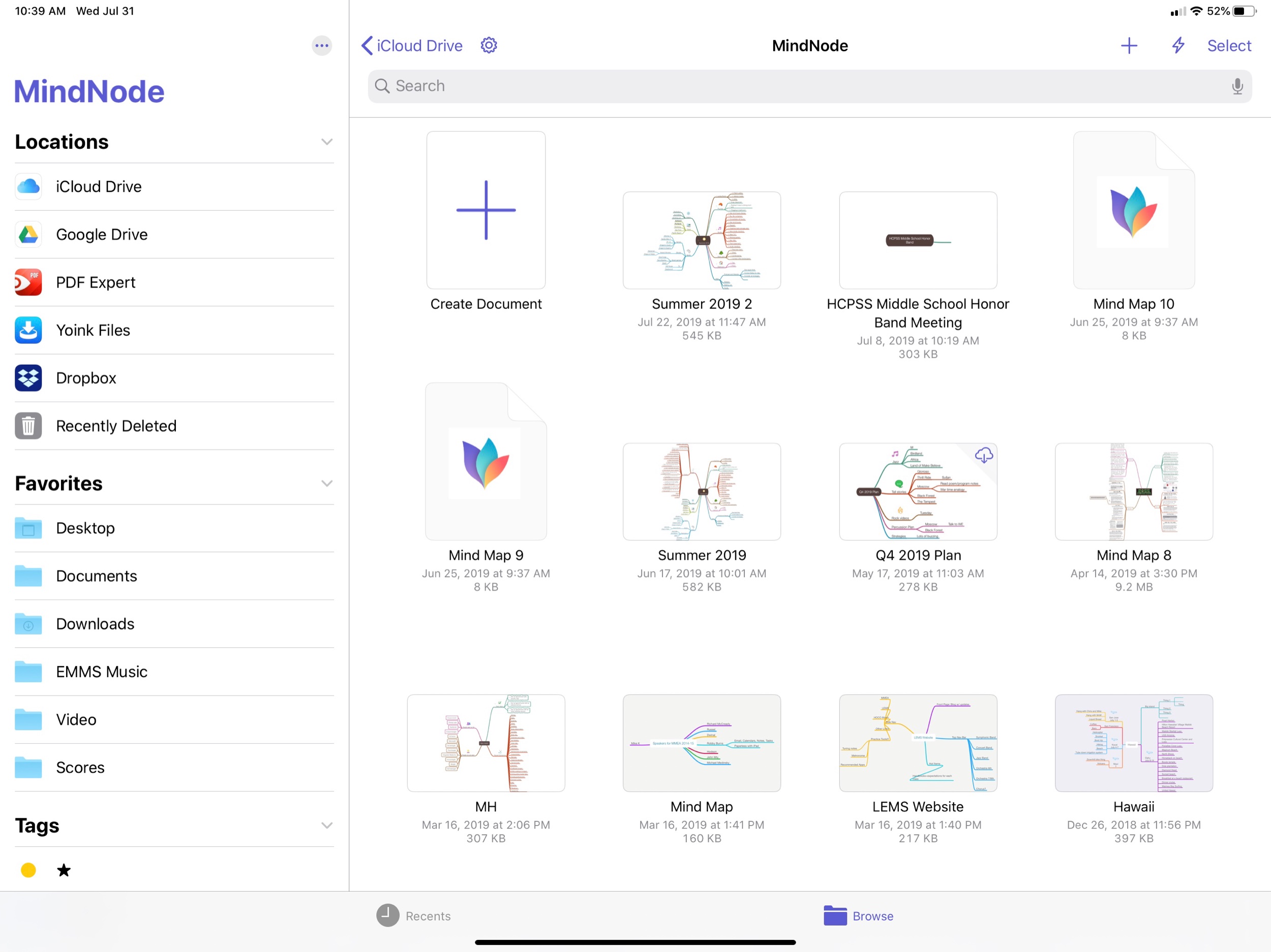
MindNode is an example of a third party app that uses the same Files interface as Apple’s own apps.

MindNode is an example of a third party app that uses the same Files interface as Apple’s own apps.

Apps like OmniOutliner show a custom interface. Fortunately, OmniGroup is changing this behavior in the fall.

Apps like OmniOutliner show a custom interface. Fortunately, OmniGroup is changing this behavior in the fall.

PDF Expert is another example of an app that does not use the native file picker. Hopefully they will get the message and adopt it soon.

PDF Expert is another example of an app that does not use the native file picker. Hopefully they will get the message and adopt it soon.

Favorites of 2018 - Apps!

These posts will never happen if I don’t make it fuss free. So here is it! With little introduction or fanfare, the ‘stuff’ that made up my year. My favorite albums, live shows, apps, and ‘things’ of 2018.

Next up, apps!

Apps

Things and OmniFocus

Task management software makes up about 50 percent my time on computing devices so it’s natural that I include what I consider to be the best two apps in this field. After seven years of using OmniFocus, I am experimenting with Things again. I plan to write about this switch in more detail but for now I leave you with this: if you are looking for a powerful way to stay on top of your tasks and don’t mind paying for a premium design, check these apps out.

The Today view in Things displays all of my tasks for the day alongside my calendar.

The Today view in Things displays all of my tasks for the day alongside my calendar.

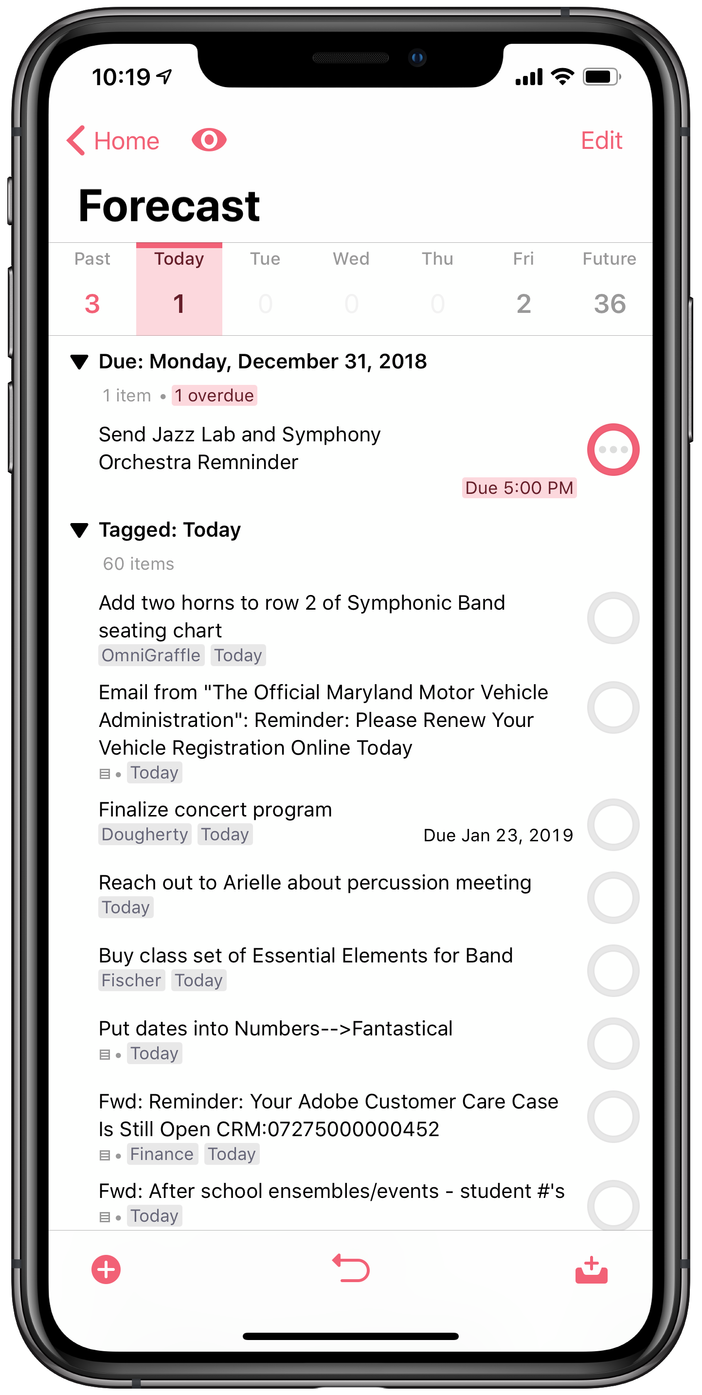
The Forecast view in OmniFocus is similar to the Today view in Things. Though I have it turned off in this screenshot, it actually displays your tasks inline with your calendar events so you can see where ‘due’ tasks fit into your day.

The Forecast view in OmniFocus is similar to the Today view in Things. Though I have it turned off in this screenshot, it actually displays your tasks inline with your calendar events so you can see where ‘due’ tasks fit into your day.

Health

The Health app by Apple is my hub for collecting all sorts of data about myself from various devices, apps and clinics. It houses data from devices like my Apple Watch, Spire respiratory monitor, Fitbit WiFi scale, and Spark Smart Water Bottle. It tracks data in third party apps like: work outs, active calories burned, steps, heart rate, sleep, water intake, nutrition, meditation minutes, caffeine intake, and blood pressure. It can now even aggregate health data from participating clinics and practices so I don’t have to log into a million web portals. My Quest and LabCorp results are a tap away. The beauty of the app is that it allows me to organize these data points and see them alongside one another so I can draw meaningful conclusions about them. Like for example, I eat better on days when I get more sleep.

Home

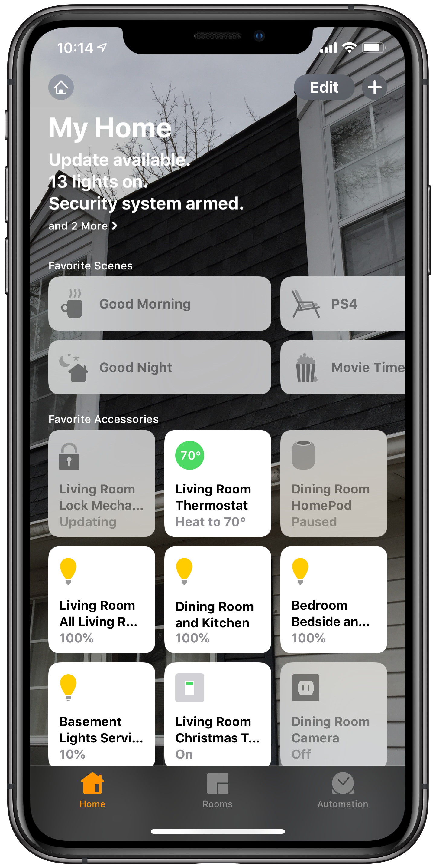
Apple’s Home app is the hub for controlling my smart home. I can control all of my smart things in the same user interface rather than by punching into lots of different apps. I can also use it to automate different actions. For example, my Good Morning scene automatically runs at 6:30 am every day which turns on my lights, changes the temperature, and lately, turns on the Christmas tree.

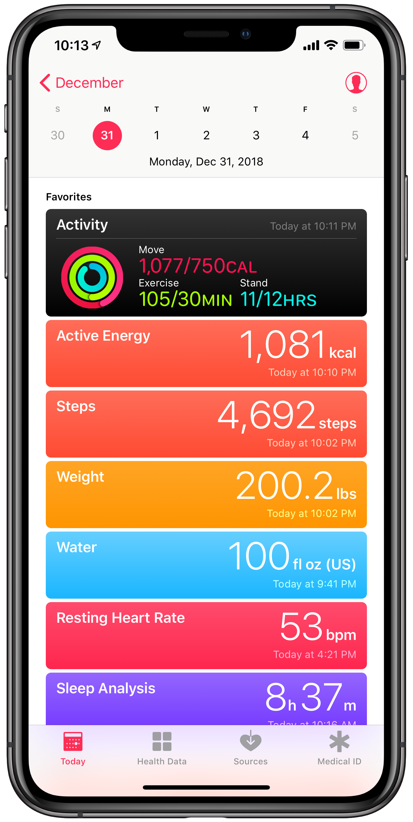
My Today view in Apple Health aggregates all of my health data regardless of which app is responsible for tracking it.

My Today view in Apple Health aggregates all of my health data regardless of which app is responsible for tracking it.

The My Home view in Apple Home shows my most used home automation devices and ‘scenes.’

The My Home view in Apple Home shows my most used home automation devices and ‘scenes.’

Tonal Energy Tuner

Absolute must for an instrumental music teacher. Using the new Screen Time feature on iOS reveals that I spend too much time on Reddit. But also that I spend more time than any other app in Tonal Energy. It’s literally running in the foreground all day long while I’m at school, helping students to match pitch, blend, and keep steady time.

Trello

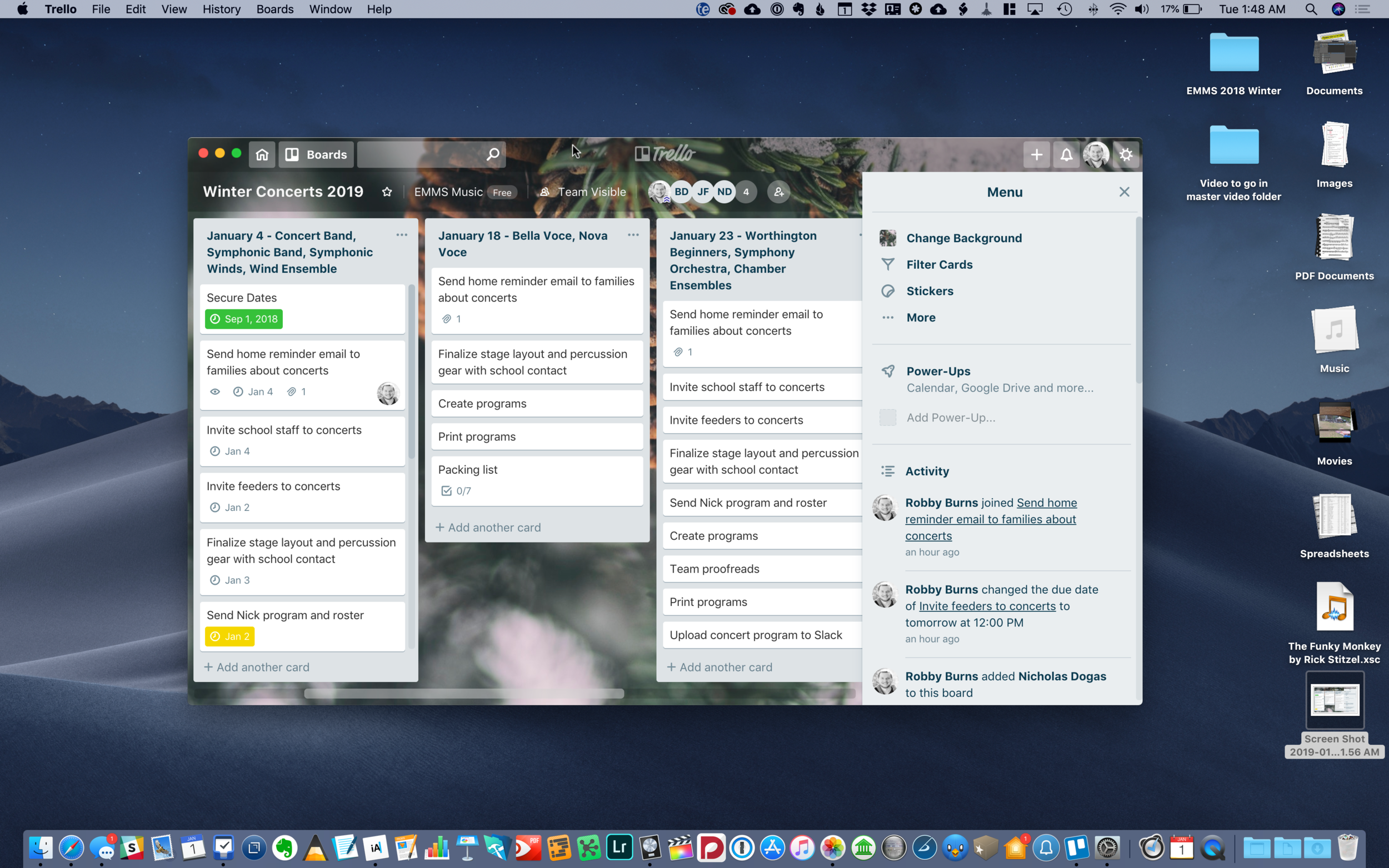
This may be my productivity discovery of the year. Trello is the team project app you have been waiting for. It’s vibrant, Kanbab board style interface will have your team, family, or Dungeons and Dragons group enjoying every minute of collaboration. Bonus points for how well this app integrates with Slack which is my preferred team communication tool.

Planning concerts in Trello allows my team to share todos, check lists, files, and more. We can give items due dates and even assign tasks to other members.

Planning concerts in Trello allows my team to share todos, check lists, files, and more. We can give items due dates and even assign tasks to other members.

GoodNotes

GoodNotes has become my go-to handwritten note application. It acts like a bookshelf of notebooks so to speak. I take a lot of the work I create in iWork, Ulysses, and OmniGraffle, export them as PDFs, organize them into notebooks in GoodNotes, then annotate them on the go using my iPad. My favorite thing to do with it is keep a notebook of seating charts that have my rehearsal annotations on top of the names of my students. I love how you do not need to trigger an annotation mode to start scribbling on a document with the Apple Pencil. It just feels like paper.

Streaks

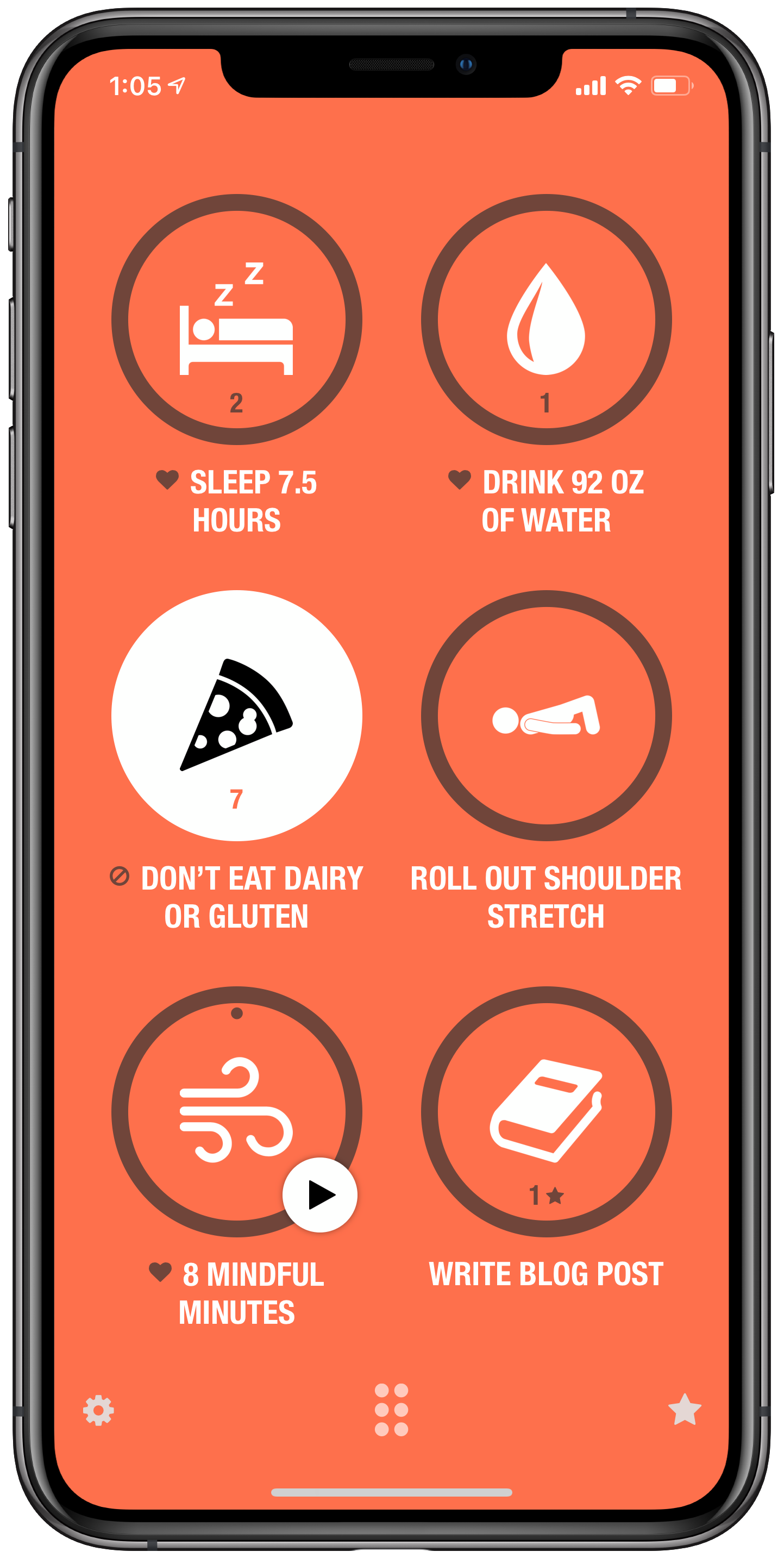
There are a lot of great habit building apps out there but Streaks has stuck with me because it encourages you to focus on just six habits at a time. When I am building too many habits at once, they start to feel like a todo list. The Streaks method of choosing six, along with its addictive user interface, keep me launching the app, which keeps me working towards my goals.

AutoSleep and AutoWake

Of the ten or so sleep trackers I have tried for the iPhone and Apple Watch, AutoSleep has stuck with me the most. There are numerous things I like about it, but most of all is how it figures out the most accurate number of hours I have been asleep whether I wear my watch to sleep or not. The companion app, AutoWake, wakes me up silently with haptic feedback on the watch. It does this when I am in my least deep sleep within a half hour before my alarm is set to go off. This eases me awake rather than jolting me awake. I plan to blog later this month about how I am automating some cool stuff in my house when I wake up using this app.

WaterMinder

WaterMinder is my favorite app for tracking water intake, mostly because of its well designed and space efficient widget.

Shortcuts

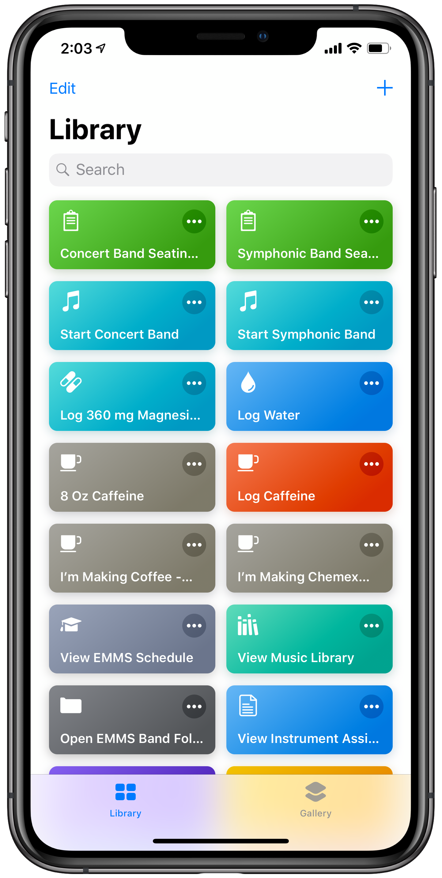
I did not get as much out of the Siri Shortcuts app this year as I wanted to. In fact, I had a lot of bad luck with it. But it is still an app that is working really well for me in a couple of small areas. In one tap, it generates a clean copy of my band's seating chart in GoodNotes for annotations and opens my lesson plan for the day in OmniOutliner. 

The Waterminder Widget.

The Waterminder Widget.

Some of my Shortcuts.

Some of my Shortcuts.

CARROT⁵ Weather

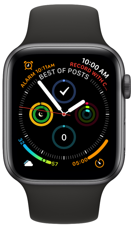
This is my favorite weather app due to its clean and appealing design. It gets my pick this year because of how they continue to innovate the Apple Watch app. My favorite feature of the watch is the customizable complications. Carrot makes the best weather complication for the Apple Watch, maybe the best complication, period. Carrot allows infinite customization for how it looks on the watch, depending on which watch face you like to view it, and even in which corner of the watch face you prefer to keep it installed.

The Carrot Weather app complication can be seen in the lower left corner.

The Carrot Weather app complication can be seen in the lower left corner.

Streaks. Guess I can check off that one in the lower right corner now.

Streaks. Guess I can check off that one in the lower right corner now.

Brief Thoughts on Apple’s Education Event

Well it has taken me long enough… This past week, Apple held an education event. Below are some brief thoughts on the subject. Chris Russell is coming on my podcast later this week to talk about all of the details. Keep in mind, I do not work in a school with 1:1 iPads or any kind of deployment strategy. But I am very seriously invested in Apple’s role in education and their vision for how their products fit into the classroom.

New iPad

This device looks great. Adding the Apple Pencil to this model will be an asset for schools. But will schools really pay 89 dollars for a pencil after just having purchased numerous 250 dollar iPads? 

The thing that gets me most excited about this device is its consumer potential. I am tempted to buy one for myself as a (more) mobile counterpart to my larger 12.9 inch iPad Pro.

iWork Updates

Apple Pencil support. FINALLY. This was my favorite announcement of the day. I anticipate editing Pages documents, scribbling on bus attendance lists made in Numbers, and annotating Keynote slides at the front of the classroom on a daily basis. I hate to be cynical (which the rest of this post will be), but Microsoft Office for iPad has had the ability to write on documents with an Apple Pencil since the Apple Pencil launched, two years ago. 

iBooks Author

Seems like the Mac app is no longer going to receive development. All book publishing features have been moved to Pages for iOS and Mac. It doesn’t appear that the new feature does everything that iBooks Author can do. Hopefully this is like when Apple rewrote Final Cut Pro X, took away some features, but then eventually added them back. Or when iWork was rewritten to be the same for iOS and macOS, stripping AppleScript features from the Mac, but eventually bringing them back. I would hate to see iBook authors unable to use workflows they have in the past using iBooks Author for the Mac. 

Classroom App for Mac

Apple’s learning management system comes to the Mac. Great! But what took so long? And can Apple keep up with the vastly more mature and flexible Google Classroom? (See conclusion below)

School Work App

An app for teachers to give assignments to students, check their progress, and collect it back. School Work can route students to other apps to do their assignments using the ClassKit API which is very cool. But why is this separate from the Classroom app? And where does iTunes U fit into all of this?

Conclusion

Apple is making a lot of solid efforts here but a lot of it it feels like too little too late, especially the student and learning management software. I really do hope they can keep up with Google Classroom who has been eating everyone’s lunch for years. Apple will have to be aggressive about adding new features to all of these new apps and making sure that their app ecosystem is flexible enough to compete with Chromebooks which use browser based software. Yes, there are way more apps on the App Store than there are Chrome based apps, but in education (and especially in music education) a lot of the big players are writing for Chrome OS. To me, the draw of Chromebooks in education is not their price, but the flexibility of web based software.

Apple’s software engineers seem spread very thin and unable to balance the release of various applications, consistently over time. This is true of many of Apple’s consumer apps. Mail and Reminders, two tentpole productivity apps have fallen way behind the competition. Calendar has not seen any more than a few major feature updates since I started using the Mac back in 2006. Apple’s apps are part of the “nice” factor of being in the ecosystem. Sometimes an app like Notes will get some major new features, but then we won’t hear from it for a few years. Google’s apps, by contrast, lack the same design sense, but are constantly being updated with new features. And they are not locked into annual OS updates like iOS is. In my opinion, this is Apple’s biggest problem right now.

Ironically, software is still my draw to Apple products. Even though their hardware is the most indisputably good thing they are doing right now (I am nearly without complaint of my iPhone X and the iPad 10.5 is perfect), it is the software that locks me in. In other words, I am much more committed to macOS and iOS than I am Mac and iPhone. This leaves me with some long term concern about my interest in continuing to use Apple products. And great concern about any educational institution who jumps on the iPad bandwagon just because apps are bright and colorful and demo well on stage. Apple has to show continual support for their education software if their dream for the classroom is to come true.