fantastical

Holiday Gift Guide 2022, with David MacDonald and Craig McClellan

I've got a new podcast episode out, and while it's probably not in time for most of your shopping, the stuff we discussed are amongst my favorite things of 2022 and are certainly great ideas to treat yourself with down the road, if not sooner.


Show regulars Craig McClellan and Dr. David MacDonald join the show to talk about stuff we like.

Subscribe to the Blog...

RSS | Email Newsletter

Subscribe to the Podcast in...

Apple Podcasts | Overcast | Castro | Spotify | RSS

Support Music Ed Tech Talk

Become a Patron!

Buy me a coffee

Thanks to my sponsors this month, Scale Exercise Play-Along Tracks.

Show Notes:

Music Ed and Tech News

Books

Software

Services

Hardware and Gadgets

Bags, Pens, and other Misc stuff

The Pen Addict Podcast

Pilot Metropolitan - 6 Cartridges https://www.jetpens.com/Pilot-Iroshizuku-Shin-kai-Ink-Deep-Sea-6-Cartridges/pd/34517)

JetPens.com - Pilot Iroshizuku Shin-kai Ink (Deep Sea) - 6 Cartridges

Rhodia Notepad

Plotter

Tom Bihn Bags

App of the Week:

Robby - Spring for Twitter

David MacDonald - Cleanshot X / Spaceteam (Board game version)

Craig McClellan - Timery

Music of the Week:

Robby - Carly Rae Jepsen: The Loneliest Time

David MacDonald - Béla Fleck, Mike Marshall and Edgar Meyer: Uncommon Ritual

Craig McClellan - Bonny Light Horseman: Rolling Golden Holy

Tech Tip of the Week:

Robby - Curating your social media experience

David MacDonald - Firefox add-on: Display Anchors https://addons.mozilla.org/en-US/firefox/addon/display-_anchors/

Craig McClellan - Focus Mode Updates

Where to Find Us:

Robby - Twitter | Blog | Book

David MacDonald - Twitter | Website

Craig McClellan - Twitter | Website

Please don't forget to rate the show and share it with others!

My favorite calendar app Fantastical releases version 3.6 with "openings" and "scheduling" features

My calendar app of choice, Fantastical, released version 3.6 this week.

Fantastical is an amazing calendar app that works with numerous calendar and task services and packs tons of powerful features in a graceful user interface.

The version adds some huge productivity boosts. My favorite of which is a feature called "Openings" which, if you have ever used the service Calendly, adds similar function right into the app.

By setting up a few quick templates, I can now quickly reschedule a private lesson with a parent by texting them a URL. I give Fantastical a window of time; it looks at the free time in between my calendar events and provides the parent with a website that prompts them to choose an available slot. Their chosen time is then added right to my calendar. It is going to help me save tons of time!

There is a video of this feature in action below, and you can read about all of the new features in 3.6 here.

Fantastical has an aggressive subscription price for the premium version, but updates like this make me feel glad I can fund their continued development.

➡️ Apps to Help with Time Management and Planning (NAfME Blog)

This blog post originally appeared on the blog for the National Association for Music Educators (nafme.org) on April 6, 2021.

In "Digital Organization Tools for Music Educators," I detailed apps that can help you plan large goals, turn them into actionable projects, and reflect on your progress.

Next, I'd like to talk about apps to help you manage your time and save your ideas digitally.

Put Only Hard Commitments in Your Calendar

Managing your time is a key part of being a music educator. Sometimes it feels like we have more responsibilities than there is actually time in the day to complete.

In "Digital Organization Tools for Music Educators," I recommend apps to help you wrangle your to-do list. Now I would like to recommend some apps and tips for managing the events on your calendar.

If your calendar needs are simple, I recommend you go no further than Google. It runs entirely in a web browser but can also be used in combination with your calendar app of choice. My music team uses a Google Calendar to publish all of our classes, sectionals, concerts, and events. This allows us to edit this data right from our calendar apps on our phones and computers, while also publishing them to a website for parents to view.
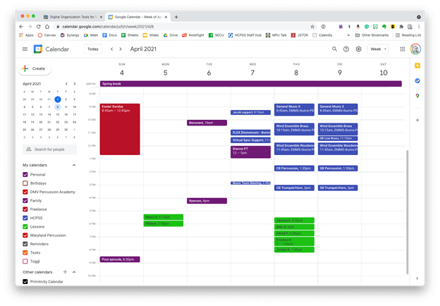
Google CalendarGoogle Calendar works perfectly fine for most needs. It is available to anyone for free on the web and has a functional mobile app on most smartphone platforms.

Microsoft Outlook and the Apple Calendars, despite being created by big tech companies, are actually capable of showing you a calendar from any service (Google included). My personal calendars are in iCloud, and our school uses Exchange. I can log into my iCloud, Google, and Exchange calendars all from within the same app to see everything I am committed to.

Apple calendarApple Calendar and Microsoft Outlook are two of the most widely used calendar apps on desktop and mobile operating systems. Either of them can handle calendars from Google, iCloud, or Exchange accounts and show them all alongside one another.
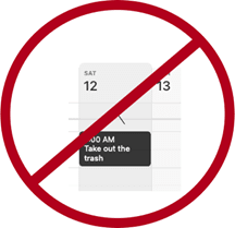
daily tasks

Tip!—Avoid putting tasks in your calendar. Tasks have due dates, but they rarely need to be worked on at a specific time. I find that putting tasks in my calendar adds lots of noise and I eventually just end up ignoring all of it. If you want to stay sane, put only time-based appointments on your calendar. You can make an appointment with yourself to tackle a big task, but try to avoid putting things like "print concert programs" and "design seating chart" alongside events with concrete start and end times.

If you want more power out of your calendars, I recommend you check out Fantastical. (Currently iOS and Mac only. Android users can check out SolCalendar). Here are my favorite features:

natural languageNatural language input is not only fast, but you can set a keyboard shortcut on your computer to invoke a mini-calendar for quickly adding events.

  • Natural language input: Typing "Choir Rehearsal tomorrow at 7 pm @2032 Beaverton Road /Work" will add an event called Choir Rehearsal to your calendar at the designated time and location. The "/Work" will put on the "Work" calendar.
  • Calendar Sets: I subscribe to my school and school district's master calendar to better plan after-school rehearsals, concerts, and space use. I subscribe to these calendars in Fantastical, but I have them toggled off by default. I created a Calendar Set called "All" that turns on the chaos and shows me every single calendar I have at once. Many things overlap, but it enables me to be informed as I plan without needing to visit my district's website.
  • Conference Call Detection: Fantastical also has built-in Zoom and Google Meet integration. If it detects a meeting URL in the calendar event, it adds a one-touch button to the event which will launch you right into the meeting. calendar zoom link to help time managementThis event was shared with me and has a Zoom call URL associated with it. Fantastical automatically added the Zoom icon so that I can click on it to immediately enter the call. FantasticalFantastical integrates with all of these services.
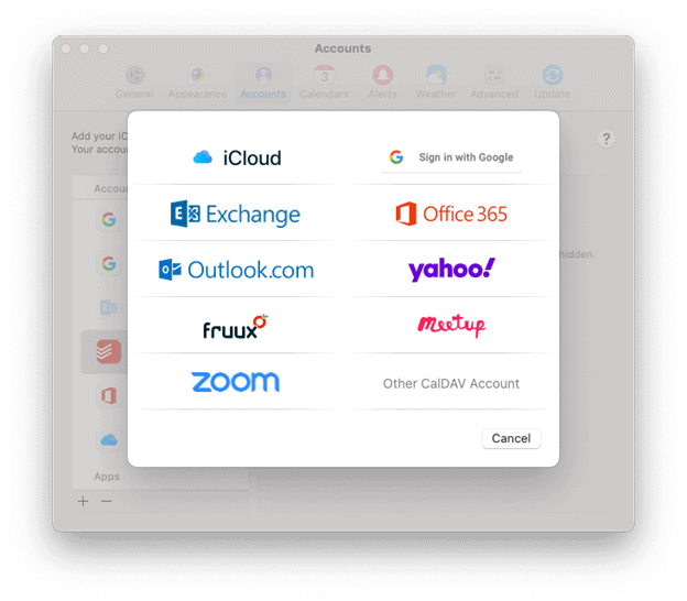
A handful of Fantastical's features are free, and some of the more advanced features are paid.

Other great calendar apps:


Quickly Clip Ideas from Everywhere

There is much to say about note apps. The one feature I see least utilized by busy teachers is the clipper. A clipper is a tool that runs in the Share Sheet of your phone or as a web extension. Clippers are perfect for "saving it for later." A good one can handle mixed media including photos, websites, emails, text notes, files, and more. Here are my favorite apps that have easy ways to capture data for later:

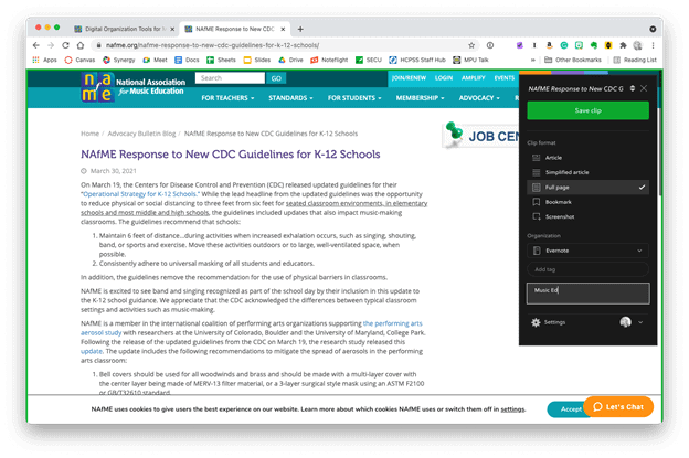
  • Evernote: Known for being cross-platform and having a free tier. Its web extension can grab almost anything from the web and clip it to your notebook in a neatly formatted article view that is text searchable. EvernoteThe Evernote web clipper can be installed as an extension or from the share-sheet on mobile devices. You can choose how it will save the content, and even categorize it with tags and a memo before clipping.
  • Microsoft OneNote: Similar features to Evernote. It's free if your district has Office 365. Plays nice with the rest of the Office Suite.

  • Apple Notes: Apple Notes has caught up with most of the major features of competing note apps. From almost anywhere on an iOS or Mac device, press the Share button to save something to Apple Notes. Almost any type of media can be clipped.
  • Drafts: Drafts is text-only, but I prefer it for my note-taking because I can capture quickly and then easily send the text out to other apps once I have decided where it belongs.
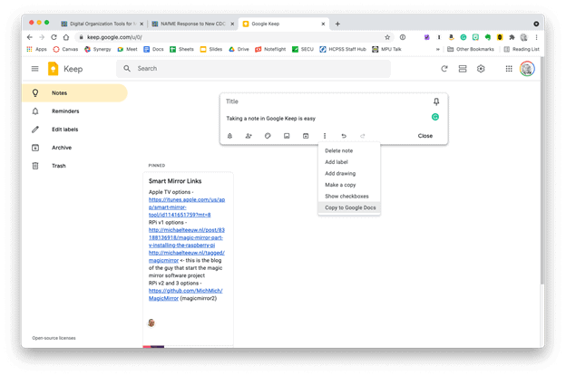
  • Google Keep: Leverages all smart AI features and integration with Google Services that you would expect. Google KeepGoogle Keep is simple, but it provides plenty of features. Notes can be turned into reminders, Google Docs, or shared with others.
  • Instapaper: Primarily for saving web content like news articles. It strips out the ads, buttons, and other chrome, so you get an experience less like reading a website and more like reading a newspaper.

Of these apps, Evernote is most able to handle whatever kind of data you throw at it. Because it's available on the web, it's easy to share your data with others and even get your data out and into another app, if you choose to.

Instapaper snipping tool

Before and after a website has been parsed by Instapaper's clipper.

Tip!—In the same way I try to avoid putting tasks on my calendar, I also try to avoid clipping things I want to check out later to my to-do list. It clutters things up. I put only actionable tasks on my task list. If it doesn't have a verb ("email Jacklyn choir rosters for 2021–22," "tune the bass drum," "draft grant proposal"), save it to a note instead.
no clippings or to-do lists

METT Episode #19 - Productivity Boot Camp (Part 2): Email and Calendars, with Dr. Frank Buck

Thanks to my sponsor this month, Flat for Education.

Dr. Frank Buck returns to the show for Part 2 of the Productivity Boot Camp mini-series to talk all about managing calendars, handling email, time tracking, and automation!

Dr. Frank Buck is a productivity master with a background in band directing and administration. I share my knowledge of Apple products and native third-party apps, and he shares his experience with web-based, cross-platform apps.

Show Notes:

App of the Week:
Robby - Reeder 5
Frank Buck - Snipboard.io

Album of the Week:
Robby - Palo Alto | Thelonious Monk
Frank Buck - Christmas Portrait | The Carpenters

Where to Find Us:
Robby - Twitter | Blog | Book
Frank Buck - Twitter | Website

Please don't forget to rate the show and share it with others!

Subscribe to Music Ed Tech Talk:

Subscribe to the Blog

Subscribe to the Podcast in...
Apple Podcasts | Overcast | Castro | Spotify | RSS

New Software Updates from Apple: Exploring Widgets!

iOS 14, iPadOS 14, watchOS 7, and tvOS 14 came out a few weeks ago. I have a lot to say about these updates, but today I wanted to write about widgets for a moment.

Widgets are catching on as a significant feature amongst the masses. As someone who plays around with the way apps are organized on the home screen at least twice a week, I can tell that widgets are going to add a lot of excitement (and anxiety) into my life. I have been toying with them since July when this software entered the public beta, and I am far from resolved.

Here is where I have landed for now…

IMG_3278.png
IMG_3261.png
IMG_3257.png

Page one (middle image) contains my most tapped app icons. This will be a hard habit to break, but I find lots of value in having upcoming calendar tasks and weather permanently on my most visited screen. Weather Line and Fantastical have the best small-sized widgets, in my opinion. Even this smallest widget size takes up four app icons, so they need to be beautiful and information-dense for it to be worth me sacrificing four apps.

I didn’t think I would want weather on this first screen, but now that it is always visible to me, I don’t see how I could live without it. The Weather Line widget is awesome because its user interface depicts the weather on a line, almost like a chart. It even manages to fit an hourly rain graph into its small space when it is raining out. Not even my second favorite weather widget, Carrot Weather, does that.

The Today View (left image) is where I keep Siri Shortcuts and the older, legacy style widgets from iOS 13. As much as I like the newer widgets’ look, the older style widgets are interactive. I keep OmniFocus, Timery (for time tracking), Streaks (for tracking daily habits), and Waterminder (for quickly logging water) all on this screen because I can tap right on the buttons to act on these apps without the widget needing to launch into the app.

I am continually playing with page 2 (right picture). I like it to be mostly another grid of tappable apps, but I am experimenting with various widgets here. I think what I have settled on is to have the Maps and Notes app widgets stacked on top of each other at the top, and then to use the Siri Suggestion widget, which shows me two rows of apps that swap in and out throughout the day based on my phone’s predictions of which apps I want to use in which contexts. The image above shows some other widgets I am experimenting with, but I think I prefer having more app icons there.

IMG_3071.png

On the iPad, I keep: calendar, weather, notes, Apollo (a Reddit app I use to keep up on the latest news about my interests), Siri Shortcuts, and the Files app for launching into recently modified files. 

On both my phone and iPad, I am waiting for an OmniFocus widget to track my tasks. Even though I like the one in the Today view where you can mark the tasks as done right from the widget, I think I might want to have my next few upcoming tasks permanently visible on page one.

9to5Mac.com and MacStories.net have been two great websites to follow if you want to stay up on which apps offer widgets.

StaffPad Comes to iPadOS (Reflections on App Store Pricing and Touch Screen Operating Systems)

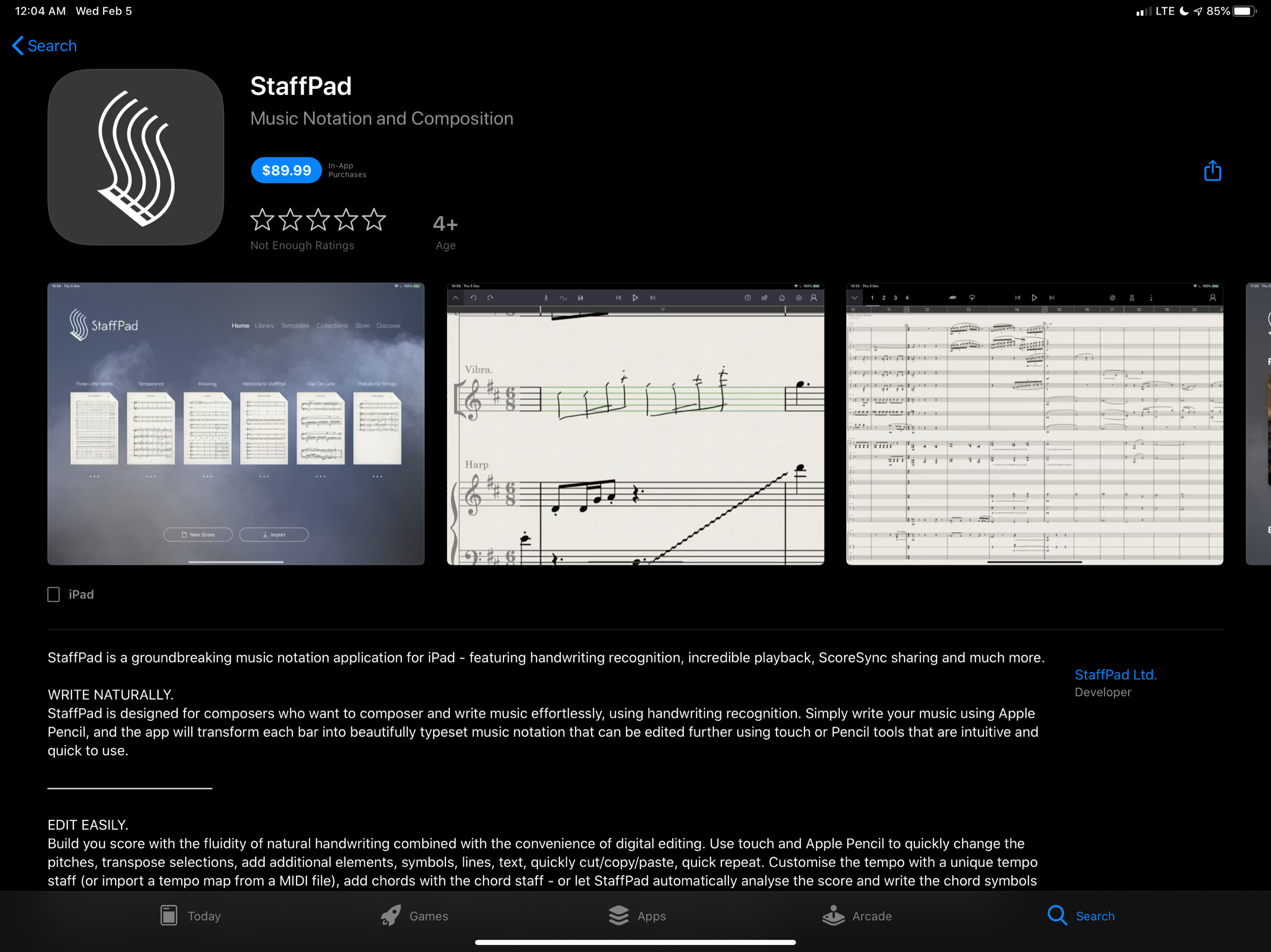
Five years ago, StaffPad came to Windows Surface tablets. StaffPad is a professional music notation application that turns handwritten notes into beautiful music notation. It is built around the stylus being the primary input, and because the iPad did not have stylus support at launch, StaffPad remained Windows only.

Multiple years into Apple supporting its own official stylus, the Apple Pencil, StaffPad is finally here on iPad!

StaffPad’s intro video sells itself, so I am not going to write much about the app here. Instead, I point you to…

StaffPad’s Introductory Blog Post

Download Link to the App Store

Scoring Notes Review - a must read if you are interested

Since the features of StaffPad are covered in the links above, I want to comment on two interesting aspects of this release.

First, the price. At $89.99, this is no impulse purchase. I find it refreshing to see a professionally priced app like this on the App Store. For years, the App Store has seen a race to the bottom type approach for grabbing sales. Users are so used to <5 dollar apps that the idea of paying for software has diminished from reality.

IMG_2544.png

Increasingly, developers are finding that subscription based pricing is the only way to maintain software and put food on the table. There was a big discussion about this in the Apple community last week when beloved calendar application Fantastical released their version 3 and went to subscription pricing. As is customary when an app goes to subscription pricing, users of the application and bystanders alike were enraged at the idea of a calendar costing four dollars a month.

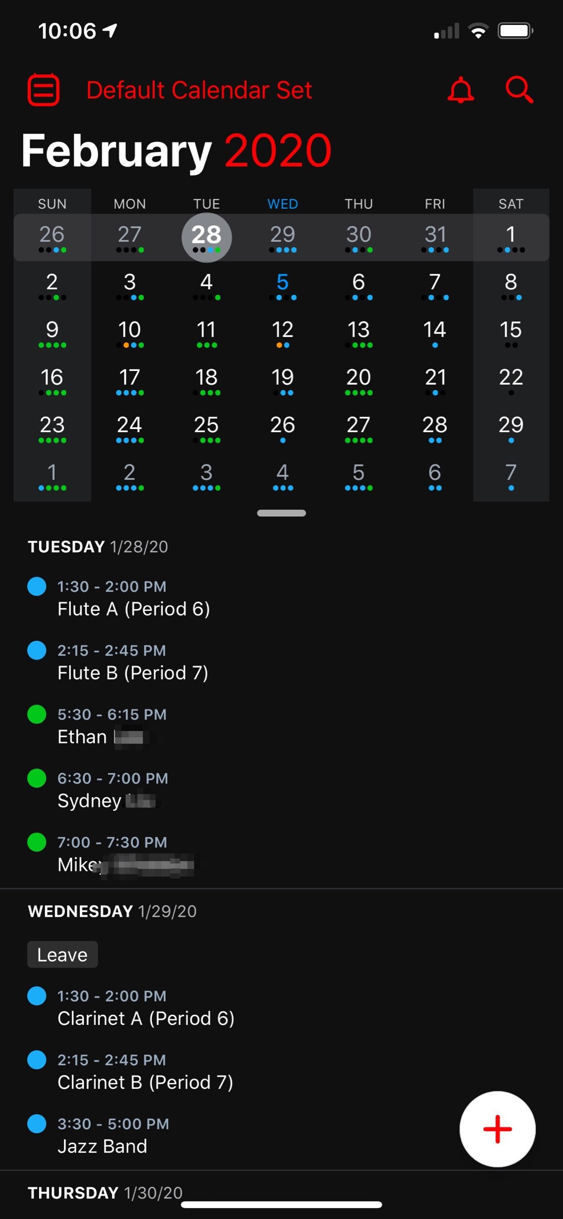
I couldn’t resist sneaking my love of Fantastical into this post. The interface is beautiful.

I couldn’t resist sneaking my love of Fantastical into this post. The interface is beautiful.

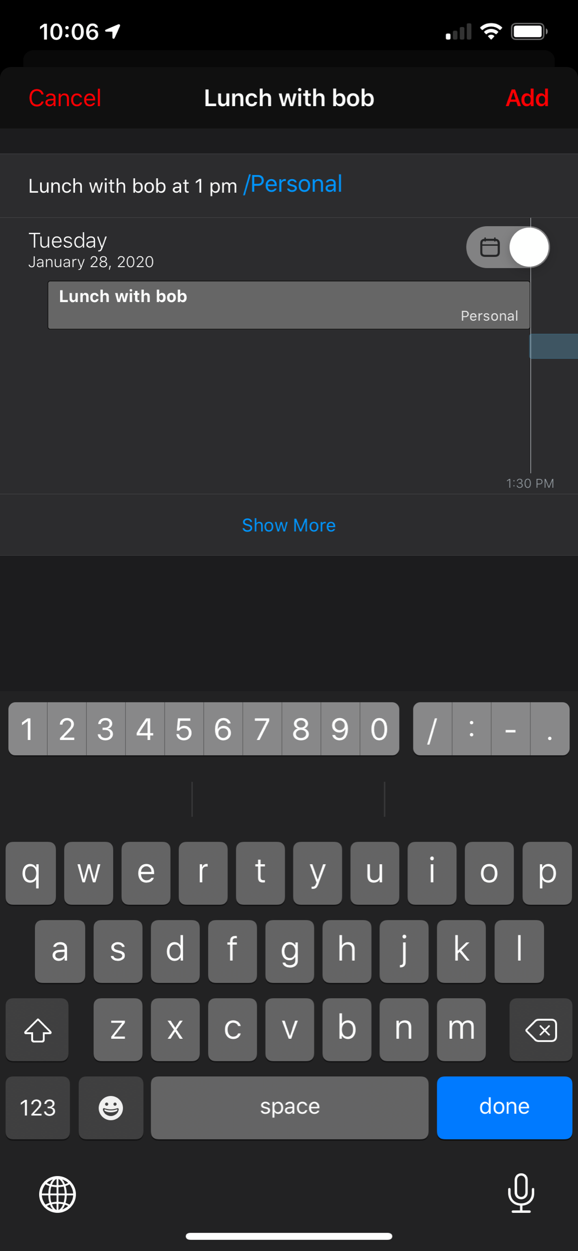
And the natural language input is one of many essential features that helps me get my work done more efficiently.

And the natural language input is one of many essential features that helps me get my work done more efficiently.

As a user of Fantastical, I was happy to keep supporting development. It is one of my most used applications on a daily basis and its features are essential to me having a full time teaching job, while also scheduling gigs, 25 private students, speaking engagements, and all of my other personal events.

Fantastical is what I would call a prosumer application. It offers more power to someone looking for an advanced and well designed calendar, and it has a wide appeal (everyone needs a calendar!). Four dollars a month is steep, but manageable. Now that the price is reoccurring, I do think it will appeal to a smaller audience, as each user will have to reevaluate on a monthly or yearly basis whether or not this application is continuing to be worth the cost.

StaffPad is very different. It is a professional creation tool. Much like Photoshop is essential to designers and photographers, score editors are essential to the lives of most musicians, composers, and music educators. By charging 89 dollars, StaffPad follows a long history of apps in its field, which are often priced between 200 and 600 dollars.

I have to wonder… if the iPad had more software like this, and from an earlier point in time, would users have adjusted their expectations and would more expensive professional apps be more viable? And if so, would the viability of such professional apps lead to more (and better) professional apps on iOS?

And furthermore, would Apple adjust to these trends? Apple still offers no free trial for apps (something that will definitely deter a lot of my music teaching colleagues away from giving StaffPad a chance). Not to mention that professional creative software has a tradition of volume licensing and educator discounts. Educators who would normally be able to afford a program like this for themselves or their class are going to be stuck if they are looking for the same options with StaffPad.

App developers get around to this in number of ways, an example of which is to offer a free app where you have to buy it as an in-app purchase after a week. Of course there is also the subscription model. I am glad StaffPad went with a more traditional model than a subscription because it fits within the tradition of how its class of software is priced. And my hope is that this just might convince more developers to bring their own apps to iPadOS.

Which brings me to my second point…

StaffPad doesn’t, and probably wont, have a macOS app. It is built entirely around stylus input. This is why it could only exist on Windows Surface tablets at first. I am thrilled it is on iPad, but this presents an interesting question for users of Apple products.

A Windows Surface user notices no distinction between whether or not StaffPad operates on a touch-based OS or a traditional point-and-click OS, because they are one and the same. Even as macOS and iPadOS move closer and closer together, this distinction has lead them to be products with very different potentials.

On the other end, all the other players in the score-editor field (Sibelius, Finale, Dorico) remain “desktop” applications that run on traditional point-and-click operating systems. With the power of the current iPad Pro, there is no reason these applications couldn’t exist on iOS, other than that developing for iOS is very different. None of these developers have shown any signs of bringing their programs to iPadOS any time soon, and I would suspect StaffPad has no plans for a Mac version.

I admire how Apple has held their ground about the iPad being the iPad and the Mac being the Mac. It has made both platforms stronger. But as the iPad becomes a more viable machine for getting work done, Apple has got to get a plan for how to solve this essential “input” question.